

Sinergie 2004

Retail
Interior design
2004
Location: Piacenza IT
Client: Private client
Area: 150mq
Provide Service:
Interior design
Sinergie
Negozio di abbigliamento nel Piacentino dove l’obiettivo è creare un’atmosfera semplice ed elegante dove i capi esposti potessero essere protagonisti. La soluzione trovata è stata quella di utilizzare materiali con colori neutri che giocassero sulle trasparenze e sulle sovrapposizioni. Il pavimento in resina e le pareti, infatti, si mantengono su colori neutri; i vetri colorati fanno da quinta alla zona camerini e sono utilizzati insieme al vetro trasparente nei tavoli per l’esposizione della merce. I camerini, volumi in policarbonato, mantengono leggerezza e diventano quasi corpi illuminanti grazie all’effetto di trasparenza dato dal materiale e dall’illuminazione retrostante. Gli specchi, articolano la parete di fondo e nello stesso tempo diventano elementi di arredo della vetrina espositiva retrostante, grazie ad un sistema di illuminazione integrato. Il bancone gioca sulla sovrapposizione di legno e vetro conferendogli maggiore leggerezza. L’illuminazione è puntuale ad eccezione della grande lampada che punta sul tavolo rotondo realizzato in legno ed acciaio. Il risultato è quello di un ambiente dove ogni minimo dettaglio, curato e pensato su misura, si presta ad esaltare l’esposizione e la vendita del prodotto.
A clothing store in Piacentine province where the objective is to create a simple and elegant feeling and where the clothing exhibited becomes the key player. The solution is to use materials with neutral colors that play with the transparencies of overlapping. The resin flooring and the walls are in fact kept neutral in color. The colored glass steals the scene in the changing room area and is used together with the tables for showcasing the merchandise. The changing rooms, volume in polycarbonate, retain lightness and almost become illuminated objects thanks to the effect of transparency from the lighting material located behind. The mirrors articulate the back wall and at the same time become decorative elements in the showroom behind thanks to a system of integrated lighting. The counter plays upon the layers of wood and glass giving it more lightness. The lighting is punctual except for a large lamp that points to a round table made from wood and steel. The result is an atmosphere where every minimal detail, thought and treated individually, helps to exalt the display and sale of the merchandise.


Mostra Ettore Sottsass

Museum-Exhibitions
Interior design
2000
Location: Parma Italia
Exhibition space:
Pecorini Palace, Parma
Client: Boscaro /
Municipality of Parma
Area: 250mq
Design team:
Massimiliano Mazzaschi
Provide Service:
Interior design
Graphic design
Works management
Allestimento mostra
ETTORE SOTTSASS 28 PROGETTI PER LE TARSIE DI ANDREA FEDELI
Parma 2000
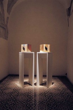
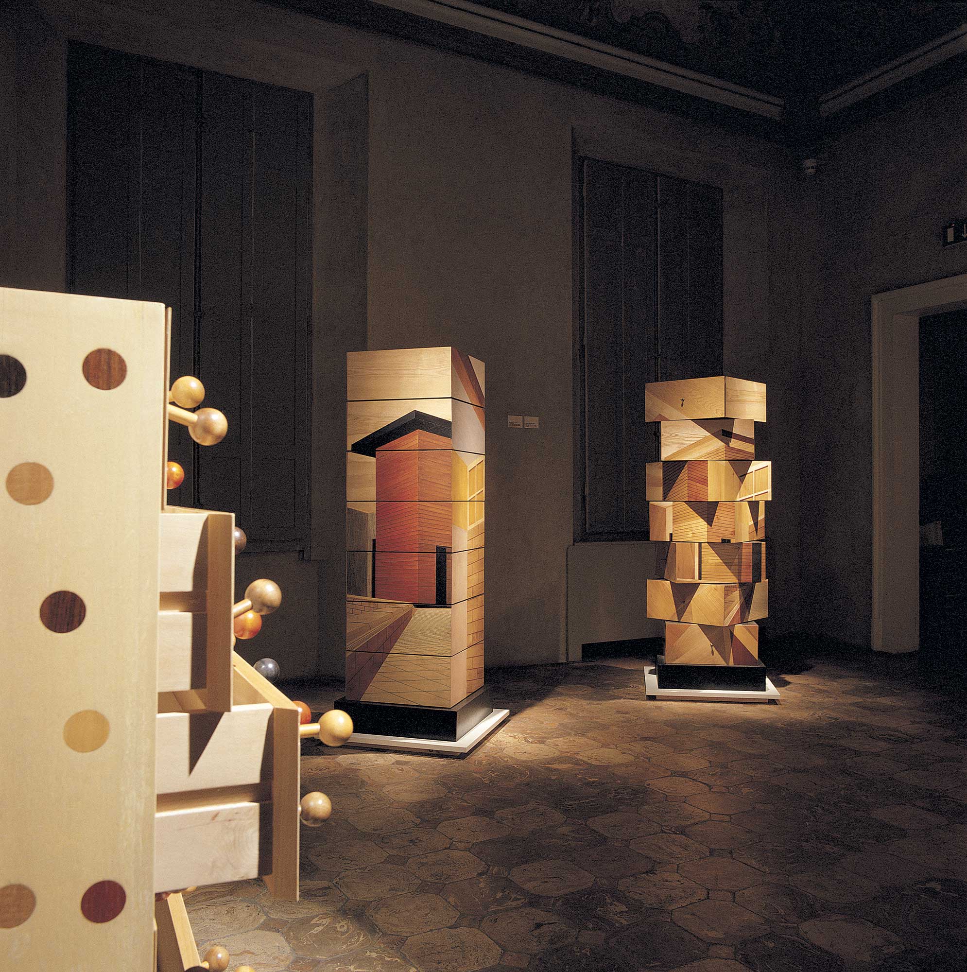
Lo studio è stato incaricato di allestire la mostra a Palazzo Pigorini, Parma, sul progetto legato alla tradizione artigianale della tarsia del legno, nato da un idea di Boscaro Project e sviluppato dall’architetto Sottsass. La mostra non si limita a mostrare le opere finite, ma documenta tramite schizzi e fotografie l’intero processo creativo “dal disegno al progetto” che ha portato alla realizzazione di questa collezione. Dato il luogo, un palazzo storico ricco di elementi e dettagli architettonici si è pensato di dar meno risalto possibile all’ambiente tramite un’illuminazione diffusa particolarmente soffusa e al contempo illuminando in modo puntuale e diretto le opere in mostra. Negli oggetti disegnati da Sottsass diviene quindi leggibile la linea, la cromia e la matericità degli elementi. L’allestimento si concretizza in elementi semplici: i supporti per le opere in mostra, bianchi e dalle linee minimali, staccano cromaticamente con il pavimento e mette in risalto l’oggetto in mostra.
ETTORE SOTTSASS 28 OBJECTS FOR ANDREAS FEDELI’S INLAYS
Parma 2000
The studio was hired to set up an exhibition in Palazzo Pigorini in Parma, based on a project related to the craftsman’s tradition of wood inlay, and generated by Boscaro Project developed by the architect Sottsass. The exhibition is not limited to the finished works but by use of sketches and photos it documents the entire creative process of “from drawings to project” that made this collection. Due to the location, a historical palazzo rich in architectural details and elements, we thought to downsize the surroundings by using diffused lighting and at the same time to illuminate more all the items exhibited. Thus a clear line was created for viewing Sottsass’s works, their chromatics, and the materials of the elements. The exhibition uses simple elements: the supports for the works are white and minimalist, which make them stand out, detaching chromatically from the flooring.



Lino's Coffee 2019-2025
Coffee & Bar
Interior design
Brand Identity
Format
Chronology: 2018-2025
Location: Vigevano PV
Client: Lino’s Coffee
Area: 70mq/200mq
Provide Service:
Interior design
Graphic design
Brand Identity
Lighting design
Lino’s Coffee
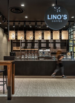
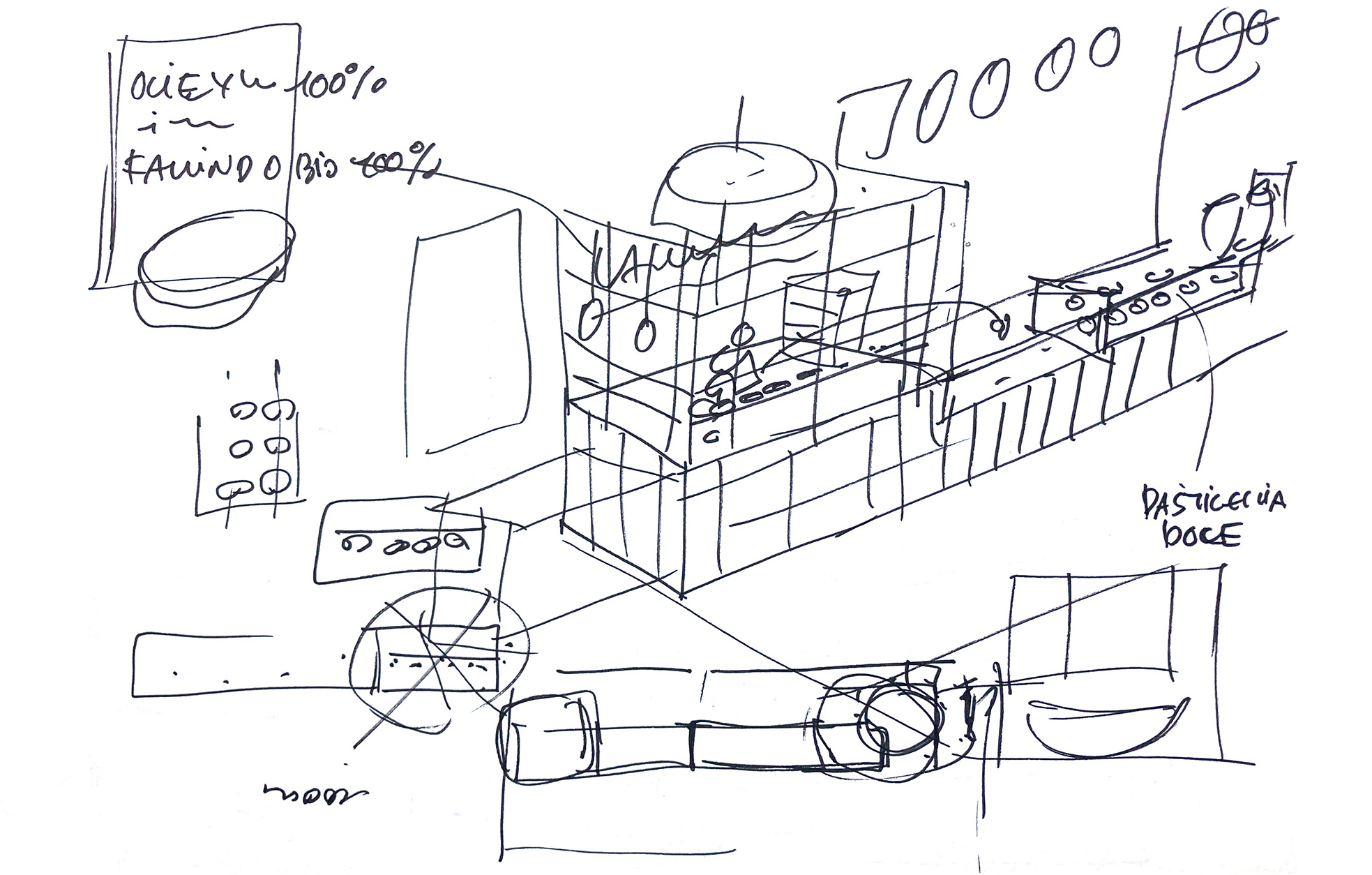
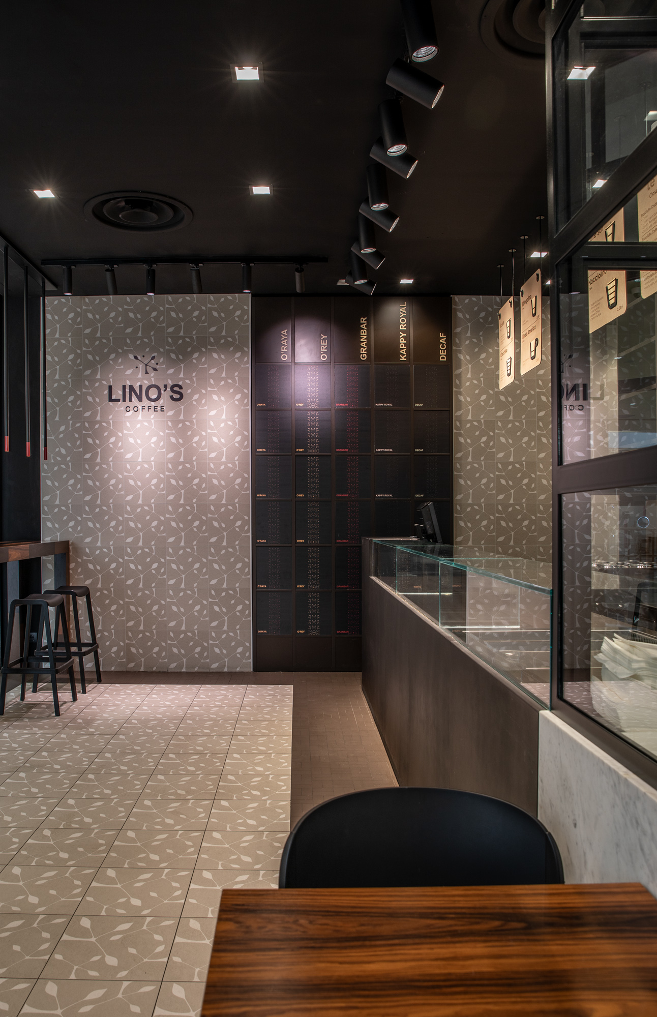
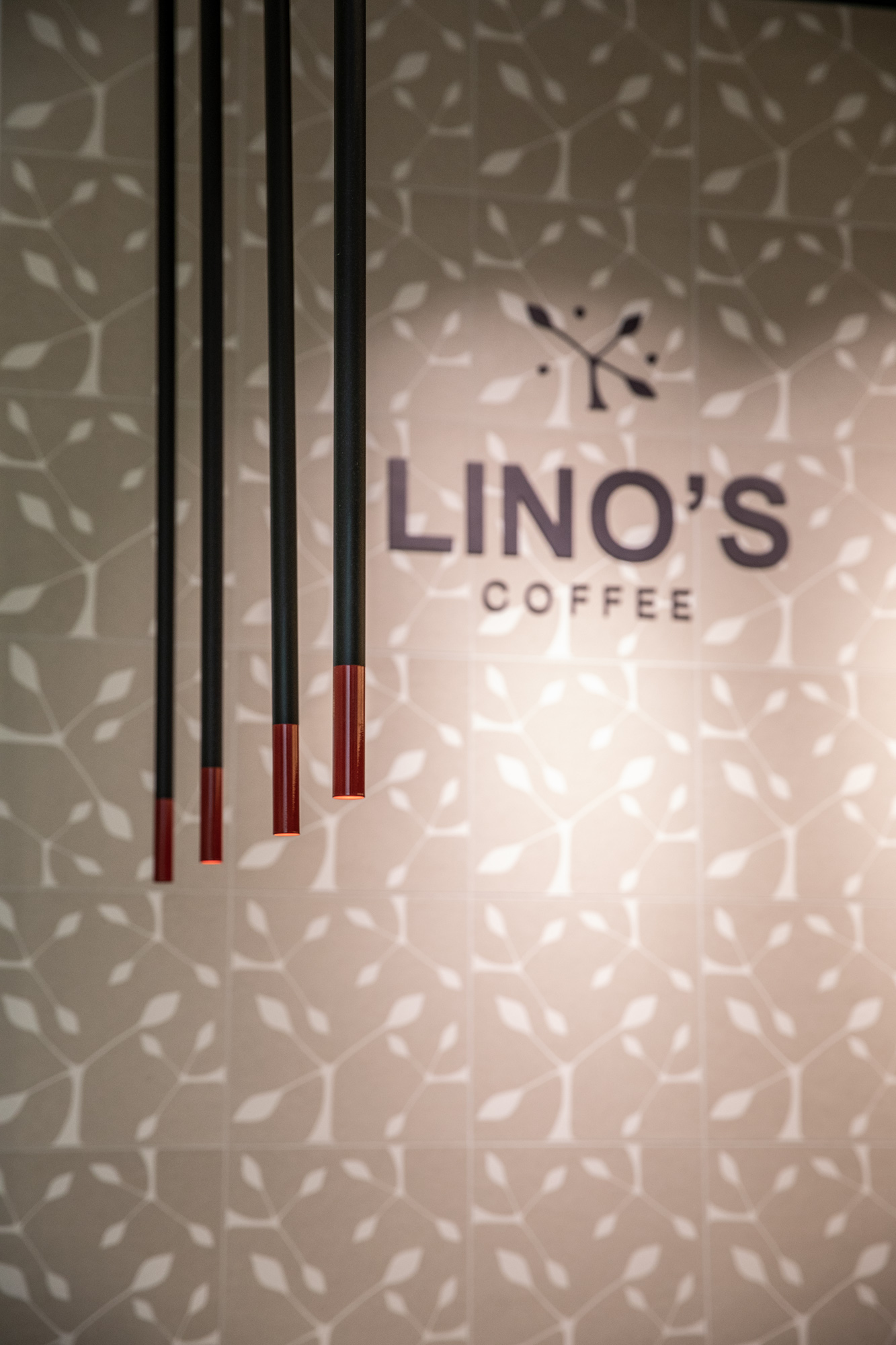
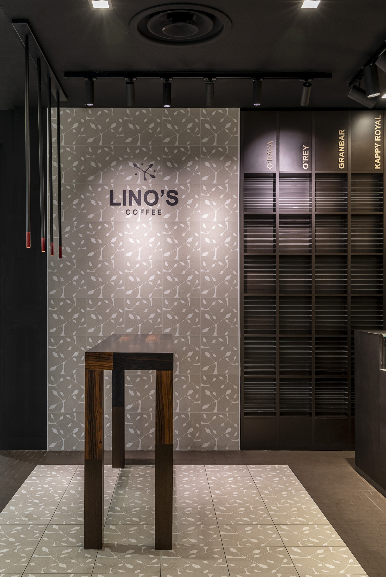
Locale della catena Lino’s Coffee, specializzata in degustazione di caffè. Il concept viene ripreso in tutti i punti vendita. E’ stato ideato il brand che connota tutti gli ambienti. Il primo locale progettato per il marchio risale al 1998. Nel progetto di rinnovamento articolatosi tra il 2019 e il 2022, si è puntato di una revisione del logo e sull’innovativa comunicazione attraverso originali menu board. La nuova insegna non è più orizzontale, bensì circolare e contiene il nome del brand, non più disposto linearmente ma armonicamente inserito nel cerchio. I menu board, ben illuminati e collocati in posizione strategica sopra al bancone, sono ricercati nelle forme e nei materiali. Presentano una base in legno; le scritte sono incise al laser e sono inseriti pittogrammi in rilievo per presentare il prodotto.
L’ambiente è tutto giocato sulle cromie del marrone scuro, che richiama il chicco di caffè. Il pattern con la stilizzazione di una pianta di caffè, che costituisce il marchio della catena, è replicato sui rivestimenti, con le piastrelle stampate ad hoc. Il bancone è suddiviso in due sezioni: la parte per la somministrazione che è aperta, il laboratorio che rimane a vista, grazie ad una vetrata.
Location Lino’s Coffee 1.0
2018 Vigevano (PV) Italia – 2019 Torino Italia – 2019 Vercelli Italia – 2020 Lodi IT-2020 Novate Italia – 2020 Gravellona Toce (VB) Italia – 2020 Gran Giussano (MB) Italia – 2021 Como Italia – 2021 Milano Italia – 2021 Novara Italia – 2022 Lino’s Coffee 2.0 Brescia Italia
A bar, belonging to the Lino’s Coffee chain, specialized in coffee tasting. The concept is present in all shops. The brand name was created to be used in all the Lino’s Coffee bars. The first bar goes back to 1998. The renovation project was carried out between 2019 and 2022, and the logo was revised plus an innovative communication using an original menu board was also introduced.
The new sign is no longer horizontal, but round and contains the brand name, not in a line but harmoniously inserted into the circle. The well illuminated menu board is strategically located above the custom counter and is refined in material and form, as is the counter itself. There is a wooden base; the text is laser printed and pictograms in relief are inserted to present the product. The atmosphere Is created by using shades of brown, reminding us of coffee beans. The pattern, showing a stylized coffee plant which constitutes the chains’ brand, is replicated in the ad hoc printed tile covering. The counter is divided in two sections: one open part for serving, and the other is a visible glass covered laboratory.


Residence IB

Private Residence
Interior Residential
Architecture Residential
2013-2017
Location: Piacenza IT
Client: Private client
Area: 250mq
Provide Service:
Architectural design,
Interior design, Styling,
Works management
Residence IB
Un’abitazione di moderna concezione con un consumo energetico estremamente basso e una vista straordinaria sulle colline piacentine. Una modernissima casa di campagna ricavata, su richiesta della committente, in un vecchio rustico completamente rimodellato e rivisitato. Anche il vecchio fienile è stato reiventato. Lo stile dell’insieme architettonico risulta semplice, essenziale, moderno.
Le pareti interne sono state demolite per aprire gli spazi, le ampie vetrate e gli infissi scelti hanno puntato sulla luminosità, accentuata dalla scelta cromatica del bianco assoluto. La scala realizzata su misura collega i tre piani, sfruttando gli spazi al meglio e proponendosi anche come elemento estetico. L’ingresso è a tutta altezza. Al piano terra si apre una hall a doppio volume: cucina e soggiorno sono delimitati da un camino bifacciale; nessuna parete li separa.
La scala conduce poi ad un secondo piano con lo studio, dal quale si accede alla zona notte. Il sottotetto conserva una copertura con travi in legno e i pavimenti sono rivestiti in rovere. Una scala a pioli, come quelle di una volta, porta ad un terzo piano con terrazzo che guarda sulle colline piacentine. Si punta sulla vista unica del paesaggio, anche con le aperture ad arco del vecchio fienile, trasformate in ampie vetrate.
A modern concept home with an extremely low energy consumption and an extraordinary view of the Piacenza hillside. A very modern country home, rebuilt by the special request of the owner from an old farmhouse, completely remodeled and reinvented. The old barn has also been reinvented. The total style of the architecture is simple, essential, modern.
The inner walls were eliminated to open the spaces, the ample windows and frames have been chosen for maximum light and are accented chromatically by the choice of absolute white. The custom staircase connects the three floors, using the spaces in the best way, also becoming a design feature. The entrance takes the entire height. On the ground floor a double sized hall opens up: kitchen and living room are delineated by a double-faced fireplace; no wall separates them. Then the staircase leads to a first floor with the study, and from here we enter the night zone. The attic has conserved its wooden beams and the floors are covered with oak planking. A staircase with rungs, like in the old days, brings us to the second floor with a terrace which overlooks the Piacenza hillside. We opted for this unique view of the landscape, also with the arched openings in the old barn, transformed into ample widows.


Residence GR


Private Residence
Interior Residential
Architecture Residential
2012- 2013
Location: Piacenza IT
Client: Private client
Area: 110mq
Provide Service:
Architectural design
Interior design
Works management
Residence GR
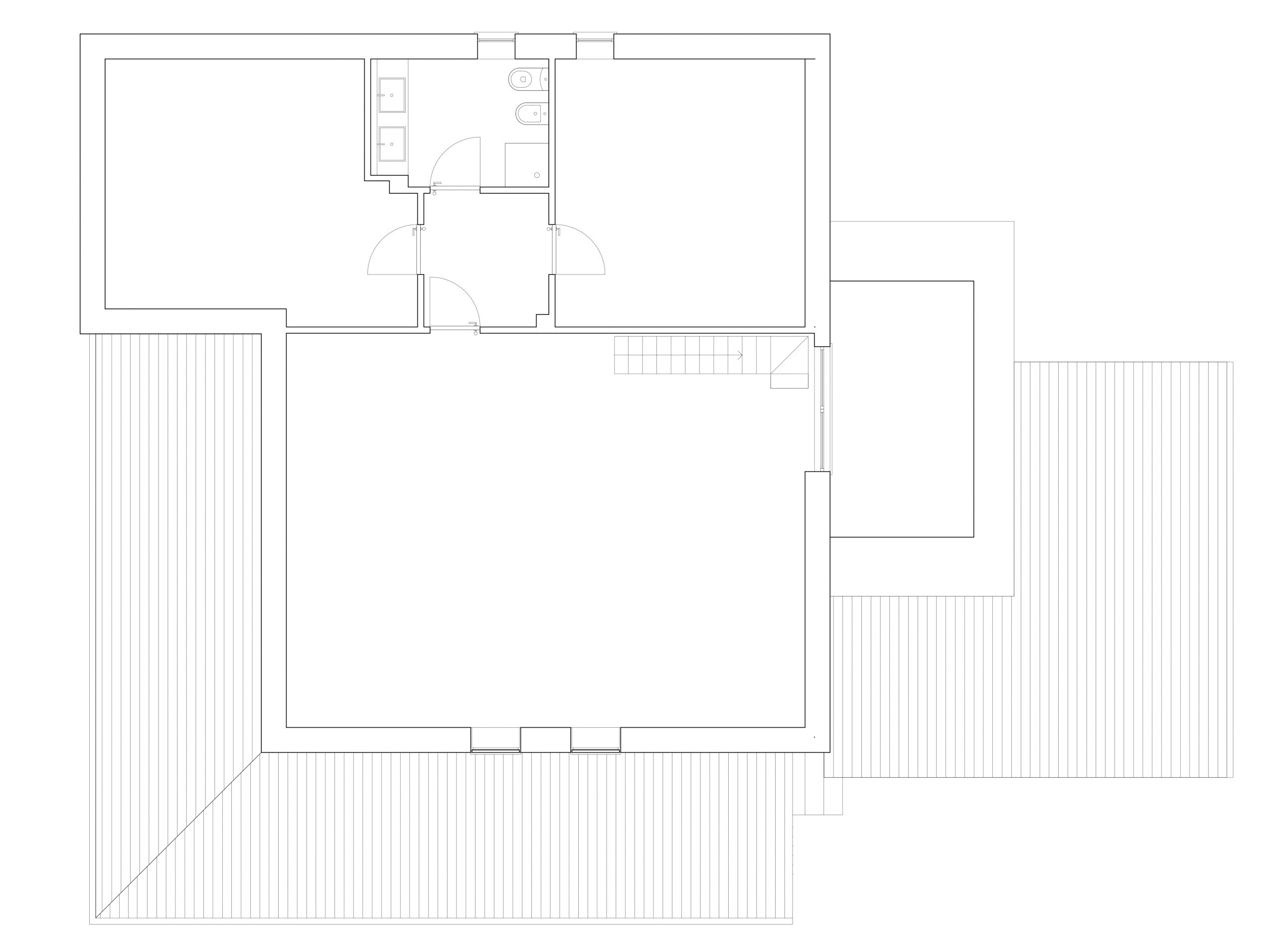
L’intervento ha trasformato una soffitta inutilizzata in un nuovo spazio abitabile luminoso e contemporaneo, composto da una sala e due camere, pienamente integrato con l’appartamento esistente. Il rifacimento del tetto ha migliorato le prestazioni dell’edificio e ha permesso di valorizzare la struttura lignea a vista, elemento caratterizzante dell’intero progetto. La nuova distribuzione interna privilegia ambienti ampi e ben illuminati, grazie alle nuove aperture e alla realizzazione di un terrazzino, che arricchisce la qualità abitativa creando un rapporto diretto con l’esterno. Il collegamento con il piano sottostante avviene tramite una scala su misura con parapetto in vetro, pensata come elemento leggero ed elegante, capace di garantire continuità visiva e spaziale. Completano l’intervento i bagni con arredi su misura, progettati per ottimizzare gli spazi e mantenere coerenza stilistica. Nel complesso, il progetto restituisce un ambiente essenziale, caldo e funzionale, in cui luce, materiali e proporzioni definiscono una nuova modalità di abitare il sottotetto.
The intervention transformed an unused attic into a bright, contemporary living space consisting of a living area and two bedrooms, fully integrated with the existing apartment below. The roof was completely rebuilt, improving the building’s performance and enhancing the exposed wooden structure, which becomes a defining architectural feature of the project. The new internal layout favors generous, well-lit spaces, thanks to new openings and the creation of a small terrace, which enhances the quality of living by establishing a direct relationship with the outdoors. The connection to the lower floor is provided by a custom-designed staircase with a glass balustrade, conceived as a light and elegant element that ensures visual and spatial continuity. The intervention is completed by custom-made bathroom furnishings, designed to optimize space and maintain stylistic coherence. Overall, the project delivers an essential, warm, and functional environment, where light, materials, and proportions define a new way of living in the attic.




Private Residence IB
Private Residence
Architecture
2013-2017
Location: Piacenza IT
Client: Private
Area: 1800mq
Provide Service:
Architectural design
Interior design
Works management
Private Residence
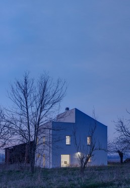
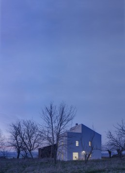
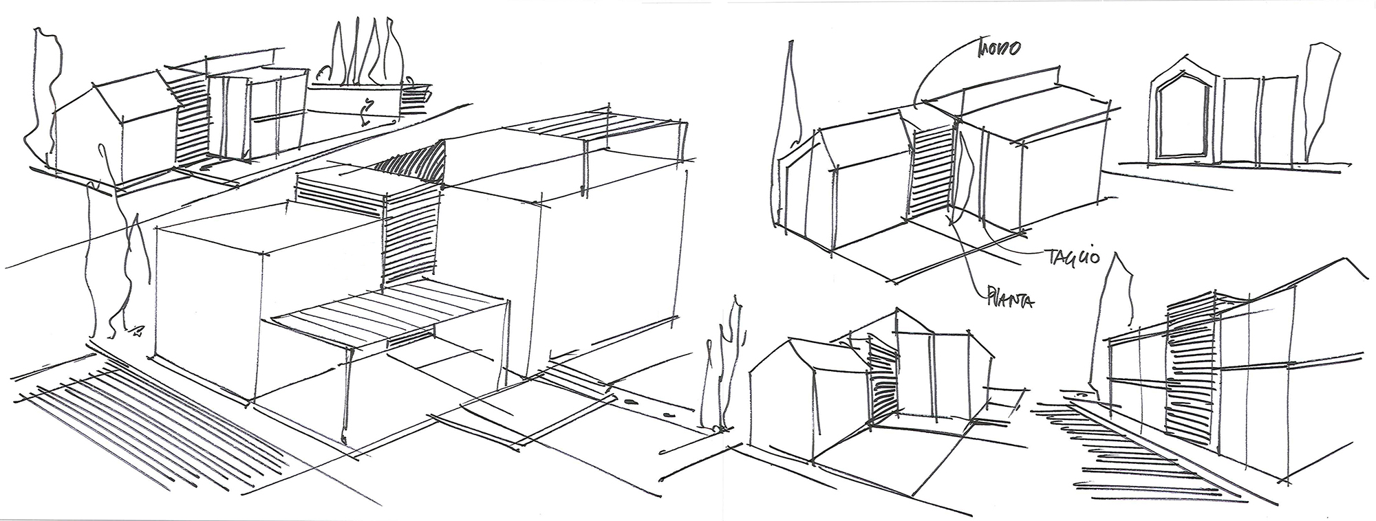
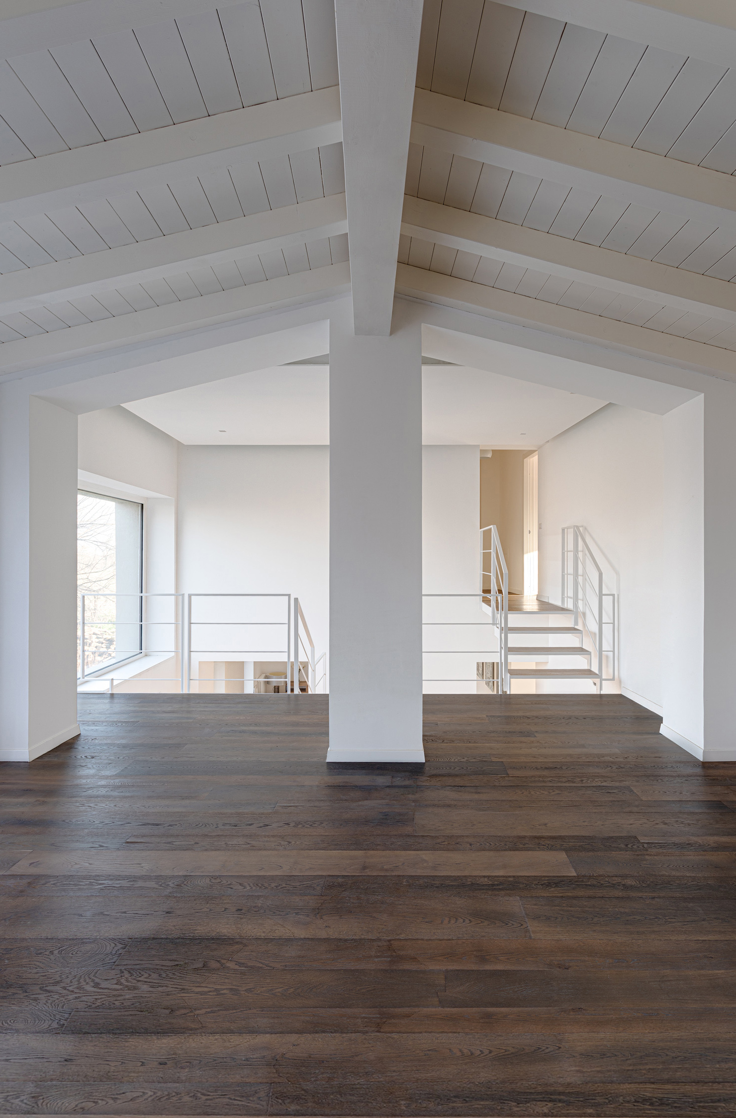
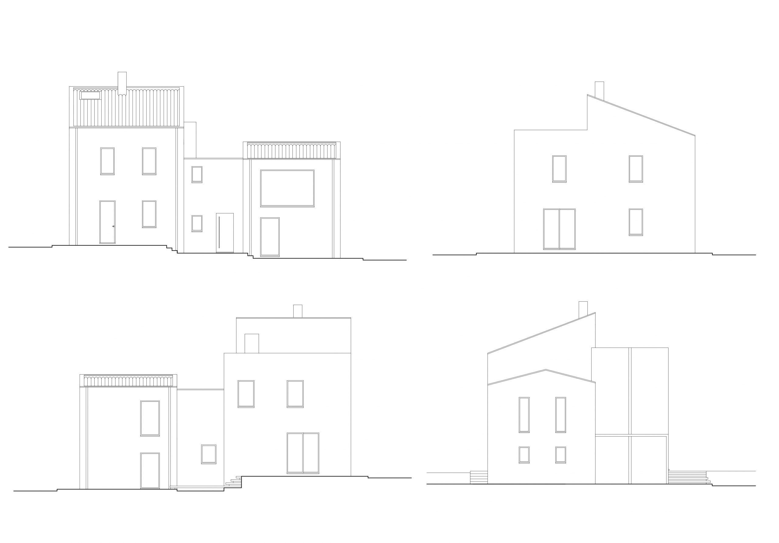
Un rustico nelle colline piacentine da ristrutturare e riprogettare. Un edificio da rinnovare completamente per ottenere una modernissima casa di campagna con un consumo energetico estremamante basso, secondo le richieste dei proprietari.Progettualmente vi è un rimando alla tipologia agricola tradizionale rielaborata in chiave attuale.Le forme e le volumetrie pulite e razionali danno un senso di ordine e di tranquillità, i colori chiari delle murature definiscono al meglio i corpi volumetrici e ne esaltano la semplicità. Il corpo centrale dell’edificio, elemento di snodo e distribuzione verticale, è rivestito da assi di legno adeguatamente trattate per resistere agli agenti atmosferici e posate a listoni orizzontali.
Tutte le falde del tetto non avranno sporto di gronda nè laterale nè frontale, reinterpretando dal punto di vista architettonico, attualizzandole, le tipologie storiche di zona. Ampie vetrate a sud-est illuminano la zona living e offrono ai residenti una bellissima vista sul paesaggio delle colline circostanti.Nel giardino si prevede una nuova piantumazione di alberi a medio-alto fusto nella zona sud per ombreggiare l’edificio in estate.
A farmhouse in the Piacentine hills to rebuild and redesign. A building to completely renew and create a modern country home with an extremely low energy cost, according to the owner’s wish. The project returns to the traditional agricultural type, revisited in a current version.
The clean and rational forms and volumes give a feeling of order and tranquility; the soft colors of the walls better define the volumes and exalt simplicity. The central body of the building, a connecting and vertical distributing element, is covered with wooden planks treated adequately to resist weather and positioned on horizontal edging. The roof gables do not have overhanging gutters on the side nor frontal, reinterpreting architecturally the typical historical forms of the past. Ample windows in the southeast illuminate the living room and offer the residents a beautiful view of the surrounding hill landscape. A new garden will be planted with medium and tall trees in the south in order to shade the building during summer.


Ongoing - Residence GC

Private Residence
Architecture
2018-2025
Status: Ongoing
Location: Parma IT
Client: Private
Area: 4000mq
Provide Service:
Architectural design
Interior design
Works management
Residence GC
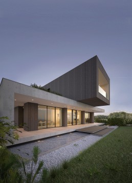
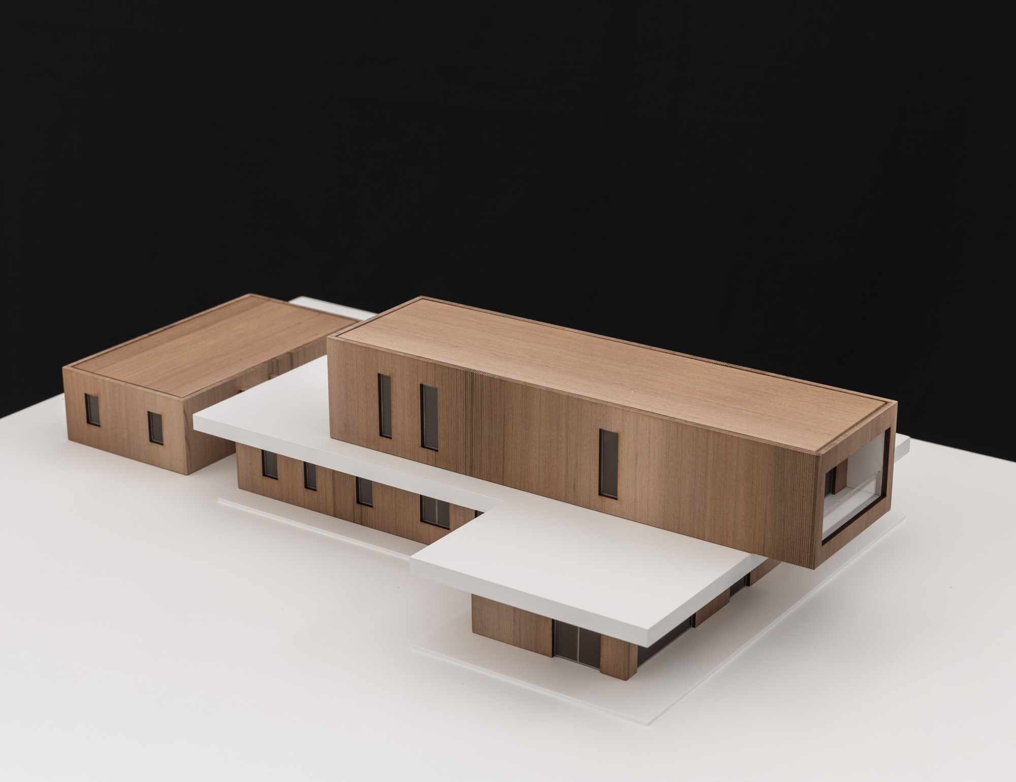
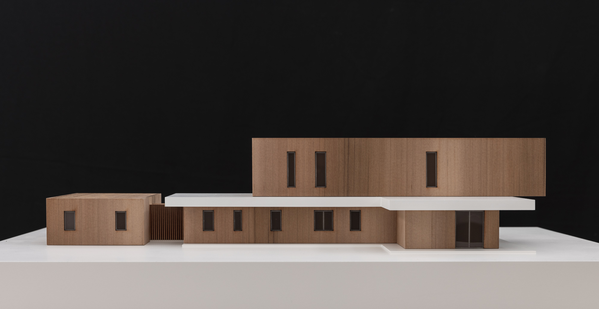
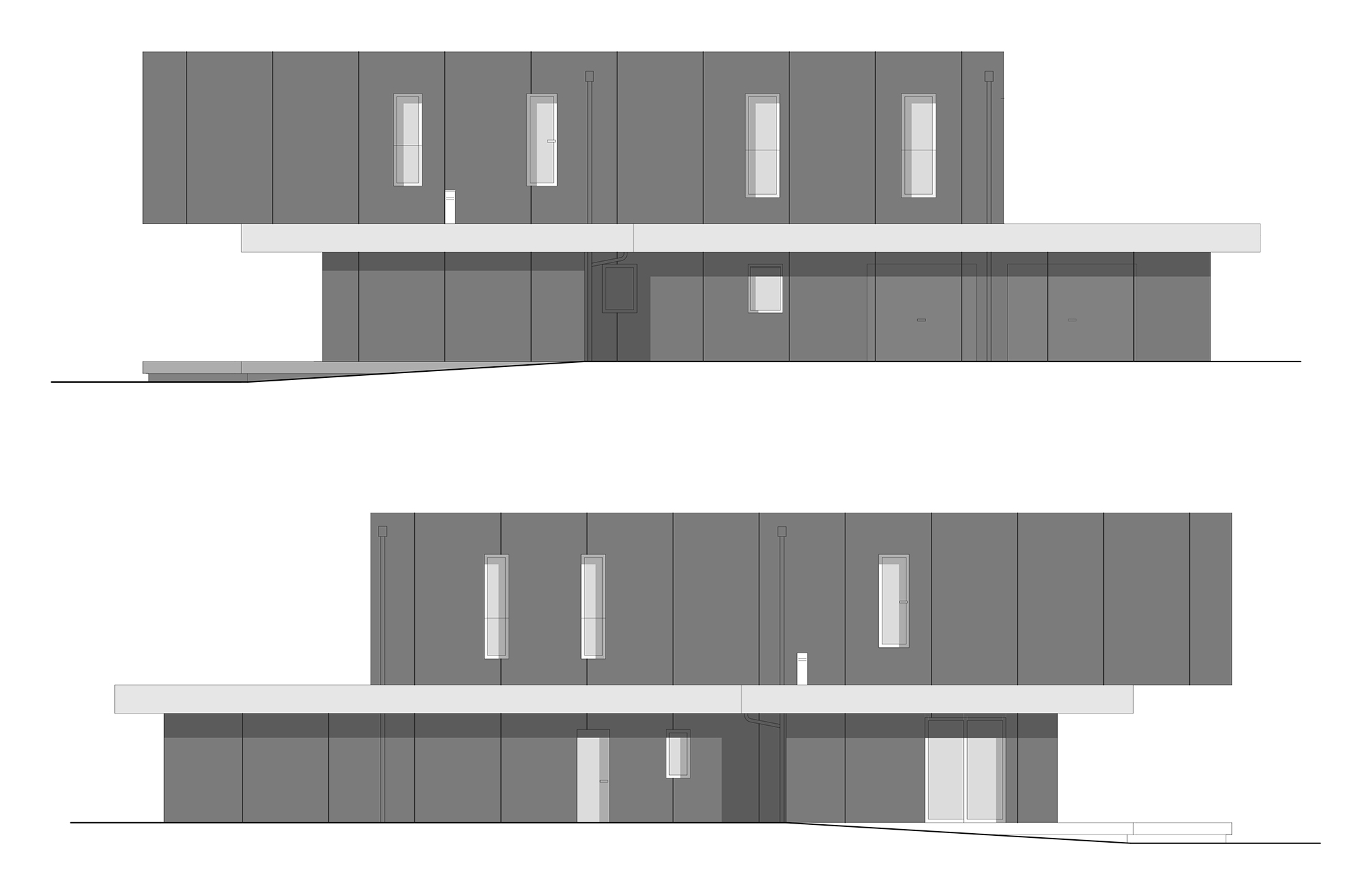
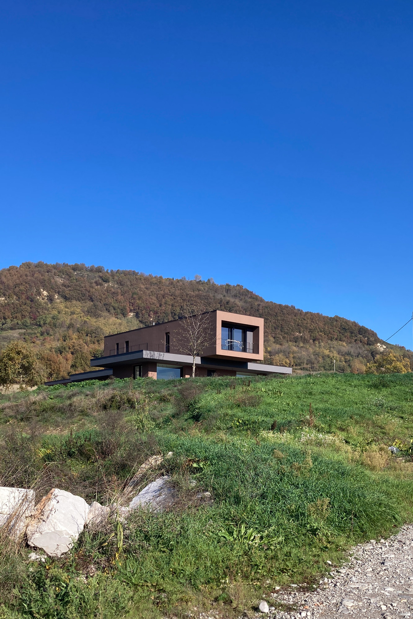
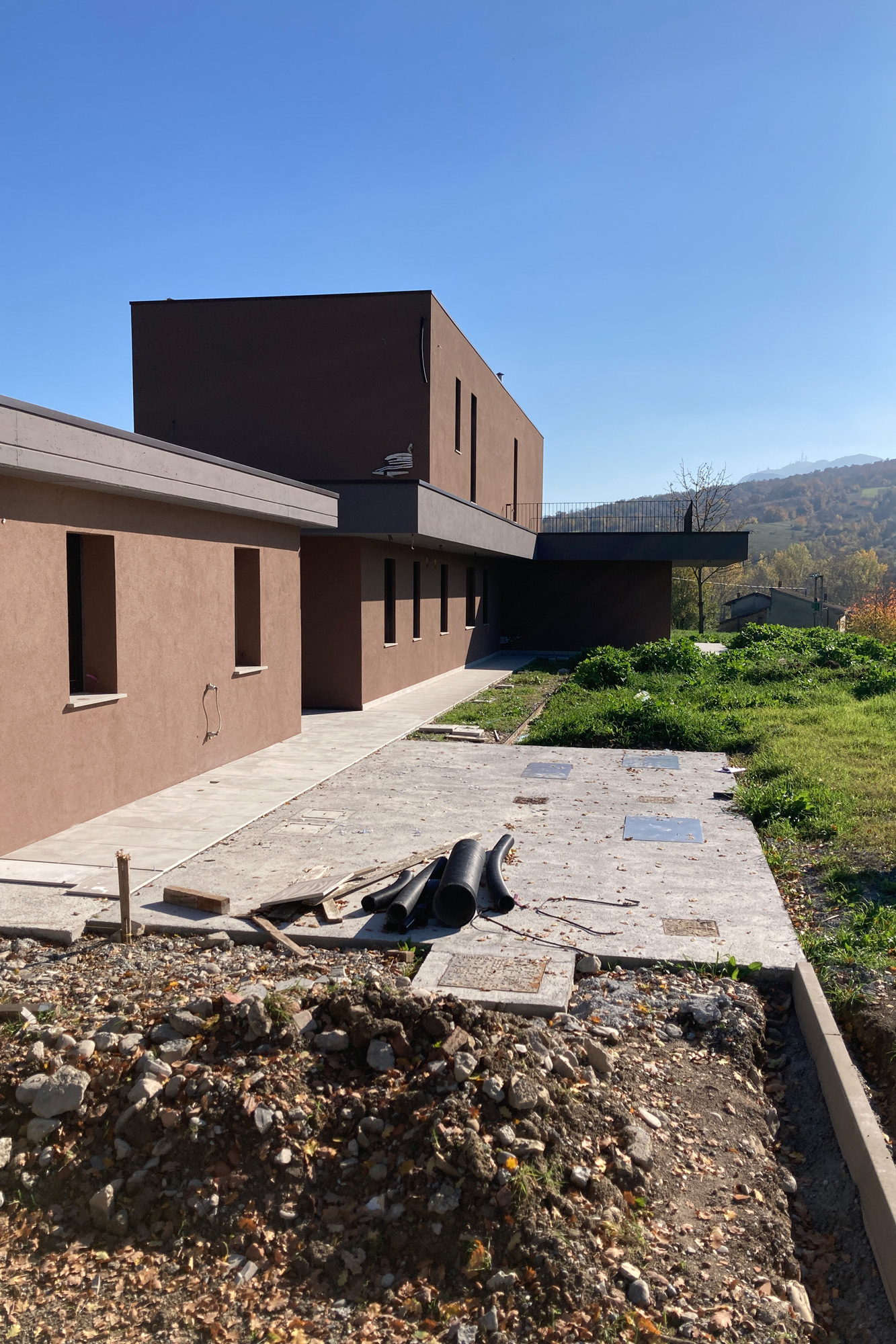
Residenza privata in corso di edificazione sulle colline piacentine. Semplice, essenziale e moderno sono le chiavi di lettura di questa architettura che si inserisce nel paesaggio sfruttandone la conformazione. Il lotto di grandi dimensioni e la mancanza di edifici confinanti, consentono l’inserimento di ampie vetrate che permettono di vivere a pieno la natura circostante. Le zone abitative sono suddivise su due piani, le zone di servizio e giorno al piano terra che sono in parte interrate e che fanno da “appoggio” alla zona notte al piano superiore che aggetta con la camera padronale, dove si focalizza la vista sulla vallata.
A private residence under construction in the Piacentine hills. Simple, essential and modern are the key words to describe its architecture which is inserted into the landscape taking advantage of its conformation. The large lot and the lack of neighboring structures allow for the use of large windows therefore living the surrounding nature to the fullest. The residential space is divided into two floors: the service area and day zone are on the ground floor with parts underground and function as a “support” for the night zone upstairs where the master bedroom is located with its panorama of the valley.



Fatto Bene Saint Tropez

Restaurants & Bars
Interior design
2016
Location: Saint Tropez
Client: Fatto Bene
Area: 55mq
Provide Service:
Interior design
Lighting design
Fatto Bene
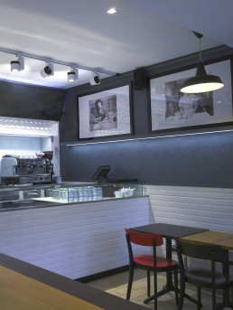
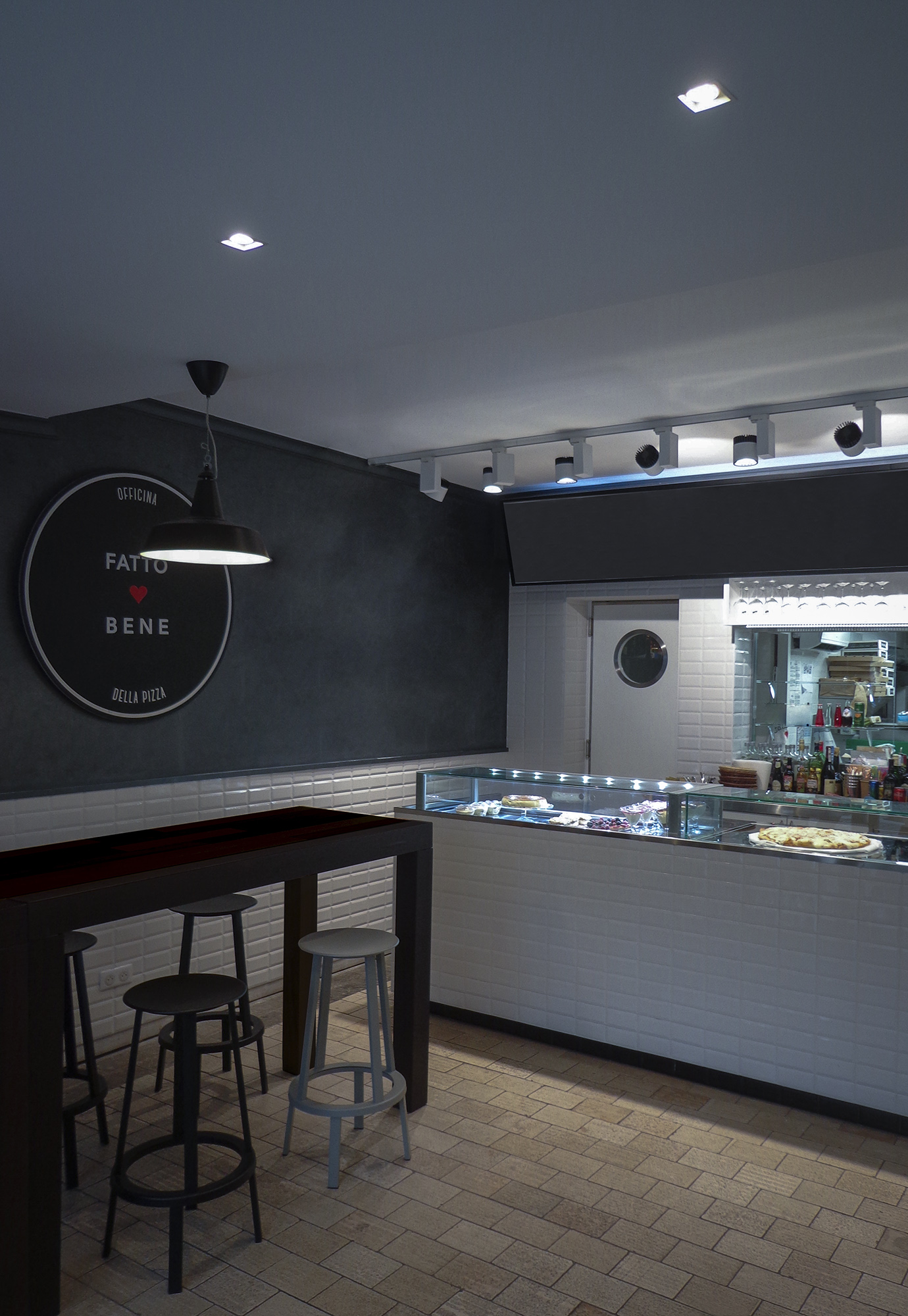
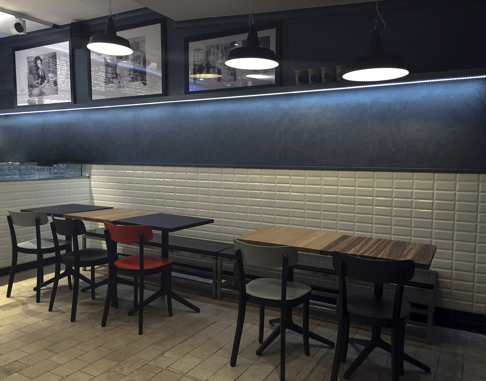
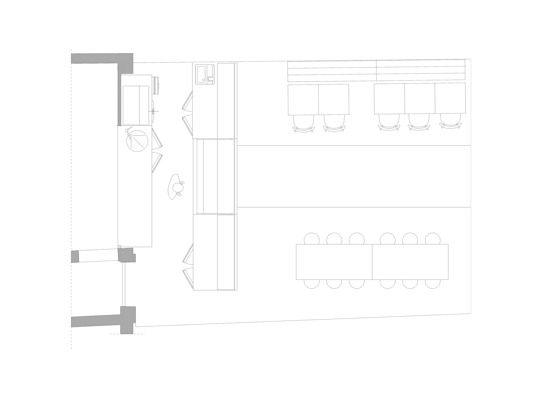
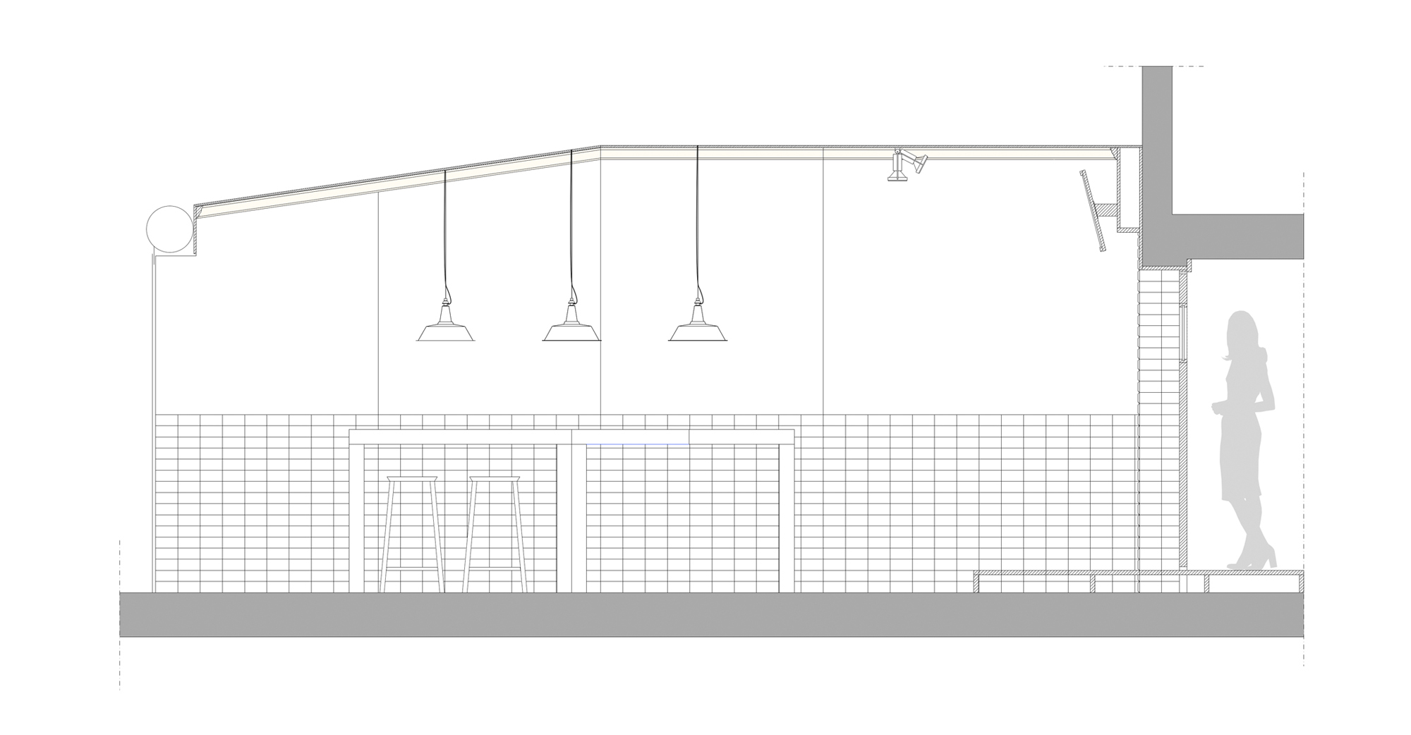
Nelle vicinanze di Saint Tropez un piccolo locale direttamente affacciato sul lungo mare punta sul marchio italiano nell’apertura di una nuova pizzeria. Nonostante le dimensioni ristrette lo spazio è sfruttato sapientemente lasciando la fascia centrale libera per invogliare il passante ad entrare e posizionando i tavoli e le sedute sui lati. Questo corridoio centrale è enfatizzato dalla pavimentazione differenziata e dal lungo tavolo laterale realizzato su misura con listoni di diverse essenze lignee. Piastrelle in ceramica bianca alle pareti, formano una fascia che riveste anche il bancone, uniformando così lo spazio. Nella zona superiore si trovano rappresentazioni di film classici italiani in bianco e nero a ricordare l’impronta italiana. Altro lato essenziale per l’immagine del locale è la realizzazione del logo con il quale poi sono stati pensati tutti gli elementi correlati al locale: partendo dal packaging per i prodotti da asporto, passando per i menù, arrivando alle tovagliette per la tavola. Il risultato è quello di un immagine unificata e ben riconoscibile.
Near Saint Tropez a little pub located right on the boardwalk wants to use the Italian trademark to open a new pizzeria. In spite of the cramped quarters the space is used intelligently, leaving the center aisle free to encourage the passersby to enter and sit at the tables on the sides. The differentiated flooring emphasizes this central corridor and the long table on the side made to order with different types of wood. White ceramic tiles on the walls form a strip that also covers the counter, thus uniting the space. In the upper area classic Italian films are projected in black and white to remind us of the Italian theme. Another essential part for the image of the bar is the creation of a logo which is used in all other items correlated to the pub: staring from the packaging for take e away products, the menu, and the napkins and table cloths. The result is that of an easily recognizable image.
Barilla Competition

Competition
Architecture
2018
Location: Parma IT
Client: Barilla
Area: 7000mq
Provide Service:
Architectural design
Barilla Competition
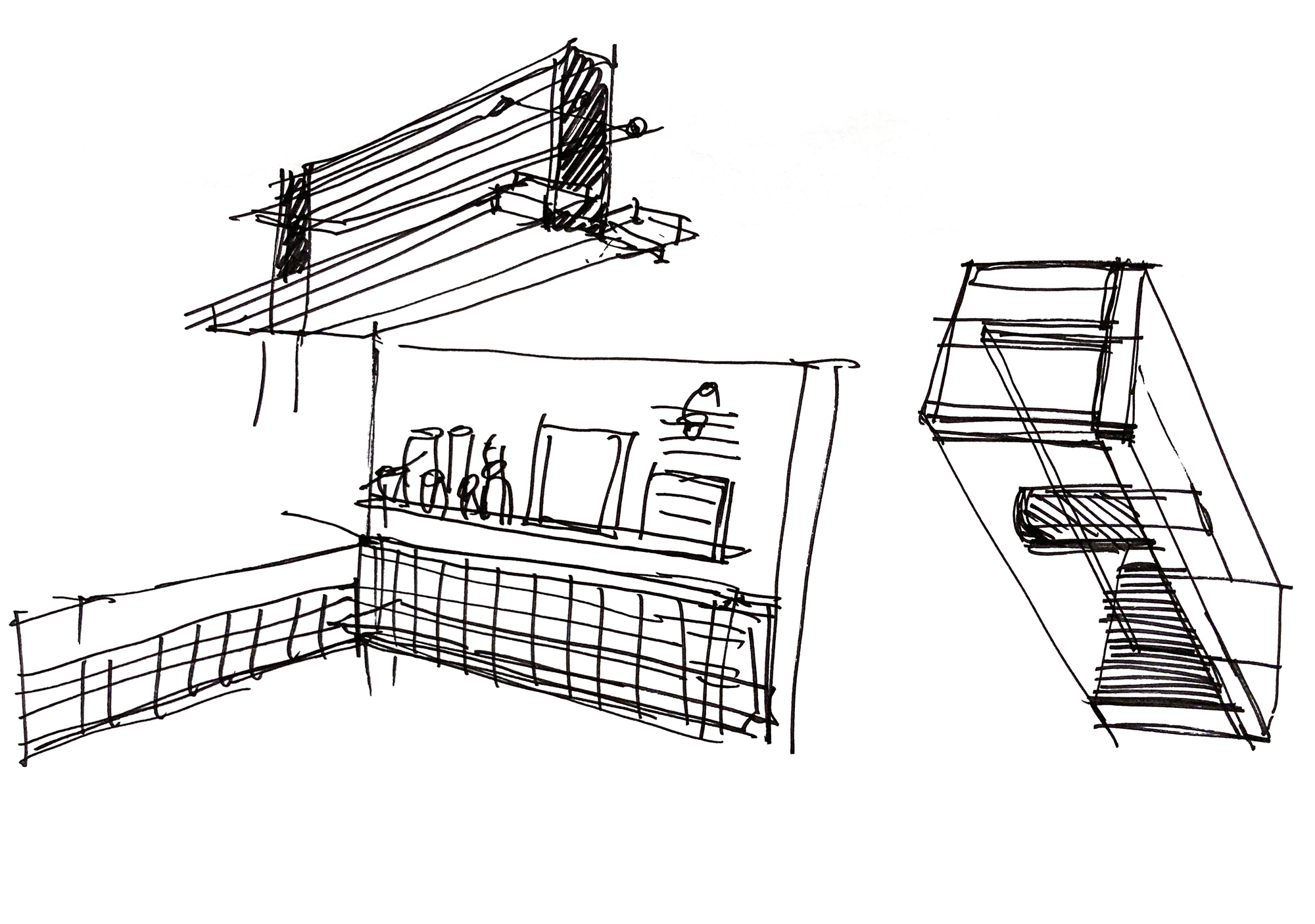
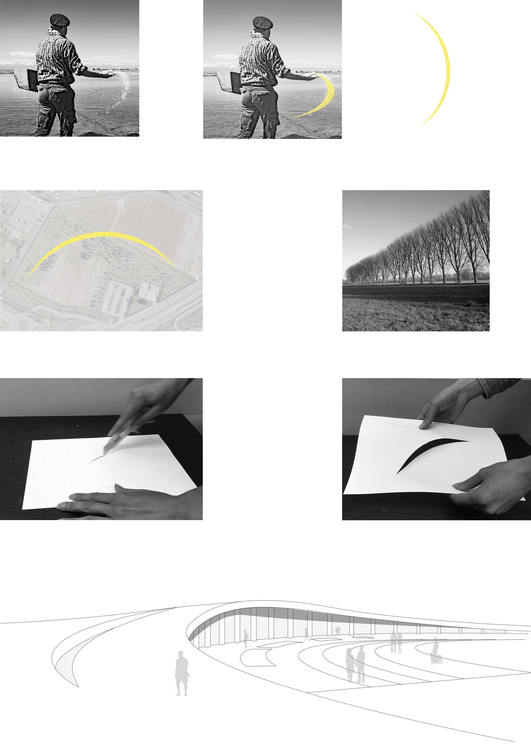
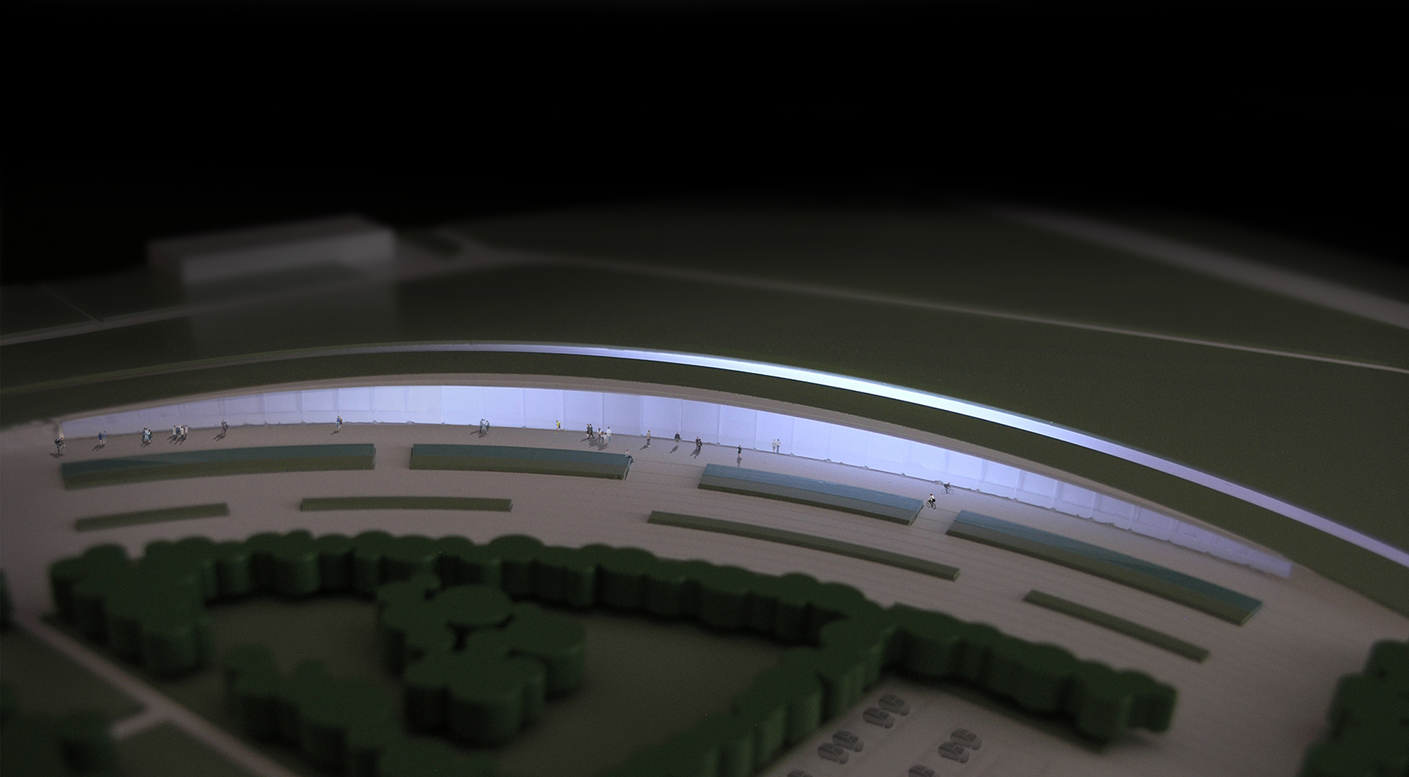
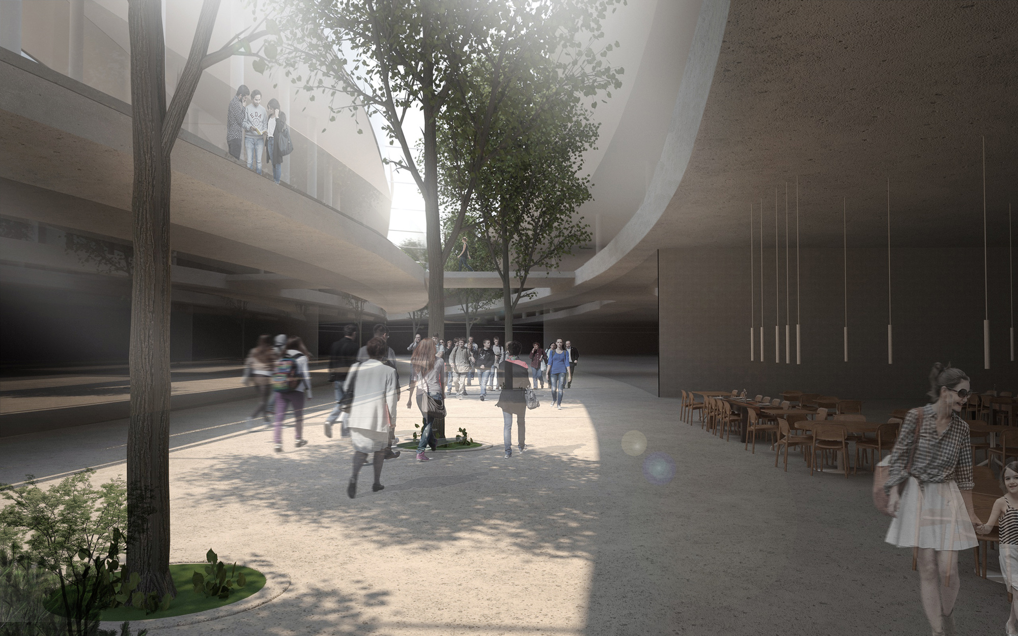
Concorso di idee promosso da Barilla per la realizzazione di un nuovo padiglione multifunzionale nello storico stabilimento di Pedrignano a Parma. La richiesta è l’ideazione di un nuovo “centro”, simbolo dell’azienda Barilla, dove collocare auditorium, uffici di ricerca e start up, spazi espositivi, ristoranti e negozi, dove vengono promossi i prodotti di eccellenza Barilla. I Principi che stanno alla base dell’idea progettuale sono i medesimi adottati da Barilla nei diversi aspetti della sua attività sia produttiva che educativa ovvero il rapporto tra uomo e natura basato su integrazione, sostenibilità, resilienza e reciproco rispetto. Oltre ad essere un luogo di celebrazione del marchio Barilla, questo padiglione vuole essere anche un punto di unione tra uomo, architettura e natura, dove l’opera dell’uomo trova spazio per essere raccontata attraverso l’architettura, che diventa un tutt’uno con la natura, integrandosi in essa. Seguendo la volontà d’integrazione, si è pensato a un edificio che s’inserisce in un contesto morfologico e che diventa esso stesso architettura. Il padiglione, infatti, è interamente assorbito dall’andamento del terreno, che assume le connotazioni di un pendio semicircolare. È proprio nel terreno che l’architettura s’inserisce, a simboleggiare un ritorno alla cultura della tradizione, nella quale ha origine anche l’esperienza Barilla. La forma curva, infatti, richiama il gesto della semina, alle origini del rapporto dell’uomo con la terra, punto di partenza sia di una realtà come Barilla, ma anche dell’artigianalità, intesa come tradizione, che si muove verso l’innovazione. Seminare, quindi, diventa un insegnamento che arriva dal passato ma anche un gesto che serve per il futuro. Proprio per ciò, in questo luogo, le persone sono educate alla sostenibilità sia alimentare, sia ambientale, dove l’architettura riduce al minimo l’impatto ambientale, si unisce e si confonde con l’ambiente circostante. La quasi totalità del lotto resta a verde, diventa un parco, dove possono essere allestiti eventi connessi a ricorrenze speciali piuttosto che essere utilizzata dai dipendenti Barilla nel tempo libero. Inoltre, una parte dello spazio esterno, è destinata a essere utilizzata per approfondire tematiche svolte all’interno (coltivazioni e relative tecniche) in modo da poter avere un riscontro fisico e pratico a quanto appreso in via teorica. Detti spazi possono essere utili anche per la sezione di ricerca. Il risultato è una sorta di taglio nel terreno, un segno, che accoglie il visitatore all’ingresso del complesso di Pedrignano e lo invita a entrare nel mondo Barilla. Un edificio di forma semicircolare che si sviluppa su due piani, uno interrato con l’ingresso dei parcheggi e uno a livello del terreno con la copertura interamente a verde. Uno spazio dove l’interno e l’esterno sono in stretta relazione, sia per la conformazione del terreno che modella la forma dell’architettura, sia per il rapporto visivo creato dalle grandi vetrate disposte su tutta la lunghezza del complesso oltre che per le diverse attività collegate tra loro. Nella piazza centrale si alternano gli elementi alla base dell’idea progettuale: verde, acqua, terra e alberi. Grandi alberi fotovoltaici si integrano con alberi veri e contribuiscono al fabbisogno energetico dell’edificio. Lungo tutta la copertura, interamente a verde e percorribile, vi sono installazioni di arte moderna che simboleggiano il rapporto uomo – natura. Il risultato è un luogo dove si trovano storia e tradizione, futuro e innovazione, nel rispetto della vita.
A competition for ideas promoted by Barilla to create a new multi functional pavilion within the historical factory complex in Pedrignano in Parma. Besides being a location of celebration for the Barilla trademark, this pavilion wants to be also a place of union between mankind, architecture and nature, where man’s work finds space to be told through architecture, and becomes one with nature, integrating with each other. Following the wish for integration, we thought of a building that inserts itself in a morphological context which becomes architecture itself. The pavilion in fact is entirely absorbed by the workings of the soil which assumes connotations of a semicircular incline. It is in the soil itself that the architecture is inserted symbolizing a return to culture and tradition, in which also the Barilla experience has its origins. The curved form in fact recalls the gesture of sowing seed in the beginning of man’s relationship to soil, the departure point of a reality such as Barilla’s, but also that of artisans as being tradition and which move towards innovation. Therefore sowing seed becomes a teaching from the past but it also is a gesture that is needed in the future. Nearly the whole lot is greenery and becomes a park where connected events or special anniversaries can be held, plus being used by Barilla employees during their breaks. The result is sort of cut in the ground, a sign that greets visitors at the entrance of the Pedrignano establishment and invites them to the world of Barilla. A semicircular building that is developed on two levels, one underground with its entrance from the parking lot and the other on the ground level covered entirely in vegetation. A space where the inside and outside are closely related, both for the conformation of the ground which models the form of the architecture and for the visual rapport created by the large windows located on the entire length of the structure and for the diverse activities connected among them. In the central plaza elements of the green project idea are alternated: water, vegetation, and trees. The result is a place where tradition and history, future and innovation are all found, in respect of life.




La Zuppiera

Food & Beverage
Interior design
2020
Location:
Fiorenzuola d’Arda (PC) IT
Client: La Zuppiera di Ignazio
Area: 45mq
Provide Service:
Architectural design
Interior design
Lighting design
Works management
La Zuppiera di Ignazio
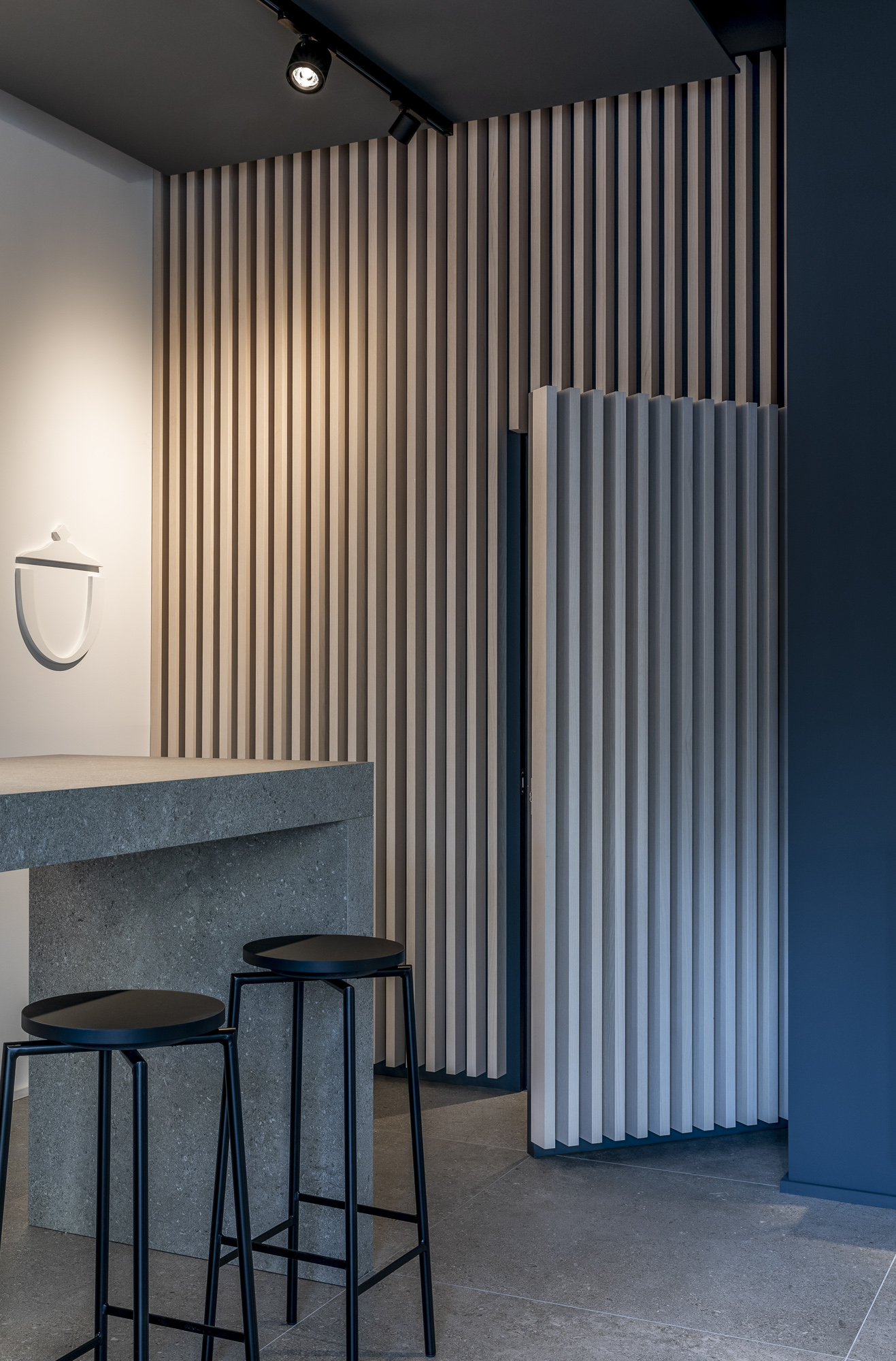
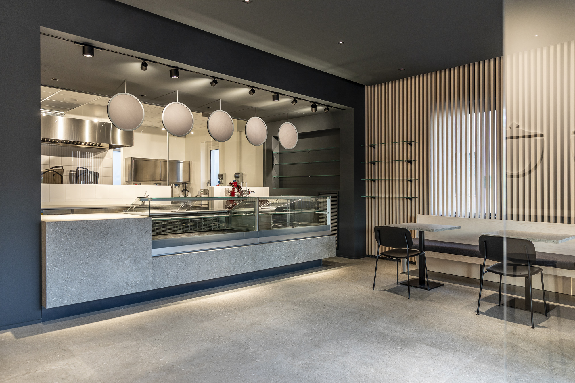
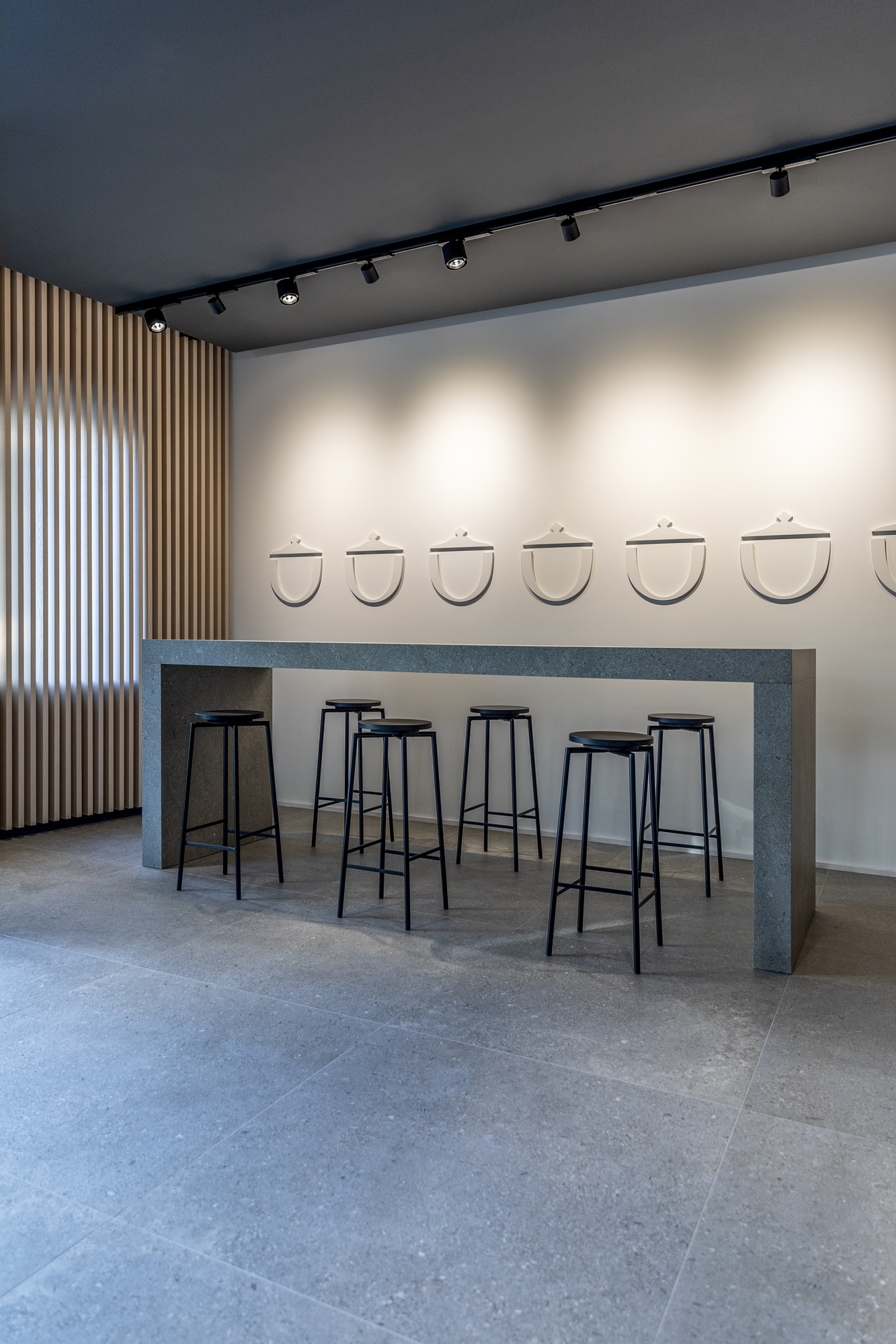
L’aspetto caratterizzante del locale è la ricercatezza di elementi in grado di rispecchiare l’eleganza del brand, dando la possibilità ai materiali di prendere vita e raccontare di uno spazio minimal con elementi contrastanti tra loro. Tutto questo è reso possibile dalla scelta della ceramica come rivestimento totale della pavimentazione e dell’arredo: un materiale concreto, forte e lineare in grado di creare un effetto visivo di continuità e stretto legame tra gli elementi stessi. L’altro materiale caratterizzante è il legno, usato per le doghe disposte in verticale sulle pareti perimetrali, a nascondere gli infissi e a creare maggior intimità e riservatezza. Dimensioni e distanza tra le doghe sono state studiate in modo tale permettere la giusta penetrazione e diffusione della luce naturale negli ambienti interni. L’unica parete non rivestita dal legno è stata dipinta di bianco e vi si legge il profilo monocromo e ripetuto del brand. Su questa parete candida si staglia un elemento d’arredo di forte impatto: il tavolo conviviale con sagoma a forma di ‘C’, disegnato e realizzato su misura con la collaborazione di più realtà produttive. Il tavolo cela un’anima in metallo e legno, rivestita poi in gres porcellanato, con una fattura di massima precisione. Lo stesso materiale è richiamato nella pavimentazione, nonché nel rivestimento del bancone per l’esposizione dei prodotti gastronomici. Il bancone è inserito in un portale, con una riconoscibile forma ad ‘U’, che risulta ultra leggero perché sospeso da terra. Dietro al bancone si apre, in profondità, la cucina a vista. Sopra al banco, una serie di menu board di forma circolare che richiamano la forma arrotondata del brand ripetuto nella parete bianca a fianco. Una serie di tavolini completano l’arredo interno: l’elemento che li collega è una panca unica; la tradizionale gamba della seduta viene sostituita e rivisitata con l’uso di un segno continuo.
Ignazio’s Soup Tureen
The characteristic aspect of the pub is the attention given to the use of elements able to reflect the brand’s elegance, thus allowing the materials to come to life and reveal a minimal space with contrasting elements. All this is made possible by choosing ceramic tiles as the total floor and décor covering: a concrete material, strong and linear, able to create a visual effect of continuity and a strong union between the materials themselves. The other characteristic material is wood, used for the slats installed vertically on the perimetral walls, and used to hide the doors and windows to create more intimacy and privacy. The size and distance between the slats were studied in a way to allow the correct penetration of natural light to the spaces inside.
The only wall not covered with wood is painted white with the monochrome company logo profile as a pattern. On this candid wall a strong decorative element stands out: a “C“ shaped convivial table, custom designed and made via joint collaboration. The table hides a metal and wooden soul, now covered with ceramic tiles, constructed with maximum precision. The same material is recalled in the floor covering, also on the countertop, where the gastronomic products are displayed. The counter is inserted in a portal with a recognizable “U” shape which seems ultra-light since it is suspended from the floor. The open view kitchen is located deeper behind the counter. Above the countertop there is a series of circular menu boards that recall the circular logo repeated on the nearby white wall.