
La Fattoria di Parma

Food & Beverage
Architectural restoration
Interior design
2015-2017
Location: Parma Italia
Client: La Fattoria di Parma
Area: 250mq
Provide Service:
Architectural design
Interior design
Facade design
Lighting design
Works management
La Fattoria di Parma
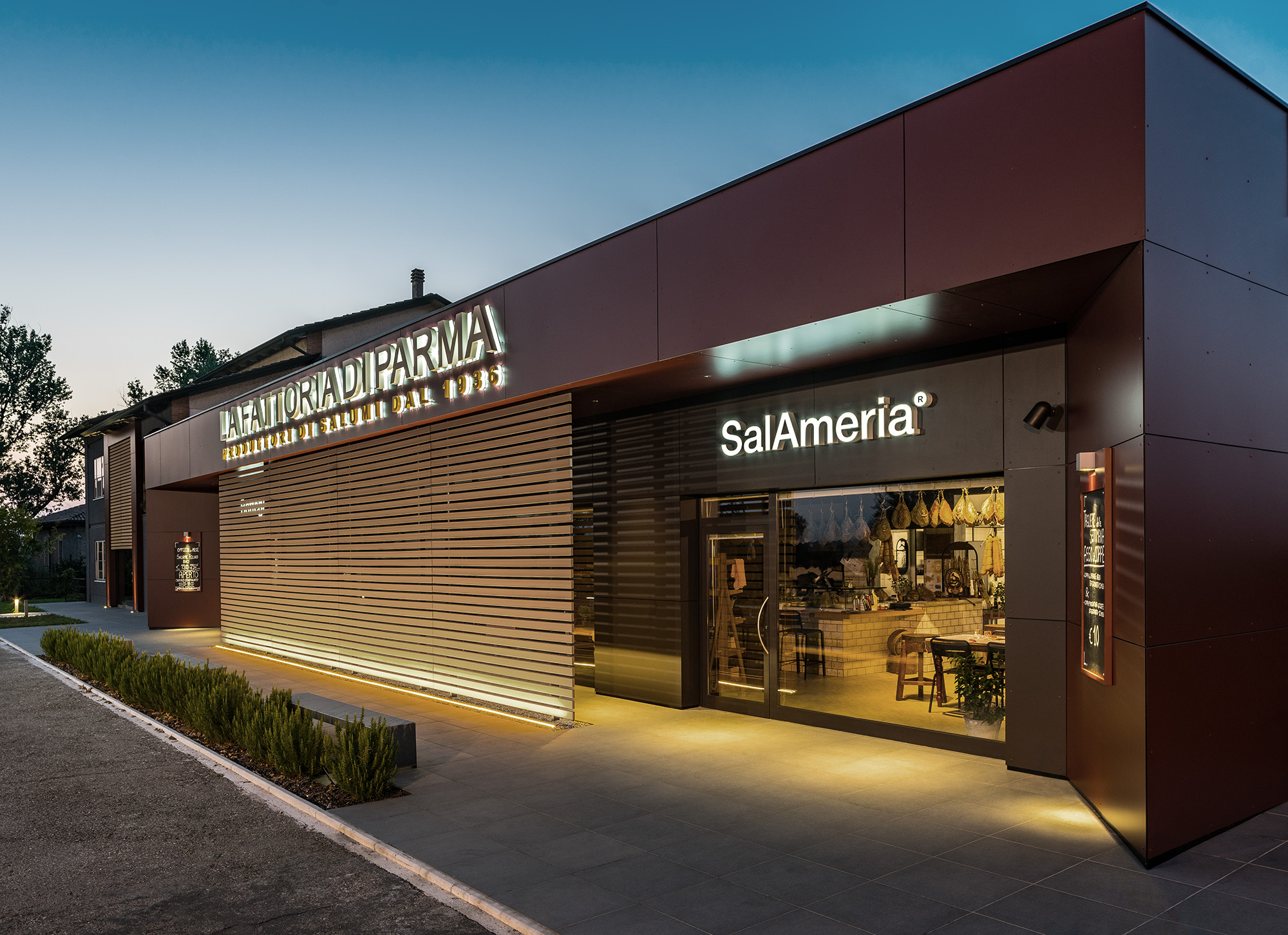
Uno spazio pensato per far vivere un’esperienza di assaggio unica. Per accogliere i propri ospiti la Fattoria di Parma, artigiani del salume dal 1936, ha ideato la SalAmeria, dedicata alla scoperta dei salumi che vengono prodotti nello stabilimento lì a pochi passi. Al nostro studio è stata affidata sia la riqualificazione del salumificio che affaccia sulla via Emilia Parmense, sia il recupero conservativo dei laboratori produttivi trasformati nello spazio di degustazione.
L’identità del luogo è diventata centrale per le scelte adottate nel trasformare gli ambienti destinati alla somministrazione e alla convivialità: il bancone è stato recuperato conservando il rivestimento in ceramica di un tempo. Si sono scelti i colori del bianco e del rosso per richiamare il carattere dell’ambiente originario. Anche i rivestimenti delle pareti sono stati mantenuti ma rinnovati con stampe realizzate sulle piastrelle e pensate su misura: il logo dell’azienda (Sant’Antonio) e una rappresentazione del re maiale, con le varie parti delle carni suine da lavorare. Per il pavimento si è optato per il gres rosso, del tutto simile alle piastrelle usate una volta.
Gli utensili e le attrezzature dal vecchio laboratorio di salumi sono diventati originali elementi di arredo, come la guidovia utilizzata per ‘mettere in bella mostra’ i miti di queste terre: culatelli, coppe, fiocchetti. Il bancone è dotato anche di una vetrina refrigerata per l‘esposizione dei prodotti.
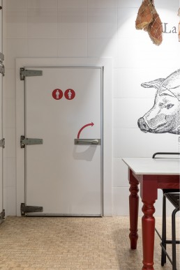
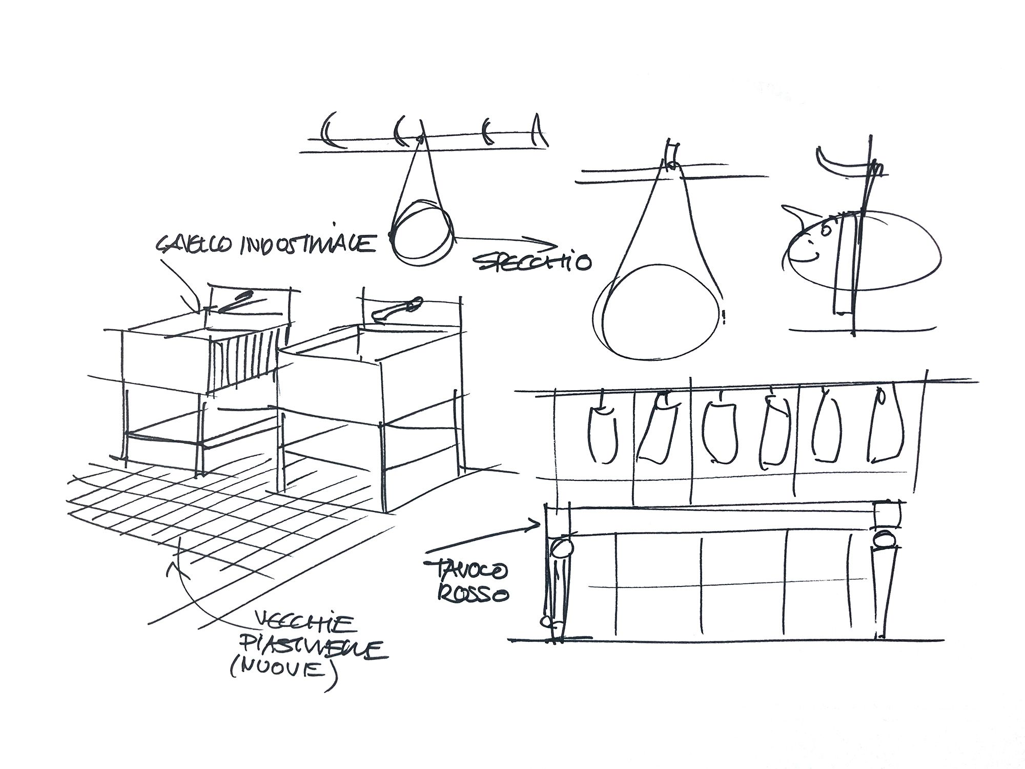
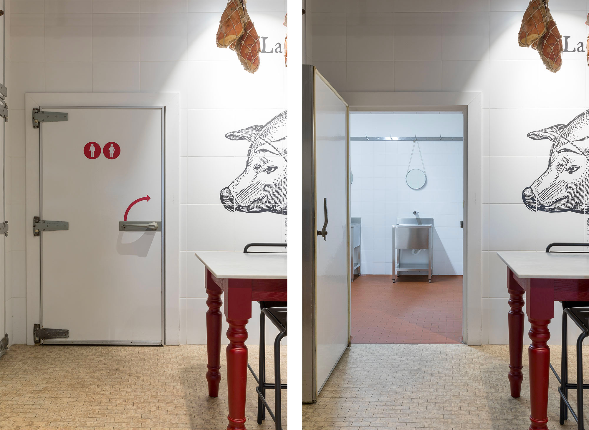
Gli arredi, disegnati su misura, ricordano quelli di un tempo: si veda la linea dei tavoli e delle panche e le cromie, che giocano coi toni del rosso, del bordeaux e del bianco. Si è conservata traccia persino delle vecchie celle frigorifere, una delle quali è stata trasformata nei servizi igienici del locale: la porta originale è stata mantenuta e rivisitata; i lavatoi prescelti richiamano volutamente le attrezzature dei vecchi laboratori; gli specchi sono appesi a ganci, tra i materiali recuperati dall’ambiente originario. Tutta l’operazione è riuscita a valorizzare il carattere del locale, facendosi ‘racconto’ di un’eccellenza produttiva e gastronomica che affonda le radici nella Bassa Parmense di quasi un secolo fa.
A space conceived to offer a unique tasting experience. To welcome its guests, La Fattoria di Parma—artisans of cured meats since 1936—created the SalAmeria, a place dedicated to discovering the products made just a few steps away in the production facility. Our studio was commissioned both with the renovation of the salami factory overlooking Via Emilia Parmense and with the conservative restoration of the former production laboratories, transformed into a tasting space.
The identity of the place played a central role in the design choices for the areas dedicated to food service and conviviality. The counter was restored, preserving its original ceramic cladding. White and red were chosen as the main colors, recalling the character of the original environment. The wall coverings were also retained and renewed through custom-designed prints applied directly onto the tiles: the company logo (Sant’Antonio) and a depiction of the “king pig,” illustrating the various cuts of pork. For the flooring, red porcelain stoneware was selected, closely resembling the tiles once used. Tools and equipment from the former curing laboratory were repurposed as distinctive furnishing elements, such as the overhead rail system used to display the local icons of these lands—culatelli, coppa, and fiocchetti. The counter also incorporates a refrigerated display case for product presentation. The custom-designed furnishings recall those of the past, particularly in the lines of the tables and benches and in the color palette, which plays with shades of red, burgundy, and white. Even the old cold storage rooms were preserved in memory: one of them was converted into the restrooms. The original door was retained and reinterpreted; the selected washbasins deliberately reference former laboratory equipment; the mirrors are hung from hooks, among the materials recovered from the original space. The entire intervention enhances the character of the place, becoming a narrative of a productive and gastronomic excellence rooted in the Bassa Parmense for nearly a century.




Residence AS

Private Residence
Interior Residential
Architecture Residential
2008-2011
Location: Piacenza IT
Client: Private client
Area: 185mq
Provide Service:
Architecture design
Interior design
Lighting design
Works management
Residence AS
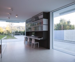
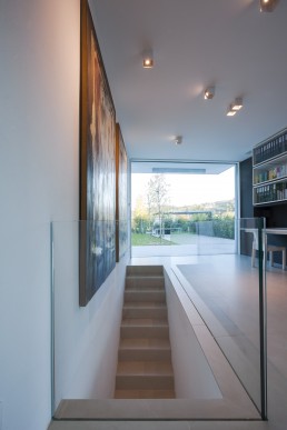
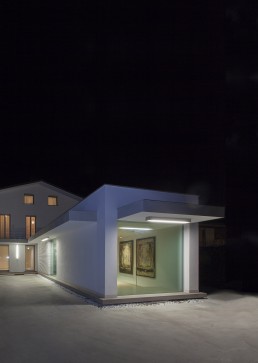
Una ristrutturazione di una casa anni ’70, ampliata da un nuovo volume a forma di parallelepipedo. La distinzione “storica” e volumetrica definisce gli orari di utilizzo della casa: il nuovo volume coincide con la zona giorno, mentre nella parte ristrutturata si è collocata la zona notte con le camere e i bagni.Caratteristica principale del nuovo ampliamento è la semplicità e la linearità: un elemento che sembra galleggiare sul terreno, segnato da una continuità spaziale interno/esterno grazie alle grandi vetrate senza cornici che permettono una miglior lettura del paesaggio e che alleggeriscono l volumetria. Con queste grandi aperture si vengono quindi a creare nuove prospettive sulle colline circostanti e si raccoglie tutto il calore possibile dai raggi solari in inverno. In estate, al contrario, quando i raggi sono zenitali e scalderebbero troppo la casa gli sporti in aggetto creano un’adatta protezione solare per le aperture.
Grazie a questi ed ad altri accorgimenti tecnologici (coibentazione a cappotto dell’involucro, ricambio forzato dell’aria, illuminazione a led, ecc…) l’edificio richiede pochissima energia per essere scaldato in inverno e raffreddato d’estate ( classe energetica A).
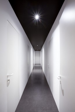
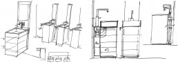
Internamente si ripete la dicotomia zona giorno/zona notte: la prima infatti è formata da ambienti aperti e luminosi, in una continuità spaziale che non necessità setti divisori. La cucina, disegnata a misura e completamente “a scomparsa”, non corrisponde al tradizionale ambiente della casa adibito alla preparazione e alla cottura del cibo ma diventa parte integrante del soggiorno. Al centro della sala da pranzo è stato collocato un grande tavolo, disegnato, geometricamente simmetrico e massiccio, pesante. Al contrario, al di sopra del tavolo troviamo un lampadario leggero e articolato, anch’esso disegnato, che rompe la linearità e la semplicità geometrica degli spazi e degli arredi. La zona notte invece è caratterizzata da spazi più stretti e meno luminosi, quasi angusti. Il corridoio segnato dal pavimento scuro e dal soffitto nero, allarga visivamente il campo sui lati dai quali accedere alle varie stanze. Il bagno è completamente nero, annullando tutte le geometrie, gli unici elementi che risaltano sono i sanitari e i due mobili lavello realizzati a disegno.
Remodeling of a home from the seventies, enlarged by a new space shaped like a parallelepiped. The “historical” and volumetric distinction defines the hours of using the home: the new volume coincides with the day area, while the rebuilt part is situated in the night area with bedrooms and bathrooms. The principal characteristic of the new enlargement is simplicity and linearity: an element that seems to float on the ground, featuring an internal/external spatial continuity, thanks to the large windows without frames that permit a better vision of the view and which lighten the spaces. With these large openings therefore, new perspectives are created on the surrounding hills and all the heat possible is collected from the sunrays in the winter. In the summer on the contrary when the rays are at the zenith and would heat the house too much, the protrusions on the eves create a solar protection for the openings.
Thanks to this and other technological details (insulation of the walls, forced air exchange, led lighting, etc.,) the building needs little energy for heating in the winter and for cooling in the summer (energy class A). Inside the day/night area this separation is repeated. The day area has open and light rooms in a spatial continuation not needing elements of division.
The specially designed kitchen, completely “pull out” does not correspond to the traditional atmosphere of a home where food is prepared but becomes part the living room. A large specially designed table, symmetrical, heavy and massive, is placed in the center of the dining room. As a contrast, above the table we find a light jointed lamp, also designed in order to break the linear geometric simplicity of the spaces and the interior decoration. The night area however has narrower spaces, which are not as bright, almost confining. The dark floored hall with its black ceiling enlarges our field of vision on the sides where the various rooms’ entrances are located. The bathroom is totally black and cancels all the geometry. The only elements that stand out are the fixtures and two sinks with custom designed cabinets.




Sinergie 2004

Retail
Interior design
2004
Location: Piacenza IT
Client: Private client
Area: 150mq
Provide Service:
Interior design
Sinergie
Negozio di abbigliamento nel Piacentino dove l’obiettivo è creare un’atmosfera semplice ed elegante dove i capi esposti potessero essere protagonisti. La soluzione trovata è stata quella di utilizzare materiali con colori neutri che giocassero sulle trasparenze e sulle sovrapposizioni. Il pavimento in resina e le pareti, infatti, si mantengono su colori neutri; i vetri colorati fanno da quinta alla zona camerini e sono utilizzati insieme al vetro trasparente nei tavoli per l’esposizione della merce. I camerini, volumi in policarbonato, mantengono leggerezza e diventano quasi corpi illuminanti grazie all’effetto di trasparenza dato dal materiale e dall’illuminazione retrostante. Gli specchi, articolano la parete di fondo e nello stesso tempo diventano elementi di arredo della vetrina espositiva retrostante, grazie ad un sistema di illuminazione integrato. Il bancone gioca sulla sovrapposizione di legno e vetro conferendogli maggiore leggerezza. L’illuminazione è puntuale ad eccezione della grande lampada che punta sul tavolo rotondo realizzato in legno ed acciaio. Il risultato è quello di un ambiente dove ogni minimo dettaglio, curato e pensato su misura, si presta ad esaltare l’esposizione e la vendita del prodotto.
A clothing store in Piacentine province where the objective is to create a simple and elegant feeling and where the clothing exhibited becomes the key player. The solution is to use materials with neutral colors that play with the transparencies of overlapping. The resin flooring and the walls are in fact kept neutral in color. The colored glass steals the scene in the changing room area and is used together with the tables for showcasing the merchandise. The changing rooms, volume in polycarbonate, retain lightness and almost become illuminated objects thanks to the effect of transparency from the lighting material located behind. The mirrors articulate the back wall and at the same time become decorative elements in the showroom behind thanks to a system of integrated lighting. The counter plays upon the layers of wood and glass giving it more lightness. The lighting is punctual except for a large lamp that points to a round table made from wood and steel. The result is an atmosphere where every minimal detail, thought and treated individually, helps to exalt the display and sale of the merchandise.


Mostra Ettore Sottsass

Museum-Exhibitions
Interior design
2000
Location: Parma Italia
Exhibition space:
Pecorini Palace, Parma
Client: Boscaro /
Municipality of Parma
Area: 250mq
Design team:
Massimiliano Mazzaschi
Provide Service:
Interior design
Graphic design
Works management
Allestimento mostra
ETTORE SOTTSASS 28 PROGETTI PER LE TARSIE DI ANDREA FEDELI
Parma 2000
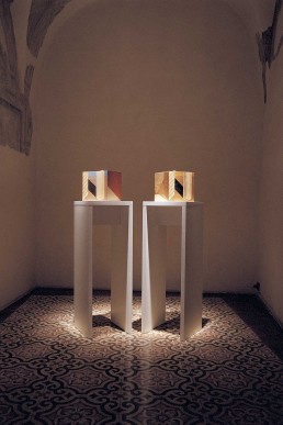
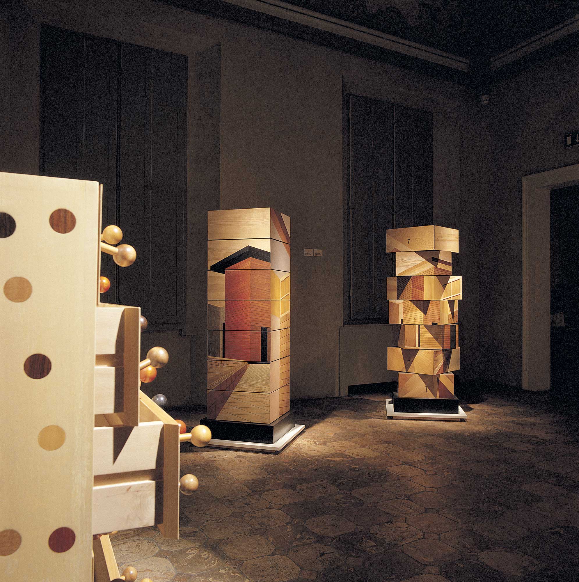
Lo studio è stato incaricato di allestire la mostra a Palazzo Pigorini, Parma, sul progetto legato alla tradizione artigianale della tarsia del legno, nato da un idea di Boscaro Project e sviluppato dall’architetto Sottsass. La mostra non si limita a mostrare le opere finite, ma documenta tramite schizzi e fotografie l’intero processo creativo “dal disegno al progetto” che ha portato alla realizzazione di questa collezione. Dato il luogo, un palazzo storico ricco di elementi e dettagli architettonici si è pensato di dar meno risalto possibile all’ambiente tramite un’illuminazione diffusa particolarmente soffusa e al contempo illuminando in modo puntuale e diretto le opere in mostra. Negli oggetti disegnati da Sottsass diviene quindi leggibile la linea, la cromia e la matericità degli elementi. L’allestimento si concretizza in elementi semplici: i supporti per le opere in mostra, bianchi e dalle linee minimali, staccano cromaticamente con il pavimento e mette in risalto l’oggetto in mostra.
ETTORE SOTTSASS 28 OBJECTS FOR ANDREAS FEDELI’S INLAYS
Parma 2000
The studio was hired to set up an exhibition in Palazzo Pigorini in Parma, based on a project related to the craftsman’s tradition of wood inlay, and generated by Boscaro Project developed by the architect Sottsass. The exhibition is not limited to the finished works but by use of sketches and photos it documents the entire creative process of “from drawings to project” that made this collection. Due to the location, a historical palazzo rich in architectural details and elements, we thought to downsize the surroundings by using diffused lighting and at the same time to illuminate more all the items exhibited. Thus a clear line was created for viewing Sottsass’s works, their chromatics, and the materials of the elements. The exhibition uses simple elements: the supports for the works are white and minimalist, which make them stand out, detaching chromatically from the flooring.



Lino's Coffee 2019-2025

Coffee & Bar
Interior design
Brand Identity
Format
Chronology: 2018-2025
Location: Vigevano PV
Client: Lino’s Coffee
Area: 70mq/200mq
Provide Service:
Interior design
Graphic design
Brand Identity
Lighting design
Lino’s Coffee
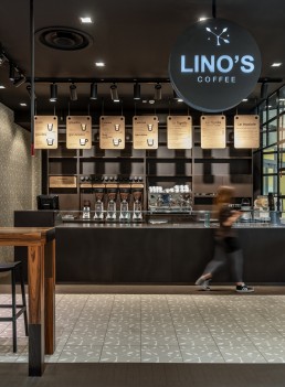
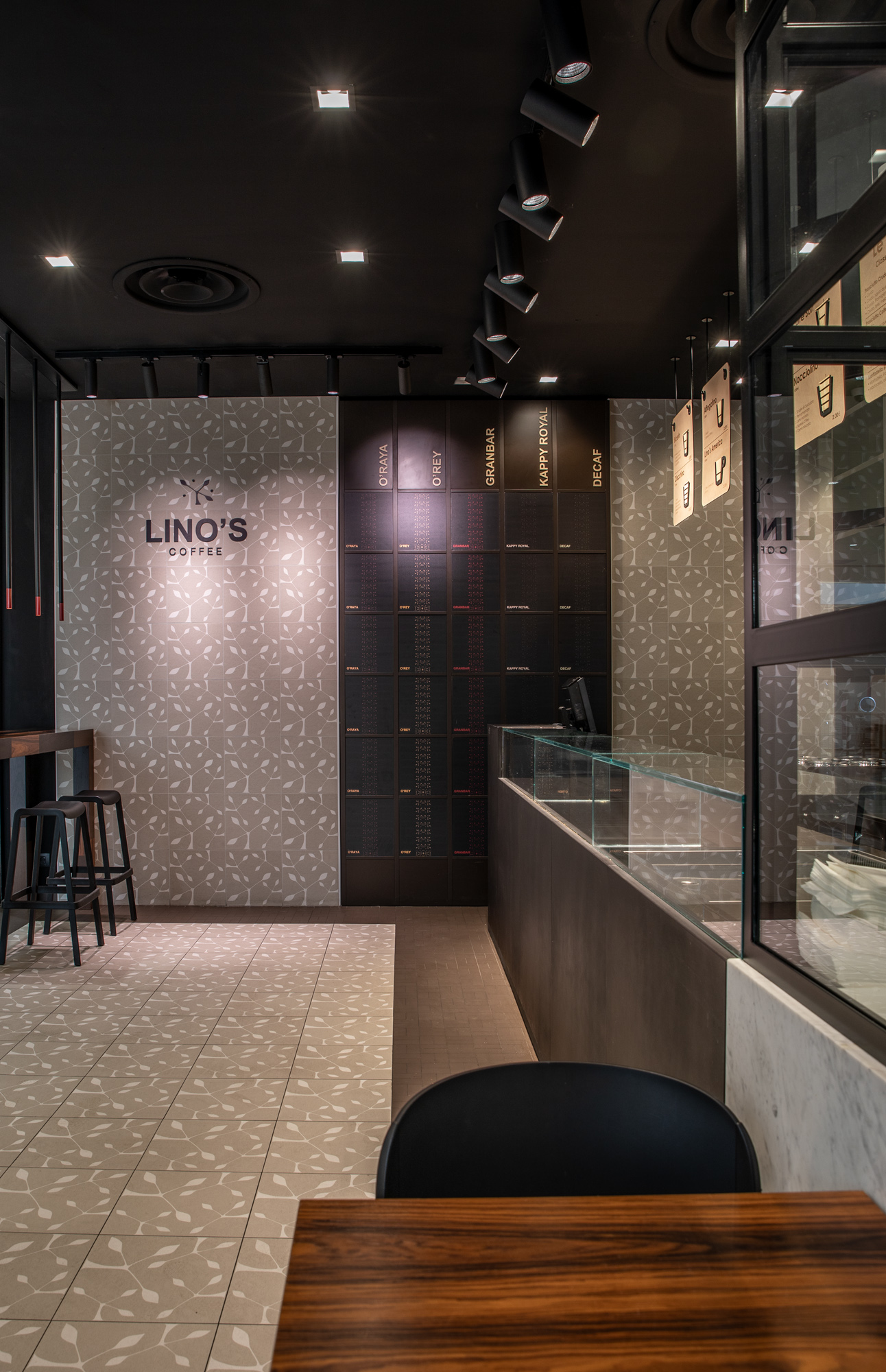
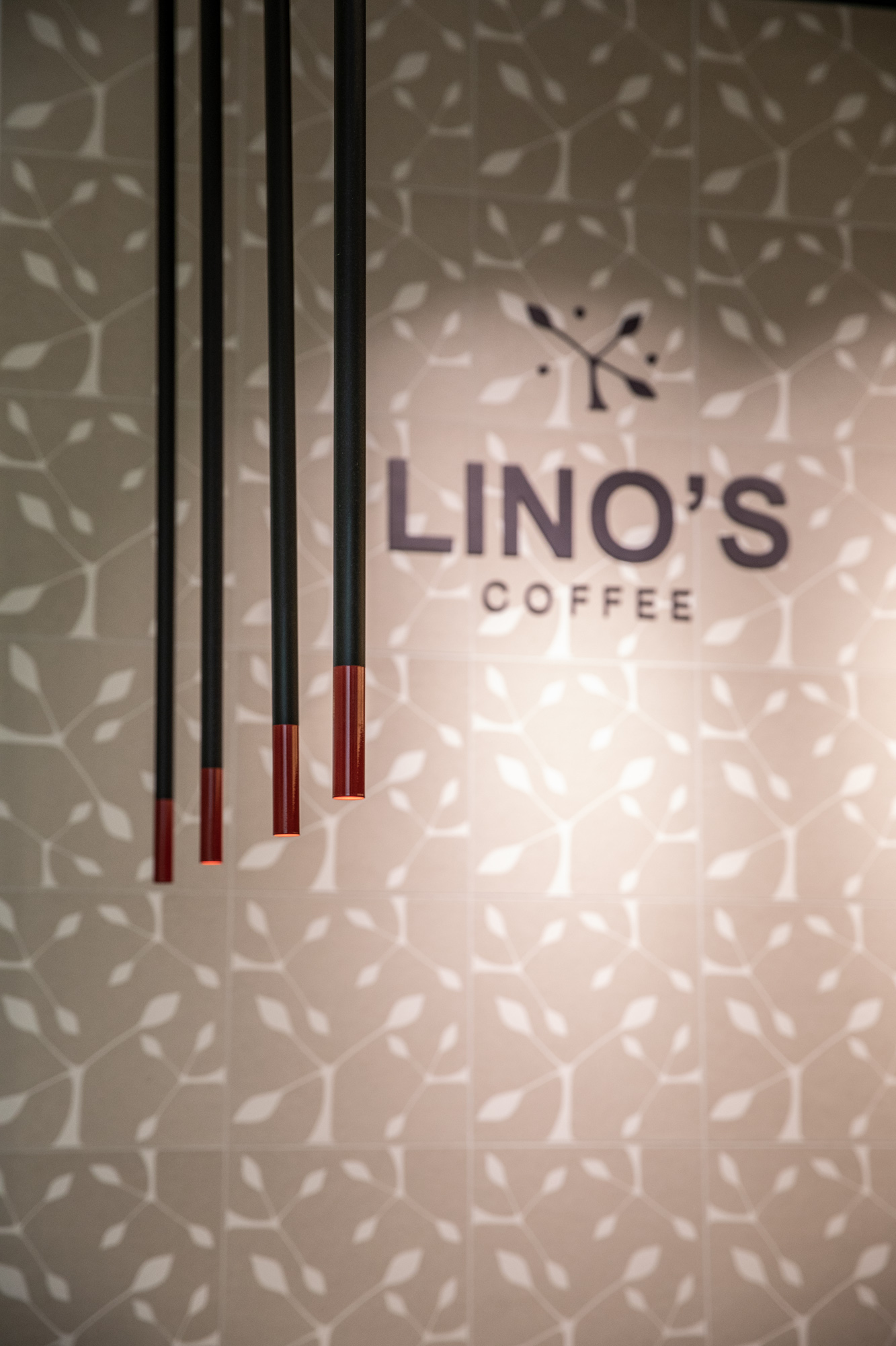
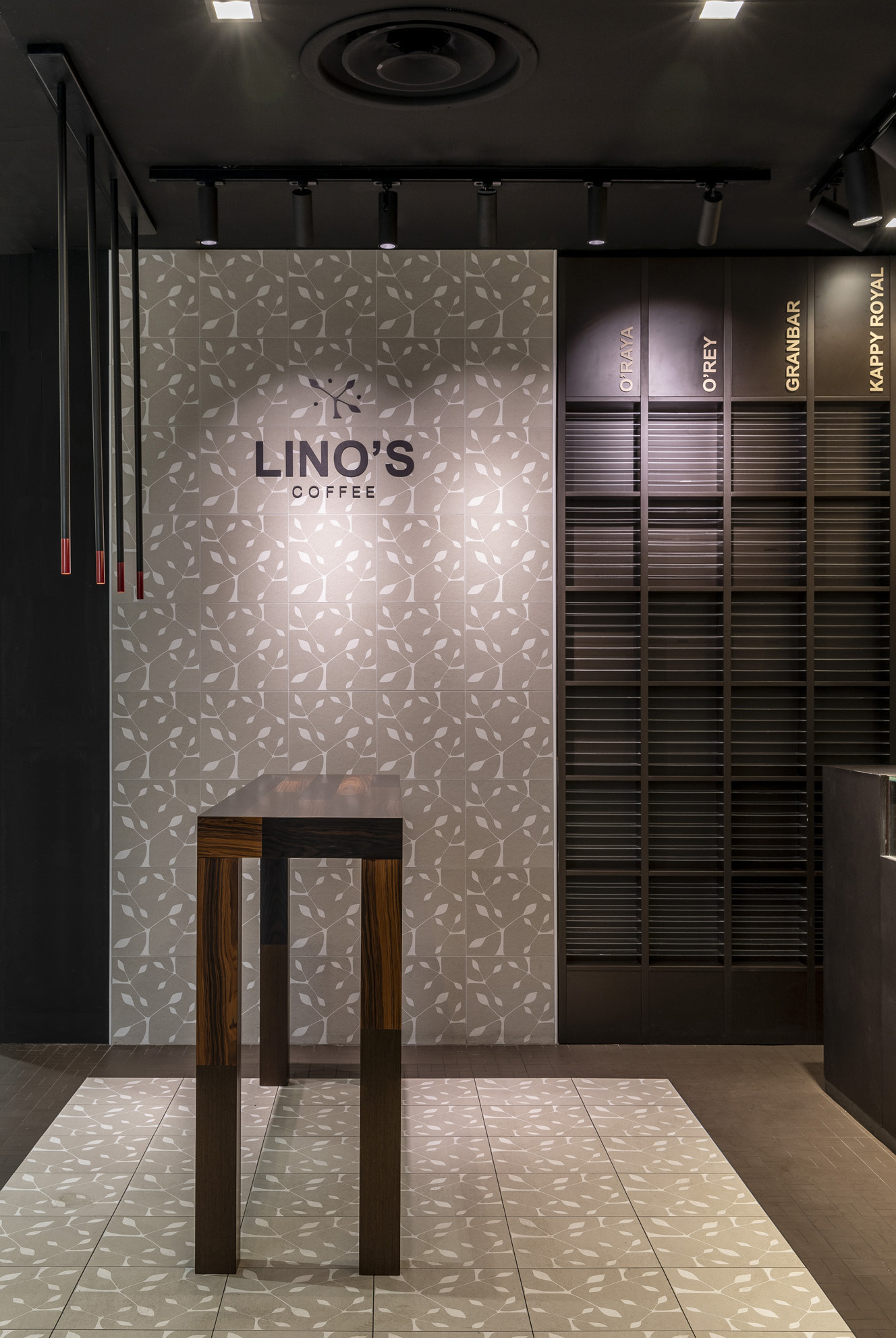
Locale della catena Lino’s Coffee, specializzata in degustazione di caffè. Il concept viene ripreso in tutti i punti vendita. E’ stato ideato il brand che connota tutti gli ambienti. Il primo locale progettato per il marchio risale al 1998. Nel progetto di rinnovamento articolatosi tra il 2019 e il 2022, si è puntato di una revisione del logo e sull’innovativa comunicazione attraverso originali menu board. La nuova insegna non è più orizzontale, bensì circolare e contiene il nome del brand, non più disposto linearmente ma armonicamente inserito nel cerchio. I menu board, ben illuminati e collocati in posizione strategica sopra al bancone, sono ricercati nelle forme e nei materiali. Presentano una base in legno; le scritte sono incise al laser e sono inseriti pittogrammi in rilievo per presentare il prodotto.
L’ambiente è tutto giocato sulle cromie del marrone scuro, che richiama il chicco di caffè. Il pattern con la stilizzazione di una pianta di caffè, che costituisce il marchio della catena, è replicato sui rivestimenti, con le piastrelle stampate ad hoc. Il bancone è suddiviso in due sezioni: la parte per la somministrazione che è aperta, il laboratorio che rimane a vista, grazie ad una vetrata.
Location Lino’s Coffee 1.0
2018 Vigevano (PV) Italia – 2019 Torino Italia – 2019 Vercelli Italia – 2020 Lodi IT-2020 Novate Italia – 2020 Gravellona Toce (VB) Italia – 2020 Gran Giussano (MB) Italia – 2021 Como Italia – 2021 Milano Italia – 2021 Novara Italia – 2022 Lino’s Coffee 2.0 Brescia Italia
A bar, belonging to the Lino’s Coffee chain, specialized in coffee tasting. The concept is present in all shops. The brand name was created to be used in all the Lino’s Coffee bars. The first bar goes back to 1998. The renovation project was carried out between 2019 and 2022, and the logo was revised plus an innovative communication using an original menu board was also introduced.
The new sign is no longer horizontal, but round and contains the brand name, not in a line but harmoniously inserted into the circle. The well illuminated menu board is strategically located above the custom counter and is refined in material and form, as is the counter itself. There is a wooden base; the text is laser printed and pictograms in relief are inserted to present the product. The atmosphere Is created by using shades of brown, reminding us of coffee beans. The pattern, showing a stylized coffee plant which constitutes the chains’ brand, is replicated in the ad hoc printed tile covering. The counter is divided in two sections: one open part for serving, and the other is a visible glass covered laboratory.


Residence IB

Private Residence
Interior Residential
Architecture Residential
2013-2017
Location: Piacenza IT
Client: Private client
Area: 250mq
Provide Service:
Architectural design,
Interior design, Styling,
Works management
Residence IB
Un’abitazione di moderna concezione con un consumo energetico estremamente basso e una vista straordinaria sulle colline piacentine. Una modernissima casa di campagna ricavata, su richiesta della committente, in un vecchio rustico completamente rimodellato e rivisitato. Anche il vecchio fienile è stato reiventato. Lo stile dell’insieme architettonico risulta semplice, essenziale, moderno.
Le pareti interne sono state demolite per aprire gli spazi, le ampie vetrate e gli infissi scelti hanno puntato sulla luminosità, accentuata dalla scelta cromatica del bianco assoluto. La scala realizzata su misura collega i tre piani, sfruttando gli spazi al meglio e proponendosi anche come elemento estetico. L’ingresso è a tutta altezza. Al piano terra si apre una hall a doppio volume: cucina e soggiorno sono delimitati da un camino bifacciale; nessuna parete li separa.
La scala conduce poi ad un secondo piano con lo studio, dal quale si accede alla zona notte. Il sottotetto conserva una copertura con travi in legno e i pavimenti sono rivestiti in rovere. Una scala a pioli, come quelle di una volta, porta ad un terzo piano con terrazzo che guarda sulle colline piacentine. Si punta sulla vista unica del paesaggio, anche con le aperture ad arco del vecchio fienile, trasformate in ampie vetrate.
A modern concept home with an extremely low energy consumption and an extraordinary view of the Piacenza hillside. A very modern country home, rebuilt by the special request of the owner from an old farmhouse, completely remodeled and reinvented. The old barn has also been reinvented. The total style of the architecture is simple, essential, modern.
The inner walls were eliminated to open the spaces, the ample windows and frames have been chosen for maximum light and are accented chromatically by the choice of absolute white. The custom staircase connects the three floors, using the spaces in the best way, also becoming a design feature. The entrance takes the entire height. On the ground floor a double sized hall opens up: kitchen and living room are delineated by a double-faced fireplace; no wall separates them. Then the staircase leads to a first floor with the study, and from here we enter the night zone. The attic has conserved its wooden beams and the floors are covered with oak planking. A staircase with rungs, like in the old days, brings us to the second floor with a terrace which overlooks the Piacenza hillside. We opted for this unique view of the landscape, also with the arched openings in the old barn, transformed into ample widows.


Residence GR


Private Residence
Interior Residential
Architecture Residential
2012- 2013
Location: Piacenza IT
Client: Private client
Area: 110mq
Provide Service:
Architectural design
Interior design
Works management
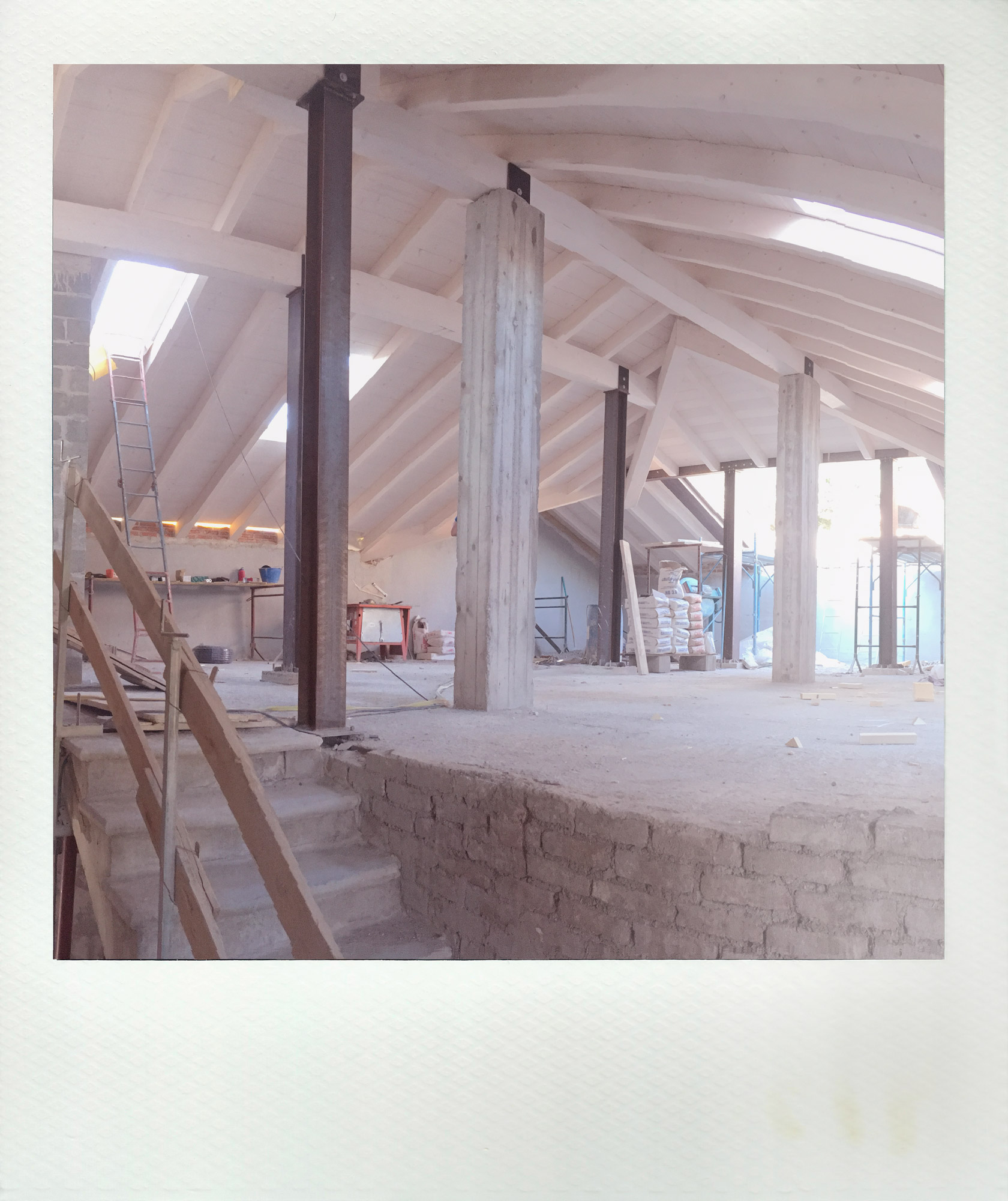
Residence GR
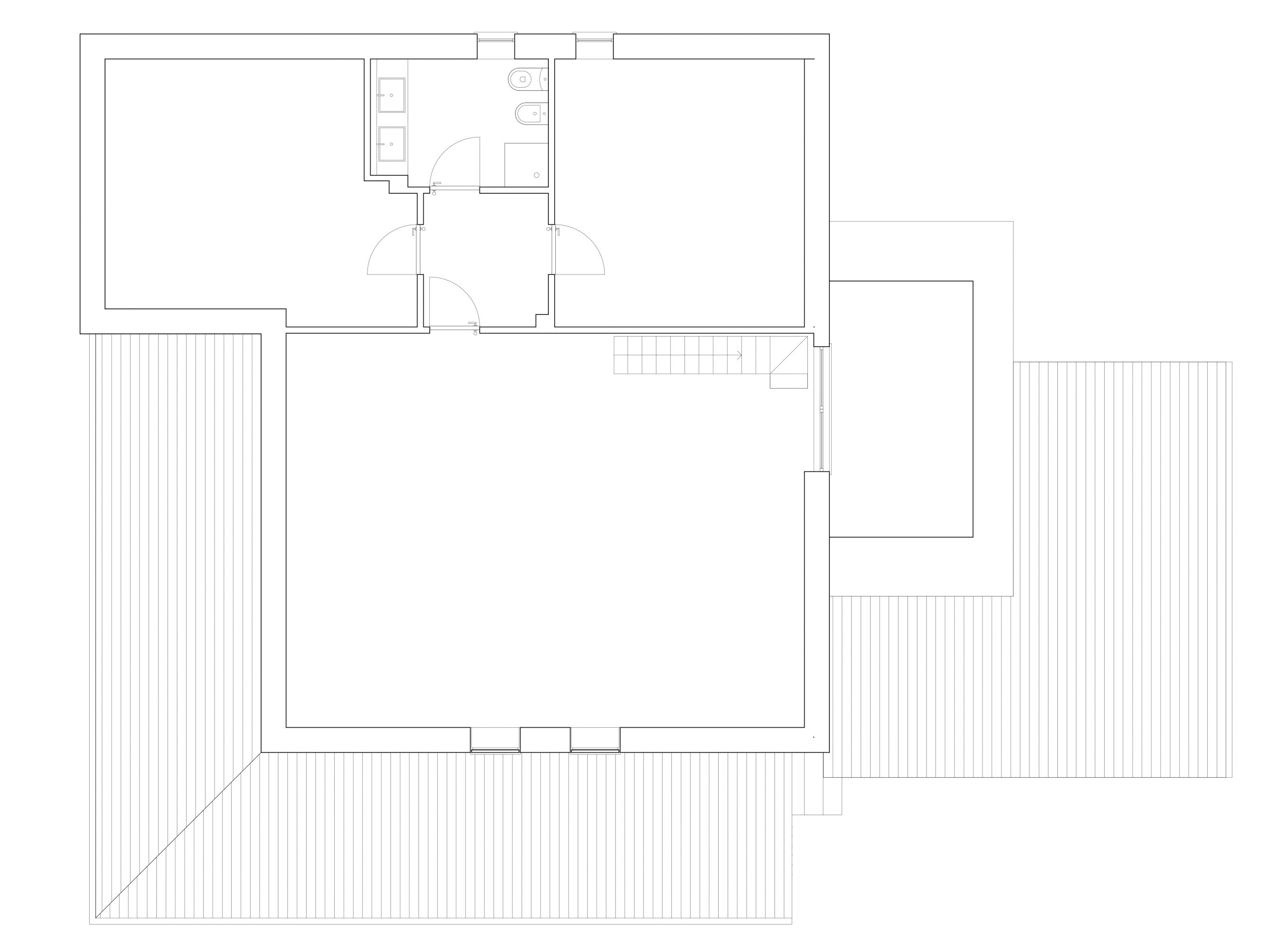
L’intervento ha trasformato una soffitta inutilizzata in un nuovo spazio abitabile luminoso e contemporaneo, composto da una sala e due camere, pienamente integrato con l’appartamento esistente. Il rifacimento del tetto ha migliorato le prestazioni dell’edificio e ha permesso di valorizzare la struttura lignea a vista, elemento caratterizzante dell’intero progetto. La nuova distribuzione interna privilegia ambienti ampi e ben illuminati, grazie alle nuove aperture e alla realizzazione di un terrazzino, che arricchisce la qualità abitativa creando un rapporto diretto con l’esterno. Il collegamento con il piano sottostante avviene tramite una scala su misura con parapetto in vetro, pensata come elemento leggero ed elegante, capace di garantire continuità visiva e spaziale. Completano l’intervento i bagni con arredi su misura, progettati per ottimizzare gli spazi e mantenere coerenza stilistica. Nel complesso, il progetto restituisce un ambiente essenziale, caldo e funzionale, in cui luce, materiali e proporzioni definiscono una nuova modalità di abitare il sottotetto.
The intervention transformed an unused attic into a bright, contemporary living space consisting of a living area and two bedrooms, fully integrated with the existing apartment below. The roof was completely rebuilt, improving the building’s performance and enhancing the exposed wooden structure, which becomes a defining architectural feature of the project. The new internal layout favors generous, well-lit spaces, thanks to new openings and the creation of a small terrace, which enhances the quality of living by establishing a direct relationship with the outdoors. The connection to the lower floor is provided by a custom-designed staircase with a glass balustrade, conceived as a light and elegant element that ensures visual and spatial continuity. The intervention is completed by custom-made bathroom furnishings, designed to optimize space and maintain stylistic coherence. Overall, the project delivers an essential, warm, and functional environment, where light, materials, and proportions define a new way of living in the attic.




Fatto Bene Saint Tropez

Restaurants & Bars
Interior design
2016
Location: Saint Tropez
Client: Fatto Bene
Area: 55mq
Provide Service:
Interior design
Lighting design
Fatto Bene
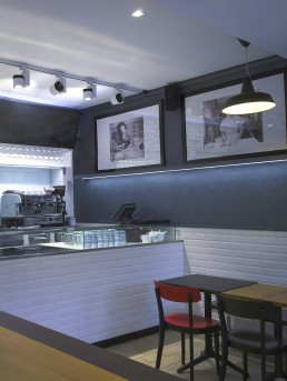
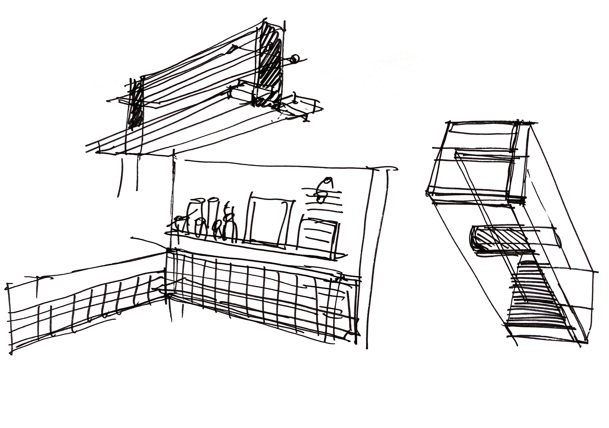
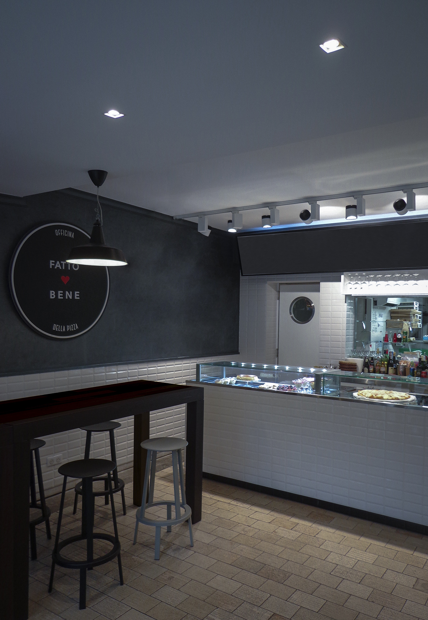
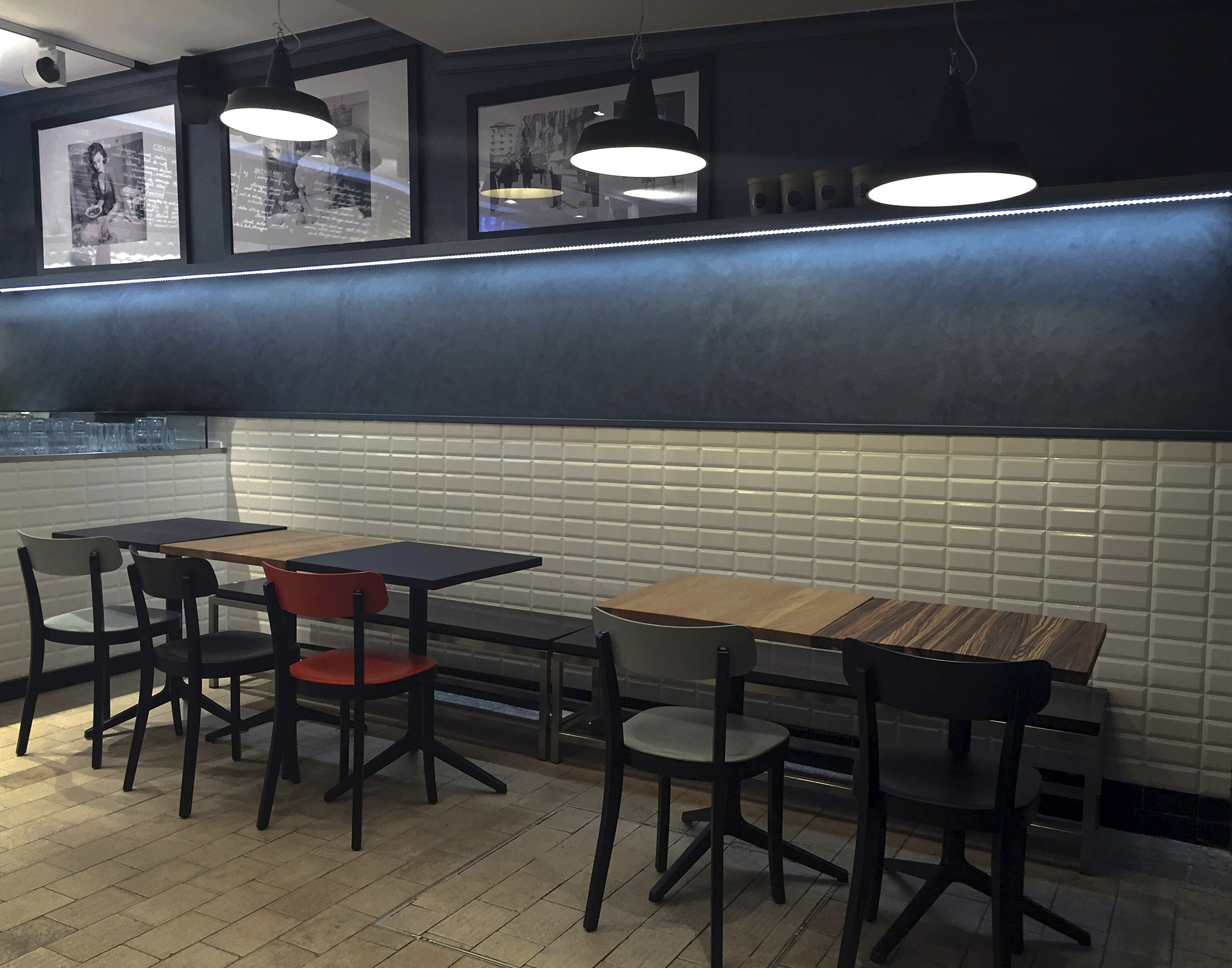
Nelle vicinanze di Saint Tropez un piccolo locale direttamente affacciato sul lungo mare punta sul marchio italiano nell’apertura di una nuova pizzeria. Nonostante le dimensioni ristrette lo spazio è sfruttato sapientemente lasciando la fascia centrale libera per invogliare il passante ad entrare e posizionando i tavoli e le sedute sui lati. Questo corridoio centrale è enfatizzato dalla pavimentazione differenziata e dal lungo tavolo laterale realizzato su misura con listoni di diverse essenze lignee. Piastrelle in ceramica bianca alle pareti, formano una fascia che riveste anche il bancone, uniformando così lo spazio. Nella zona superiore si trovano rappresentazioni di film classici italiani in bianco e nero a ricordare l’impronta italiana. Altro lato essenziale per l’immagine del locale è la realizzazione del logo con il quale poi sono stati pensati tutti gli elementi correlati al locale: partendo dal packaging per i prodotti da asporto, passando per i menù, arrivando alle tovagliette per la tavola. Il risultato è quello di un immagine unificata e ben riconoscibile.
Near Saint Tropez a little pub located right on the boardwalk wants to use the Italian trademark to open a new pizzeria. In spite of the cramped quarters the space is used intelligently, leaving the center aisle free to encourage the passersby to enter and sit at the tables on the sides. The differentiated flooring emphasizes this central corridor and the long table on the side made to order with different types of wood. White ceramic tiles on the walls form a strip that also covers the counter, thus uniting the space. In the upper area classic Italian films are projected in black and white to remind us of the Italian theme. Another essential part for the image of the bar is the creation of a logo which is used in all other items correlated to the pub: staring from the packaging for take e away products, the menu, and the napkins and table cloths. The result is that of an easily recognizable image.
La Zuppiera

Food & Beverage
Interior design
2020
Location:
Fiorenzuola d’Arda (PC) IT
Client: La Zuppiera di Ignazio
Area: 45mq
Provide Service:
Architectural design
Interior design
Lighting design
Works management
La Zuppiera di Ignazio
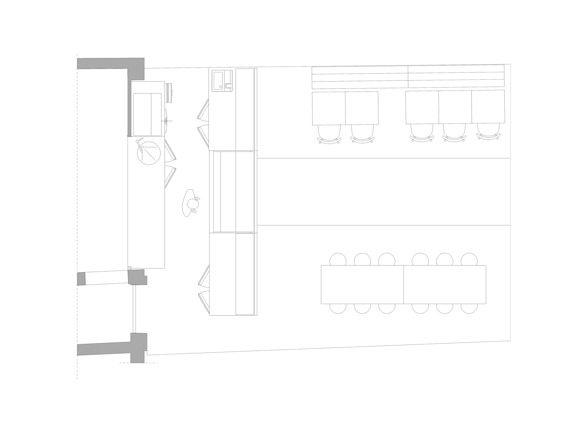
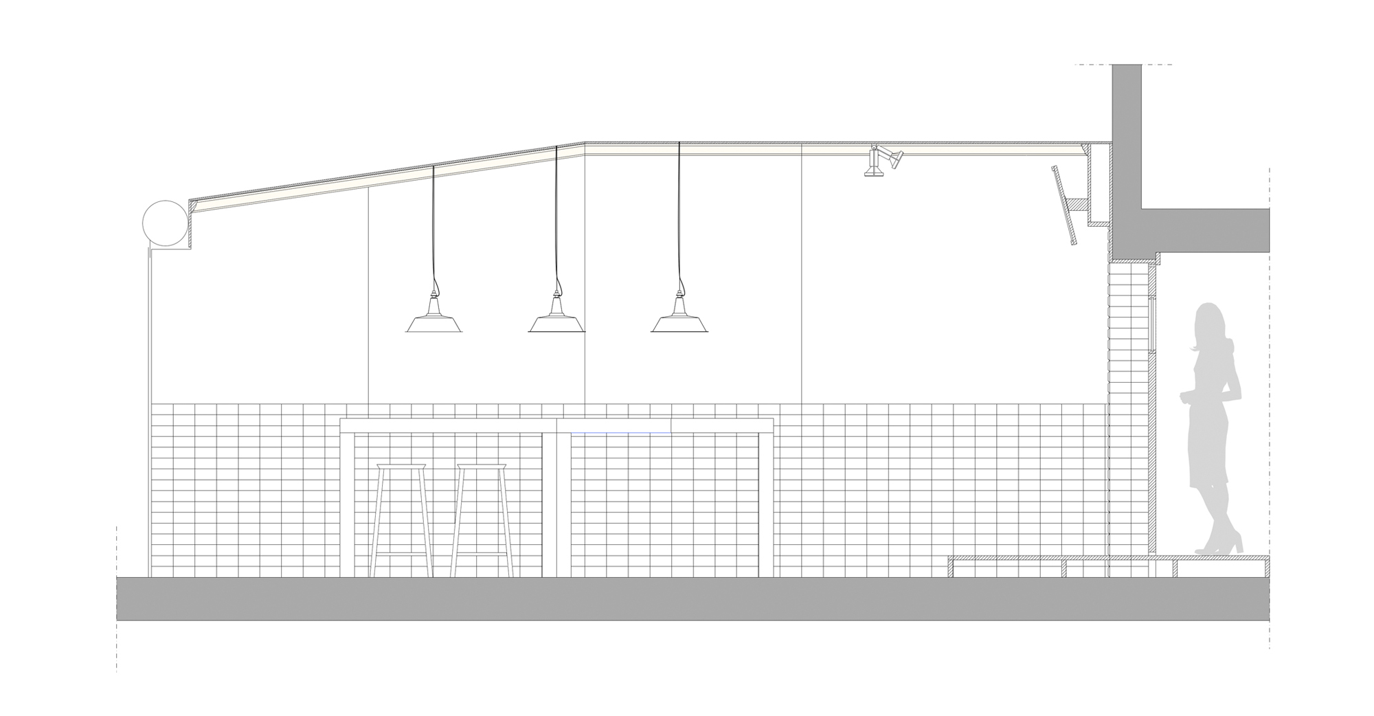
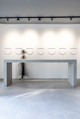
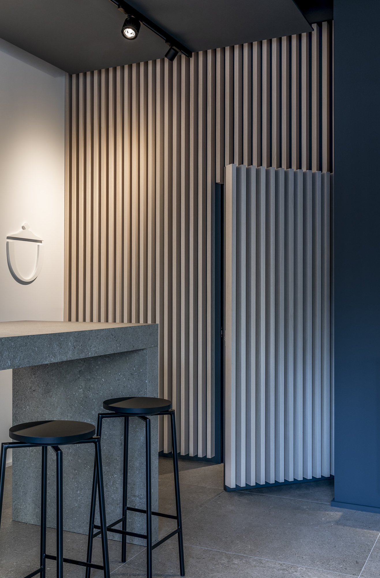
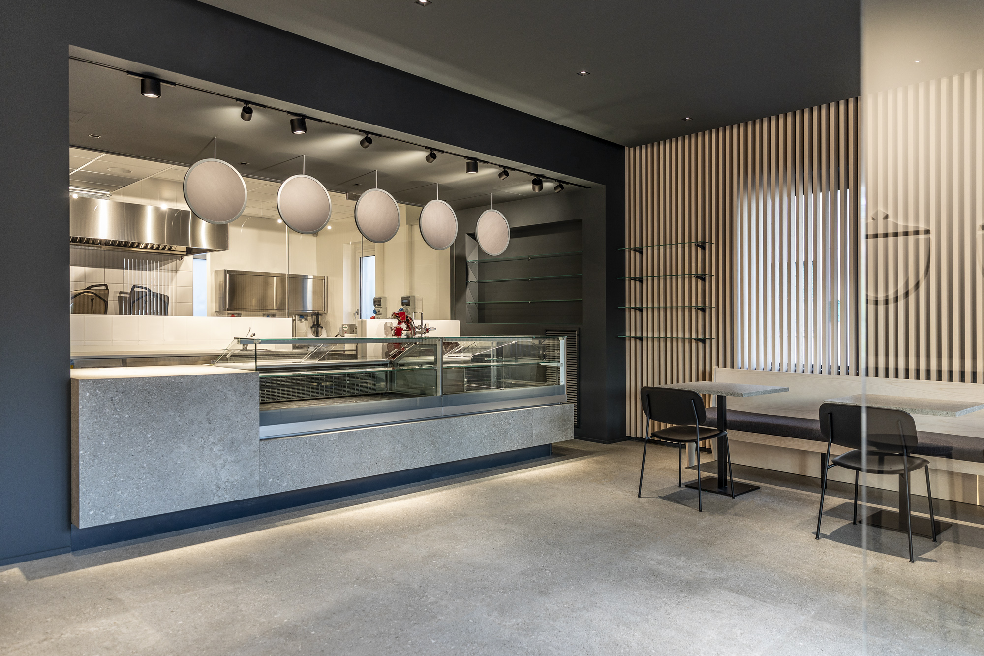
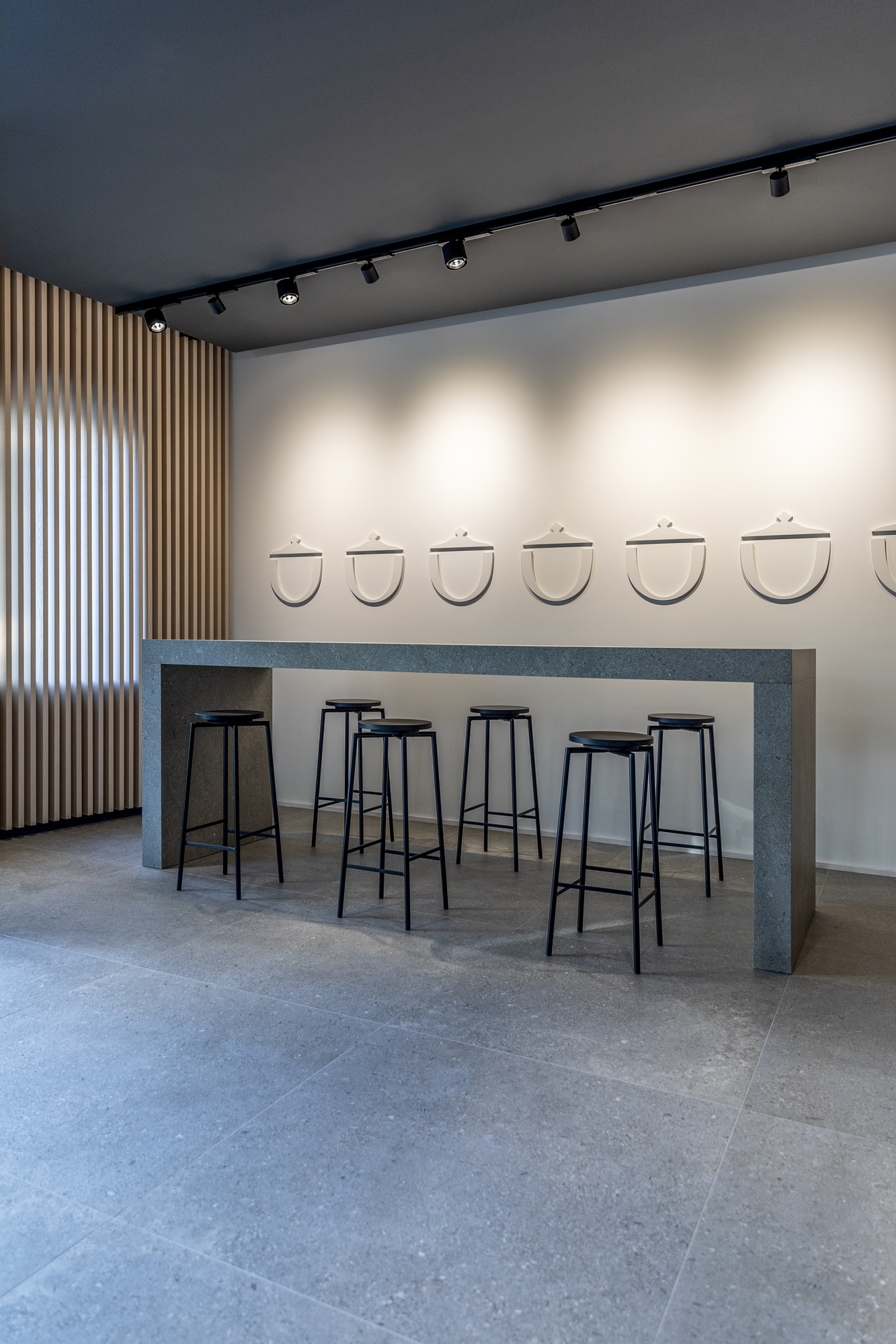
L’aspetto caratterizzante del locale è la ricercatezza di elementi in grado di rispecchiare l’eleganza del brand, dando la possibilità ai materiali di prendere vita e raccontare di uno spazio minimal con elementi contrastanti tra loro. Tutto questo è reso possibile dalla scelta della ceramica come rivestimento totale della pavimentazione e dell’arredo: un materiale concreto, forte e lineare in grado di creare un effetto visivo di continuità e stretto legame tra gli elementi stessi. L’altro materiale caratterizzante è il legno, usato per le doghe disposte in verticale sulle pareti perimetrali, a nascondere gli infissi e a creare maggior intimità e riservatezza. Dimensioni e distanza tra le doghe sono state studiate in modo tale permettere la giusta penetrazione e diffusione della luce naturale negli ambienti interni. L’unica parete non rivestita dal legno è stata dipinta di bianco e vi si legge il profilo monocromo e ripetuto del brand. Su questa parete candida si staglia un elemento d’arredo di forte impatto: il tavolo conviviale con sagoma a forma di ‘C’, disegnato e realizzato su misura con la collaborazione di più realtà produttive. Il tavolo cela un’anima in metallo e legno, rivestita poi in gres porcellanato, con una fattura di massima precisione. Lo stesso materiale è richiamato nella pavimentazione, nonché nel rivestimento del bancone per l’esposizione dei prodotti gastronomici. Il bancone è inserito in un portale, con una riconoscibile forma ad ‘U’, che risulta ultra leggero perché sospeso da terra. Dietro al bancone si apre, in profondità, la cucina a vista. Sopra al banco, una serie di menu board di forma circolare che richiamano la forma arrotondata del brand ripetuto nella parete bianca a fianco. Una serie di tavolini completano l’arredo interno: l’elemento che li collega è una panca unica; la tradizionale gamba della seduta viene sostituita e rivisitata con l’uso di un segno continuo.
Ignazio’s Soup Tureen
The characteristic aspect of the pub is the attention given to the use of elements able to reflect the brand’s elegance, thus allowing the materials to come to life and reveal a minimal space with contrasting elements. All this is made possible by choosing ceramic tiles as the total floor and décor covering: a concrete material, strong and linear, able to create a visual effect of continuity and a strong union between the materials themselves. The other characteristic material is wood, used for the slats installed vertically on the perimetral walls, and used to hide the doors and windows to create more intimacy and privacy. The size and distance between the slats were studied in a way to allow the correct penetration of natural light to the spaces inside.
The only wall not covered with wood is painted white with the monochrome company logo profile as a pattern. On this candid wall a strong decorative element stands out: a “C“ shaped convivial table, custom designed and made via joint collaboration. The table hides a metal and wooden soul, now covered with ceramic tiles, constructed with maximum precision. The same material is recalled in the floor covering, also on the countertop, where the gastronomic products are displayed. The counter is inserted in a portal with a recognizable “U” shape which seems ultra-light since it is suspended from the floor. The open view kitchen is located deeper behind the counter. Above the countertop there is a series of circular menu boards that recall the circular logo repeated on the nearby white wall.




Residence FS

Private Residence
Interior Residential
Architecture Residential
2016-2020
Location: Piacenza IT
Client: Private client
Area: 150mq
Provide Service:
Architectural design,
Interior design,
Lighting design
Works management
Residence FS
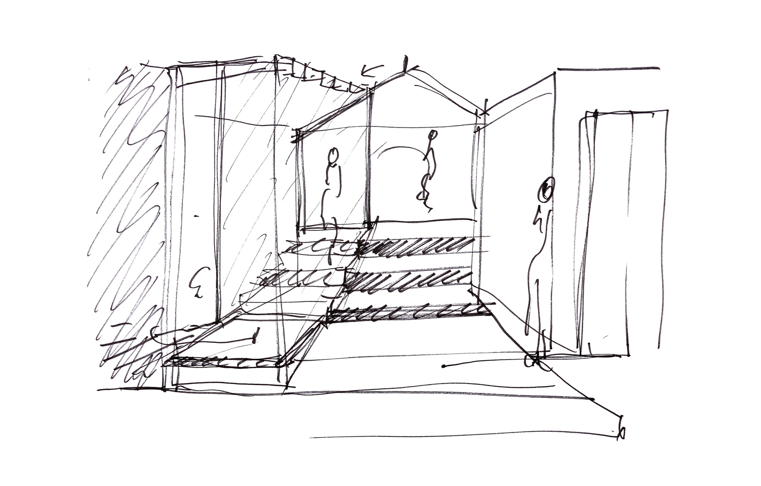
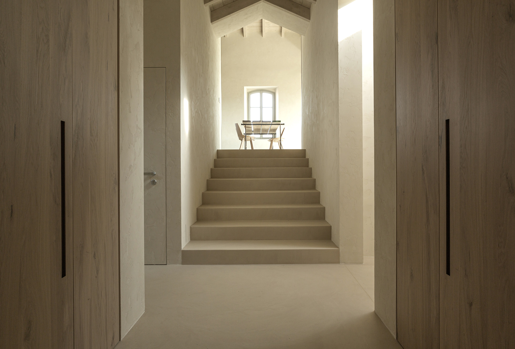
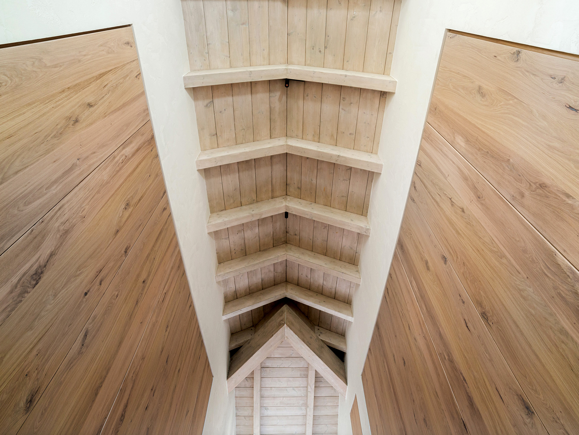
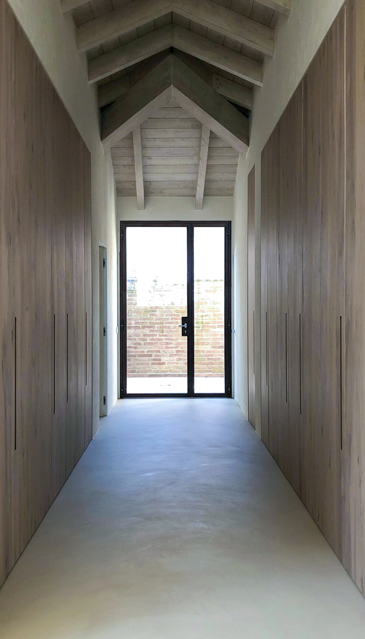
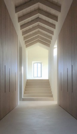
Uno splendido corridoio prospettico disegna lo spazio e accompagna ad una scala, sovrastata da una finestra che fa entrare un fascio di luce. Percorsi i gradini, si apre l’open space: un’ariosa sala da pranzo. Il corridoio di nuova concezione collega la zona giorno e la zona notte e si presenta con un soffitto composto da travetti e perline in legno disposti a spiovente, a riprendere l’andamento della copertura del fabbricato. L’ampia unità abitativa è stata ricavata nel piano sottotetto, grazie ad opere di demolizione e ricostruzione che hanno consentito anche di aumentarne l’altezza utile. Nella zona living sono state recuperate le capriate originali. Un’attenzione particolare è stata posta sulla scelta dei materiali in tutti gli ambienti: la resina monocromatica è la superficie prescelta per tutta l’abitazione.
A splendid perspectival hall delineates the space and takes us towards a staircase located underneath a window, through which a ray of light shines. After climbing the steps, we come to an open space: an airy dining room. A new concept hall connects the day zone to the night zone and presents us with a ceiling made of little beams and matchboard lining, sloping down to follow the roof of the building.
The ample living unit was extracted from the attic, and thanks to demolition and rebuilding, which allowed us to increase the usable height. In the living area the original trusses have been recuperated. Special attention was given to the choice of materials in all spaces: monochromatic resin is the choice for the entire residence.