
Lino's Coffee 2001

Coffee & Bar
Interior design
2001
Location: Parma IT
Client: Lino’s Coffee
Area: 120mq
Provide Service:
Interior design
Works management
Lino’s Coffee
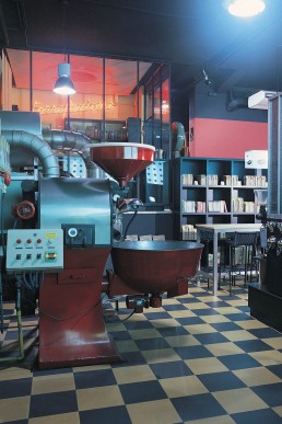
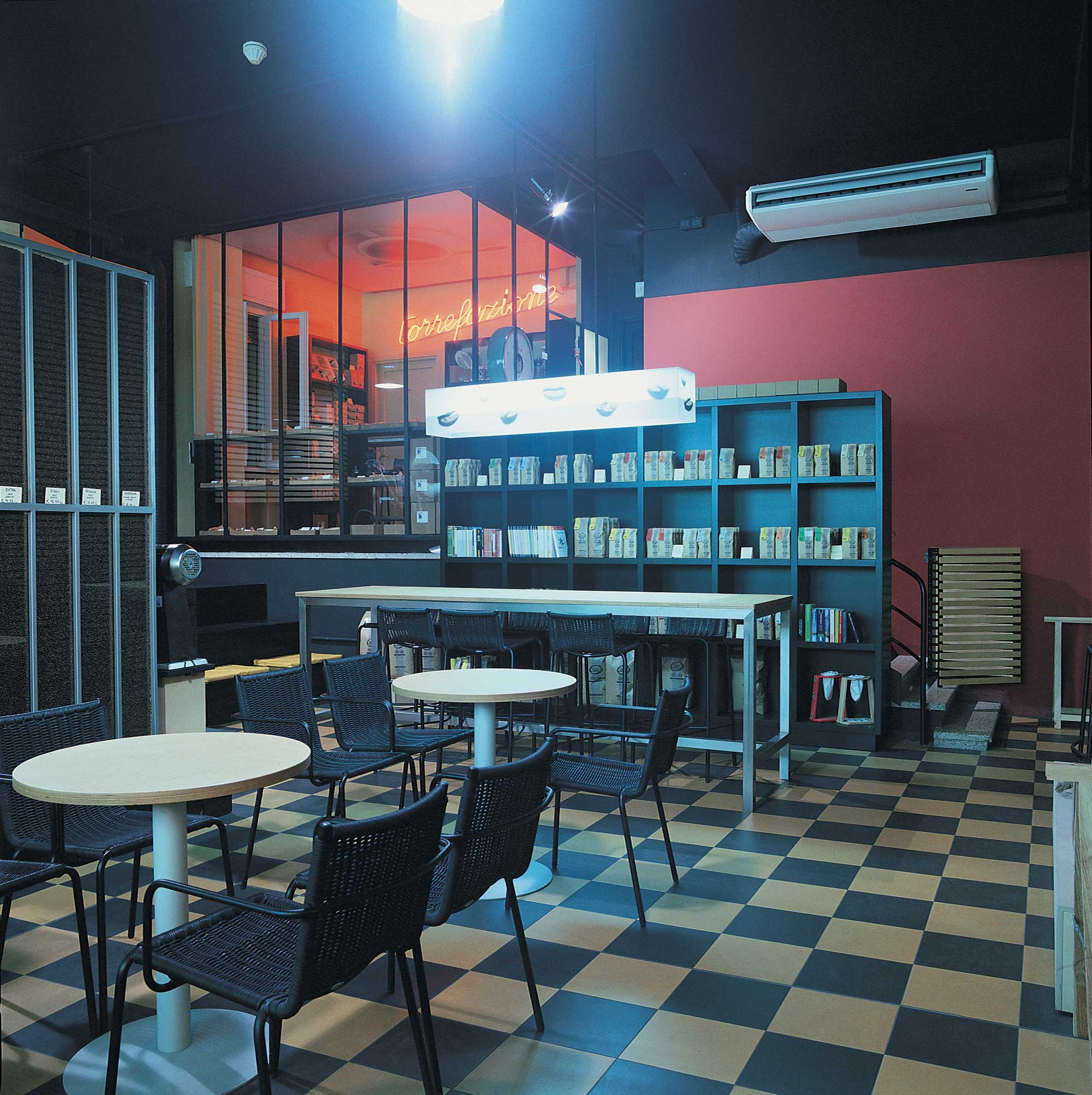
Un’ex officina, diventata poi Torrefazione, ospita questo locale che mantiene visibili gli elementi caratterizzanti gli utilizzi passati, nella macchina per la torrefazione, nella pavimentazione originale e negli uffici, come nella vetrata d’ingresso. Elementi di design, come gli arredi disegnati su misura, la parete retroilluminata al bancone e i corpi illuminanti dal gusto industriale, si accostano a quelli esistenti senza alterarne il carattere, creando un ambiente nuovo ed originale. Questo luogo può essere utilizzato come caffè tradizionale ma anche come luogo di relax e di condivisione sfruttando gli spazi pensati per la lettura e internet, si trovano anche spazi espositivi dei prodotti per la vendita diretta al pubblico.
The building is an ex workshop that has become a coffee toasting plant, but it still retains visible elements of its past use: the roasting machine, the original flooring, the offices, and the glass wall entrance. Design elements such as custom made furniture, a retro illuminated wall at the front desk and industrial type lighting fixtures join the existing without changing the character thus creating a new and original atmosphere. This place can be used like a traditional café but also as somewhere to relax and share by taking advantage of the spaces for reading and Internet. There are also spaces for displaying the products for direct sale to the public.




Lino's Coffee 2000 Parma

Coffee & Bar
Interior design
2000
Location: Parma IT
Client: Lino’s Coffee
Area: 50mq
Provide Service:
Interior design
Concept
Lighting design
Graphic design
Works management
Lino’s Coffee
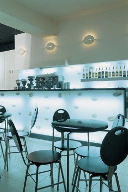
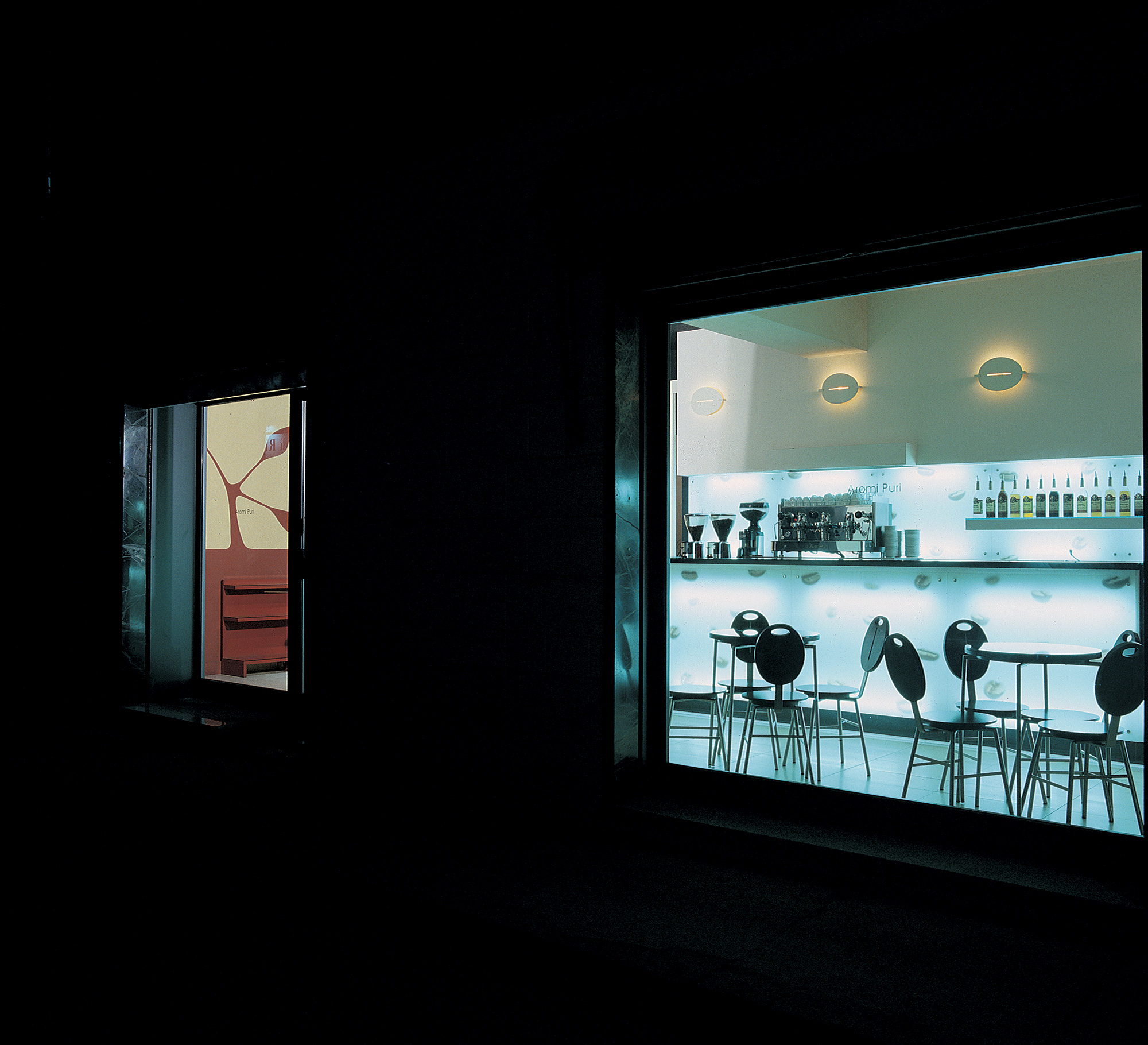
Locale della catena Lino’s Coffee in provincia di Parma. Si distingue per la sobrietà cromatica adottata, che segue gli standard del marchio, oltre che per una grande attenzione ai dettagli. Infatti, in tutto lo spazio è ripetuto lo stesso elemento, sia nel pannello retroilluminato del bancone, che nelle applique, nelle sedute e nei tavolini, tutti disegnati su misura: il chicco di caffè. Il risultato è un ambiente originale che ricorda costantemente al fruitore la propria identità.
One of the Lino’s Coffee chain bars in the Parma Provence. It distinguishes itself by its sober chromatics, following the trademark’s standards and also for the attention given to the details. In fact in the entire space the same element is repeated, both in the retro illuminated wall panel of the counter, as in the wall lamps, in the chairs and tables, all custom designed: the coffee bean. The result is a unique atmosphere, which constantly reminds the client of the company’s true identity.


Museo Illica 1998

Museum-Exhibitions
Interior design
1998
Location: Castell’Arquato IT
Client: Pubblic Administration
Area: 100mq
Provide Service:
Interior design
Graphic design
Lighting design
Works management
Museo Illica
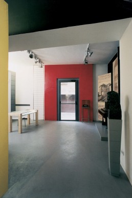
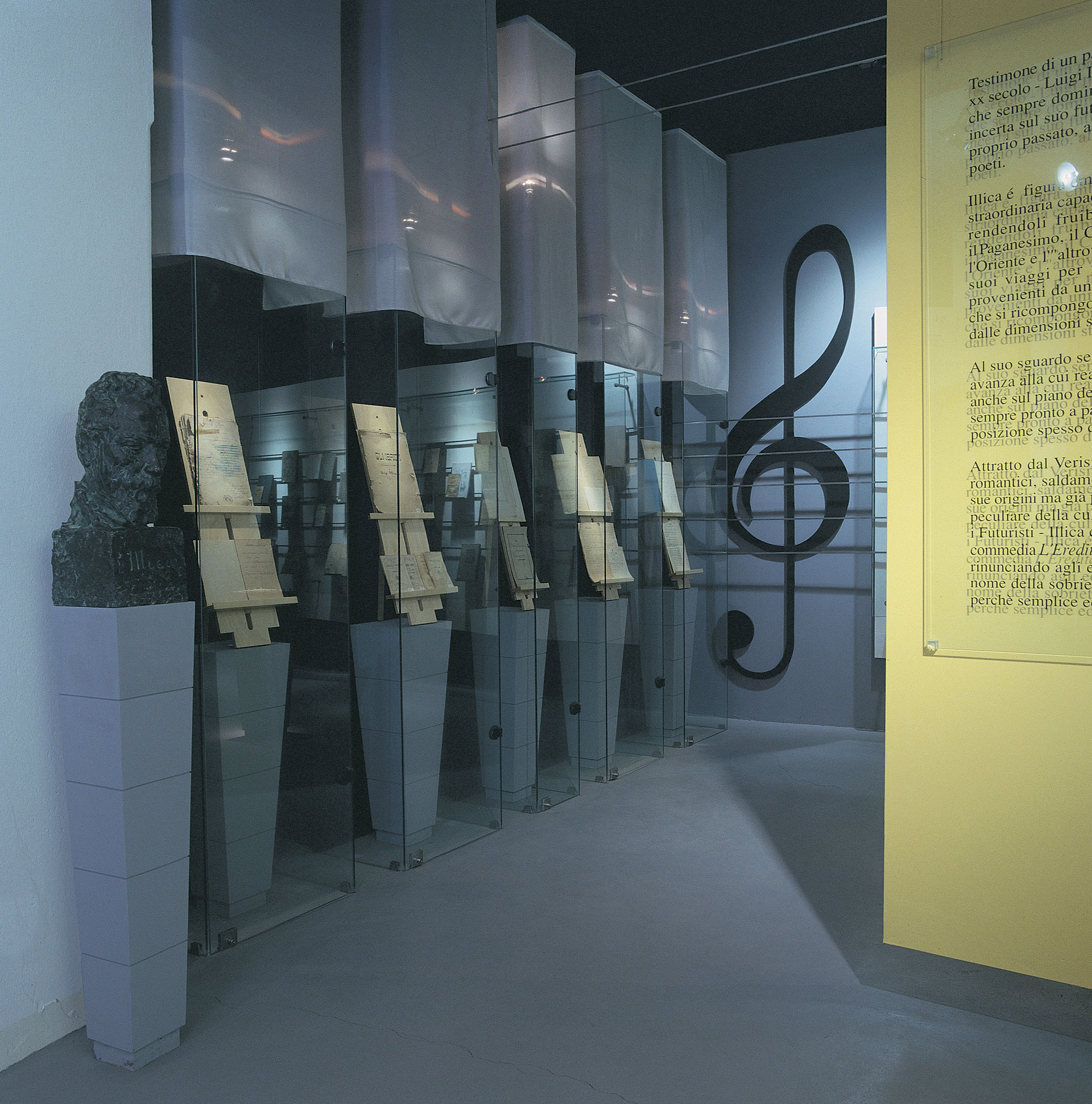
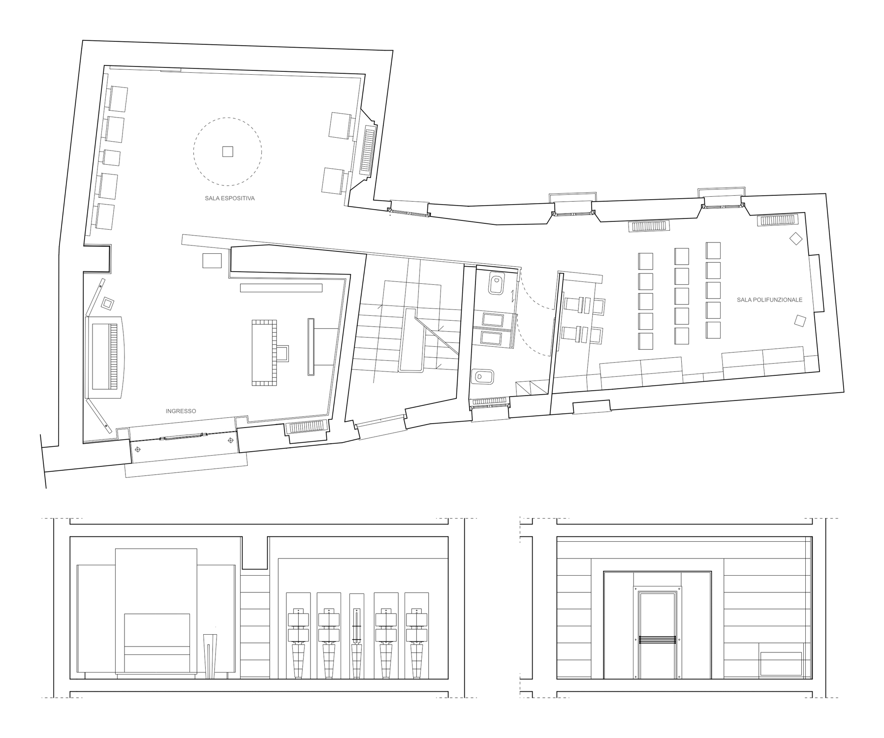
Lo studio è incaricato di progettare l’allestimento del Museo Illica a Castell’Arquato, paese natale del famoso librettista. Collocato in un immobile a fianco della casa nativa dell’artista, gli spazi vengono suddivisi in ingresso, angolo bookshop, sala espositiva e zona per la consultazione di materiale informativo. Ruolo fondamentale è svolto dal colore, che scandisce i vari luoghi e che accompagna il visitatore nella zona d’ingresso con il rosso e dalla zona espositiva a quella di consultazione attraverso una parete gialla, di forte impatto, dove sono riportate le documentazioni più significative dell’epoca. La zona espositiva è definita tramite grandi pannelli didascalici, bacheche essenziali e funzionali, illuminazione mirata ai singoli elementi. Gli arredi sono pensati su misura, compresi quelli collocati nell’area di consultazione. In questo luogo la memoria all’artista è valorizzata attraverso un ambiente piacevole e rilassante, che offre al visitatore una esperienza di conoscenza storica musicale e letteraria.
The studio was commissioned to design the setup of the Illica Museum in Castell’Arquato, birthplace of the famous librettist. Located in a building next door to the artist’s birthplace, the space is divided as follows: entrance, bookshop corner, showroom, and area for consulting informational material. Color plays a fundamental role and highlights the various rooms accompanying the visitor with red at the entrance and in the showroom into the consulting room with the strong effect of its yellow walls and where the most important documentation of the period is conserved. The showroom has large captioned panels; essential and functional bulletin boards and all items are directly illuminated individually. The furnishing has been custom designed including the consulting area. In this museum the memory of the artist and his valorization in the pleasant and relaxing atmosphere offers the visitor the opportunity to learn about musical and literary history.



Melograno 2004

Restaurants & Bars
Interior design
2004
Location: Milano IT
Client: Vera srl
Area: 400mq
Provide Service:
Interior design, Styling,
Graphic design
Lighting design
Works management
Melograno
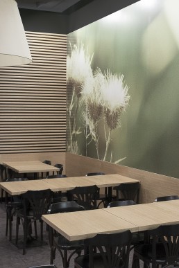
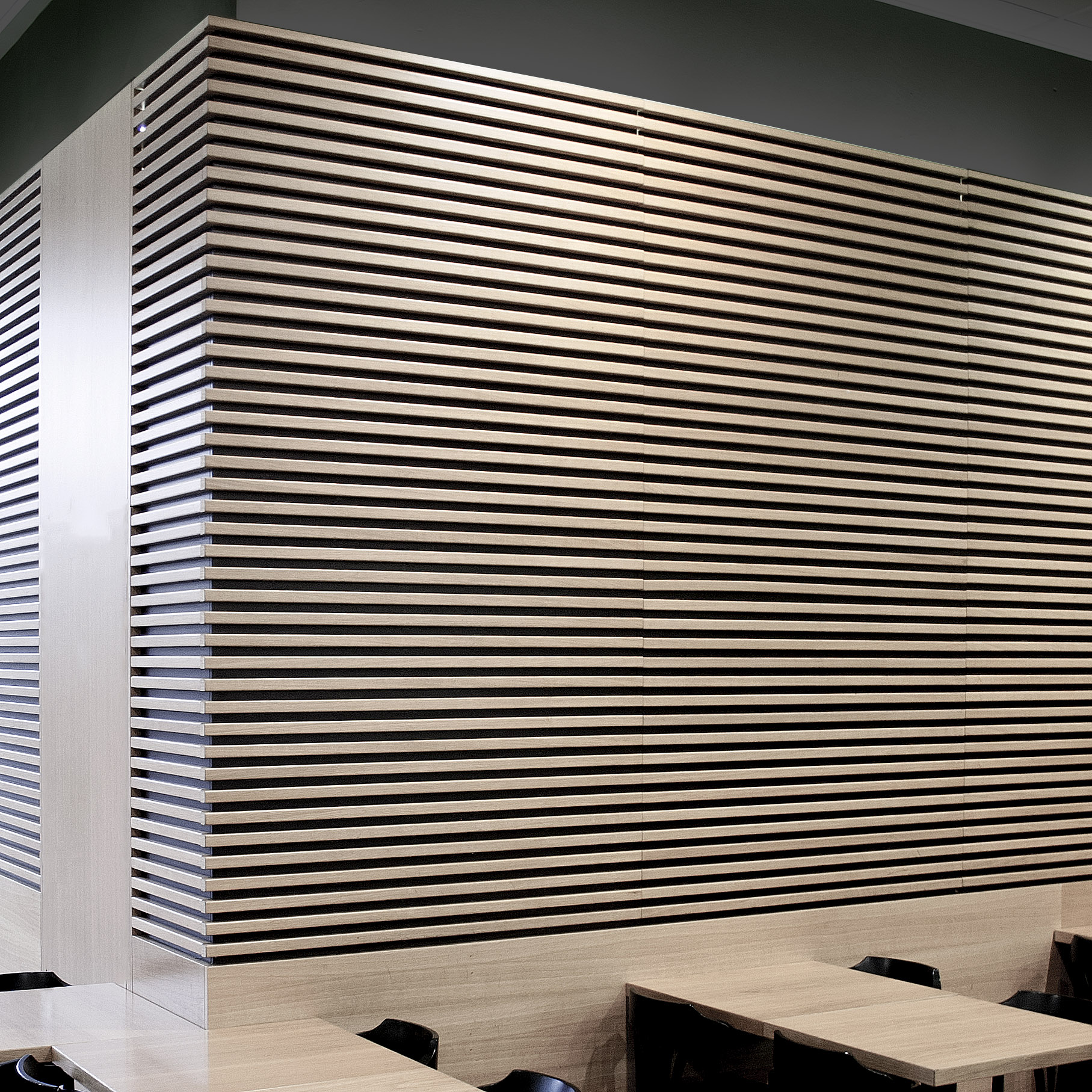
Locale che offre servizi di ristorazione e self service a Monza, ha come fulcro la cucina in acciaio completamente a vista, che offre una visione trasparente e a 180° delle varie fasi di preparazione dei cibi. Il senso di leggerezza e armonia è dato da una vetrata sospesa con angoli arrotondati in perfetta sintonia con la base lignea della struttura e che circonda interamente la cucina. Al vetro, materiale igienico per eccellenza, è stato accostato il legno, versatile ed elegante, utilizzato oltre che per senso estetico anche per migliorare l’acustica all’interno di questo grande spazio. Le pareti infatti sono state rivestite con doghe sottili e raffinate che creano una texture a righe alternate di forte impatto visivo. Una zoccolatura percorre l’intero locale intervallata a tratti dalle porte rese quasi invisibili perché realizzate a filo rivestimento. Grandi immagini fotografiche con riproduzioni di elementi naturali creano un contrasto con la geometria dell’ambiente, e inseriscono una nota di colore all’interno del locale.
This is a self-service and pub restaurant in Monza which focuses on its stainless steel kitchen, entirely visible so that clients have a transparent 180° view of the various food preparation phases. A suspended window with rounded corners gives a feeling of casualness and harmony in perfect accord with the structure’s wooden base which surrounds the kitchen. Glass, an excellent hygienic material, has been paired with wood, versatile and elegant and it is used not only for esthetic reasons but also to improve the acoustics inside this large space. In fact the walls are covered with elegant thin slats creating a texture of alternating lines and creating a strong visual impression. Base skirting is applied around the entire pub, alternating with nearly invisible doors that are flush with the wall covering. Large photographic images of natural elements create a contrast to the geometry of the ambient and add a note of color inside.


Portello Caffè 2006

Coffee & Bar
Interior design
2006
Location: Milano IT
Client: Portello Caffè
Area: 140mq
Provide Service:
Interior design, Styling,
Graphic design
Lighting design
Works management
Portello Caffè
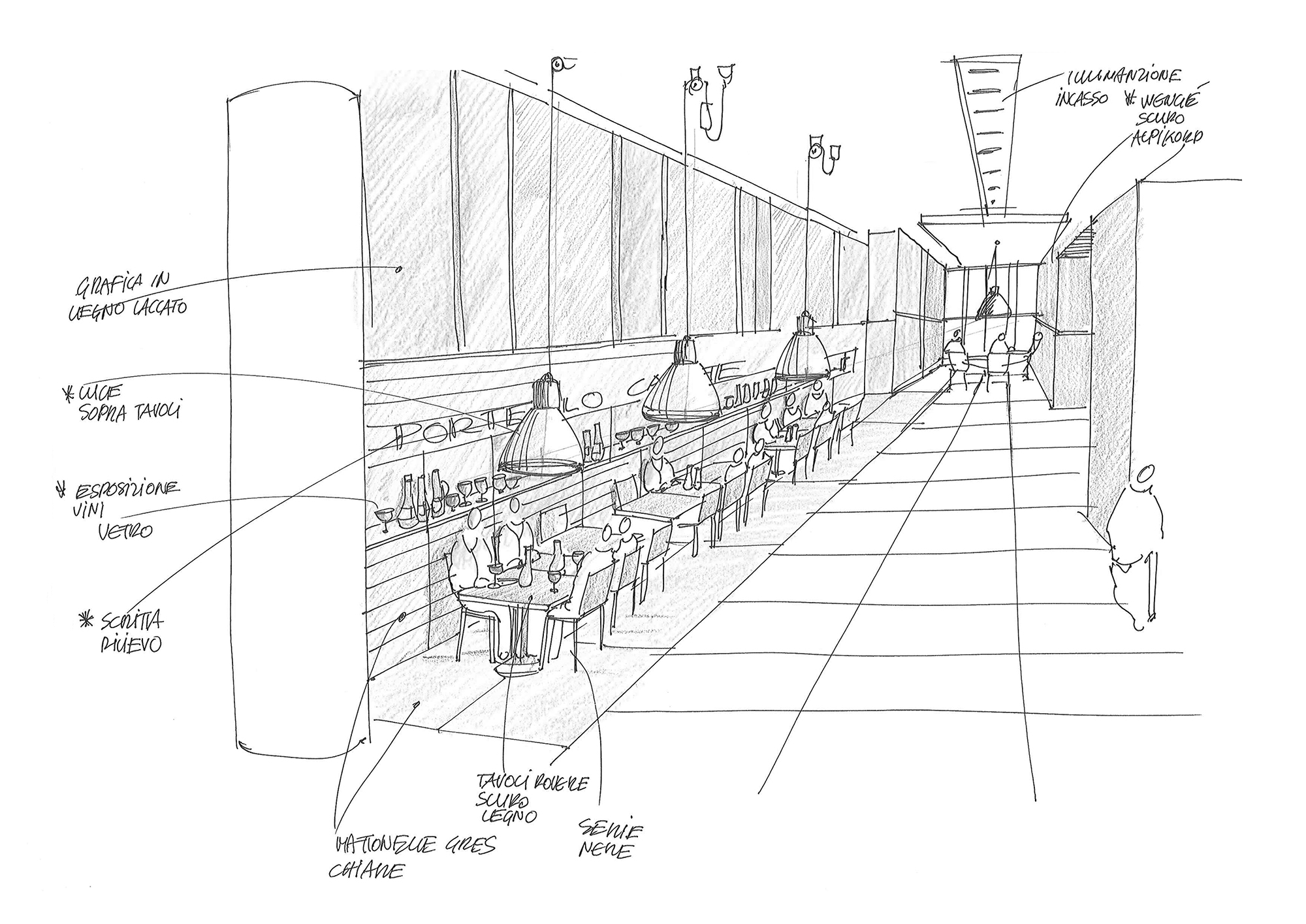
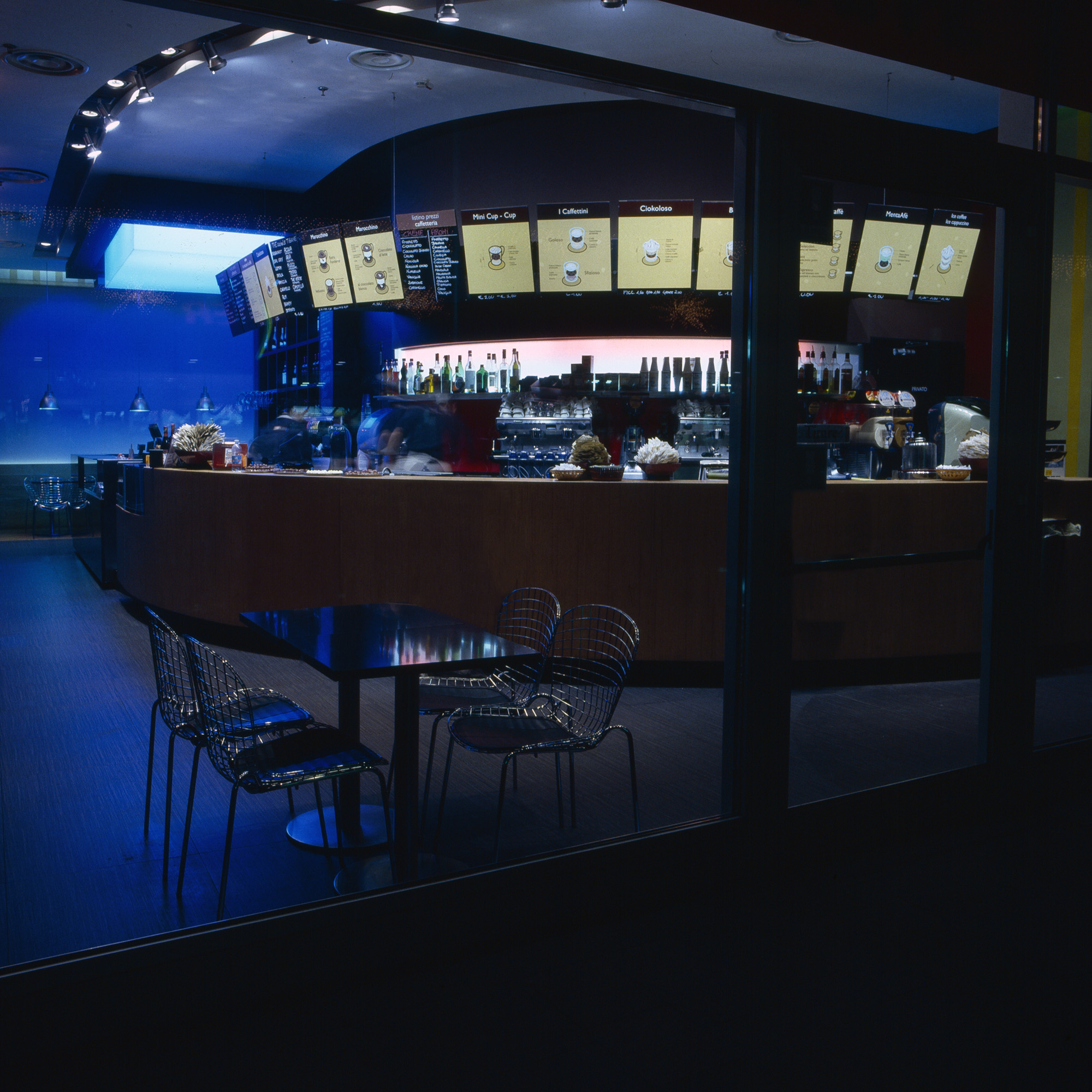
Uno stile contemporaneo ed elementi originali caratterizzano questo bar caffetteria che nasce come progetto pilota e rappresenta il primo locale della catena Portello Caffè. Collocato in un complesso commerciale all’aperto nella zona portello di Milano, questo locale, in un unico spazio rettangolare, unisce una zona di somministrazione bevande ad un ambiente dinamico con tavolini. Luminosi menu board riportano le caratteristiche dei prodotti disponibili e sovrastano il bancone semicircolare di somministrazione caffetteria. Ma è l’illuminazione l’elemento che caratterizza e diversifica questo locale conferendo ad esso una doppia entità, una doppia anima. Nella zona consumazione, ai teli decorati con grandi quadrettature (texture che rimanda alle tovaglie di tradizione) si sostituiscono, alla sera, lampade a sospensione che creano un’illuminazione intima e soffusa che, con diverse combinazioni cromatiche, conferiscono all’ambiente un aspetto dinamico. Il locale presenta un dettagliato studio dei materiali, come l’uso di legno multistrato e quarzite per il bancone, grès come rivestimento della parete nella zona dinamica. In accordo con lo stile lineare della struttura viene inserito l’inconfondibile motivo grafico del brand, che si ritroverà in tutti i locali “Portello Caffè”.
This bar cafeteria was conceived as a pilot project with its contemporary style and original elements, and represents the Portello Caffe chain’s first bar. It is located in a shopping mall the portello zone of Milan. In one rectangular space it unites an area of serving drinks with a dynamic area with table. An illuminated menu board lists the available products and are located above the cafeteria’s semicircular serving counter. But the lighting is the element that characterizes and diversifies the bar, giving it a double identity, a double soul. In the eating and drinking area the large fabric squares decorated in a texture, which reminds us of traditional tablecloths, are alternated in the evening by hanging lamps which create an intimate suffused atmosphere together with diverse chromatic combinations that confer a dynamic aspect to the structure. The bar has a detailed study of materials like the use of plywood and quartzite for the counter and stoneware as a wall covering in the dynamic area. The recognizable graphic motive of the brand visible in all “Portello Caffè” bars is inserted in keeping with the linear style of the structure.


Portello Caffè 2008

Coffee & Bar
Interior design
2008
Location: Milano IT
Client: Portello Caffè
Area: 50mq
Provide Service:
Interior design
Graphic design
Lighting design
Works management
Portello Caffè
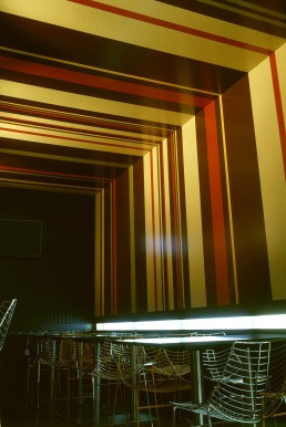
Questo Portello Caffè nasce come prototipo all’interno di un centro commerciale a Milano. Le linee squadrate della struttura mettono in risalto la grafica che contraddistingue il brand: una texture formata da righe dai colori caldi, che ricordano le tinte della pianta del caffè. Il prodotto commerciale pubblicizzato nei menu board luminosi acquista maggior risalto grazie all’utilizzo dei materiali scuri scelti per la struttura e per il bancone, realizzato in wengè. Una linea luminosa contorna l’intera struttura e demarca la squadratura e la rigidità dell’intero complesso. La leggerezza strutturale delle sedie realizzate in materiale metallico si contrappone alla geometria del locale, senza però romperne l’armonia.
This Portello coffee shop was conceived as a prototype for a Milan shopping mall. The structure’s square lines highlight the brand’s graphics: a texture formed of warm colored lines that remind us of the color of coffee plants. The products advertised on the illuminated menu boards are further highlighted thanks to the use of dark materials chosen for the counter, made in wénge. An illuminated line frames the entire structure and highlights the squared and rigid interior. The structural lightness of the metal chairs contrasts with the shop’s geometry without disturbing its harmony.


NuovaOttica 2006

Eyewear shop
Interior design
Graphic design
2006
Location: Parma IT
Client: NuovaOttica
Area: 100mq
Provide Service:
Architectural design
Interior design
Graphic design
Lighting design
Works management
NuovaOttica
Bianco, beige, nero. Orizzontalità e prospettiva. Tutto il progetto si basa su tre colori e due concetti, semplici, che ripetuti e declinati in vari modi identificano e caratterizzano questo punto vendita. Tutte le linee confluiscono verso il fondo dell’ambiente, attirando ed invogliando l’avventore a muoversi in avanti, come se le linea indicasse la direzione da seguire. Ma al contrario di un “trompe-l’œil” il centro del fondale, dove ci si aspetta che confluiscano tutte le linee, non tiene fede alle attese e ci ricorda, disingannandoci con le sue linee parallele, che lo spazio non è infinito ma ben delimitato. Un progetto quindi che è ben consapevole dei rapporti geometrici non ben proporzionati di questo luogo e che prima ci inganna per poi riportarci alla realtà: non un corridoio infinito dunque, ma un negozio dalle dimensioni delimitate.
White, beige, black. Horizontal and perspective. The entire project is based on three colors and two concepts, simple, which when repeated and used in several ways attract and invite the observer to move ahead as if the line shows a path to follow. But contrary to a “trompe-l’oeil”, the basic center where one would expect all lines to connect does not follow the rule, it reminds and contradicts us that the space is not infinite but well defined. Thus a project well aware of geometric relation, not well proportioned in this place and firstly trick us and then take us back to reality: therefore not an infinite hallway, but a store with fixed dimensions.


Ringomobile Store 2013-2015

Mobile operator
Interior design
Brand Identity
2013-2015
Location: Milano IT
Piazza Angilberto 2013
Viale Monza 2013
Via Padova 2013
Cinisello Balsamo 2014
Sesto San Giovanni 2015
Client: Ringomobile
Area: 40mq /80mq
Provide Service:
Interior design
Graphic design
Communication design
Lighting design
Works management
Ringomobile Store
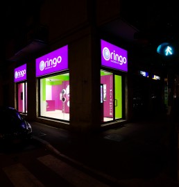
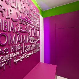
Lo studio è stato incaricato di gestire e coordinare l’immagine di una nuova compagnia telefonica, a partire dal logo, passando all’immagine coordinata (caratteri, colori, biglietti da visita, carta intestata, buste, sito web, email, footer) fino ai punti vendita, ai totem informativi, ai corner commerciali.
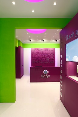
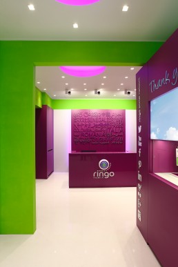
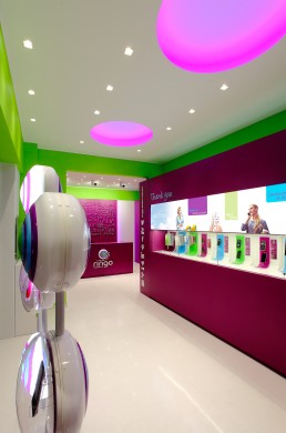
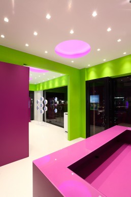
Lo spazio dello store è distribuito su una parte di vendita dei cellulari e degli accessori ed una parte per servizi e assistenza post-vendita. Il colore dominante è il viola, che riprende il logo: una goccia che crea cerchi concentrici a richiamare l’idea del network, racchiusa in una forma circolare che ricorda la globalità e la terra, percorsa dalle reti di comunicazione.
Originali gli espositori per i cellulari, un vero oggetto di design: si tratta di totem retroilluminati che integrano il logo e che sono stati studiati appositamente per contenere e mettere in mostra i vari modelli proposti.
The studio was asked to manage and coordinate the image of a new telephone company, starting from the logo, including a coordinated image (typeface, color, business cards, stationary, website, email etc.) up to the shops and the information totems in shopping malls.
The store space is distributed into one area for cell phone sales and accessories and another area for service and aftersales assistance. Purple ls the dominant color which is in the logo: a drop that creates concentric circles giving the idea of a network, enclosed in a round form that recalls the earth’s globe covered with its communication network.
The original cell phone display, a true design object, is a totem lit from the back and integrating the logo and specially designed to show the various models offered.
La Table 2005

Restaurants & Bars
Renovation
Interior design
2005
Location: Parma IT
Client: La Table
Area: 120mq
Provide Service:
Architectural design
Interior design
Lighting design
La Table
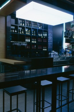
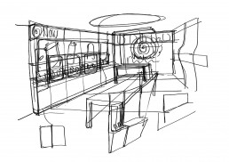
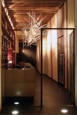
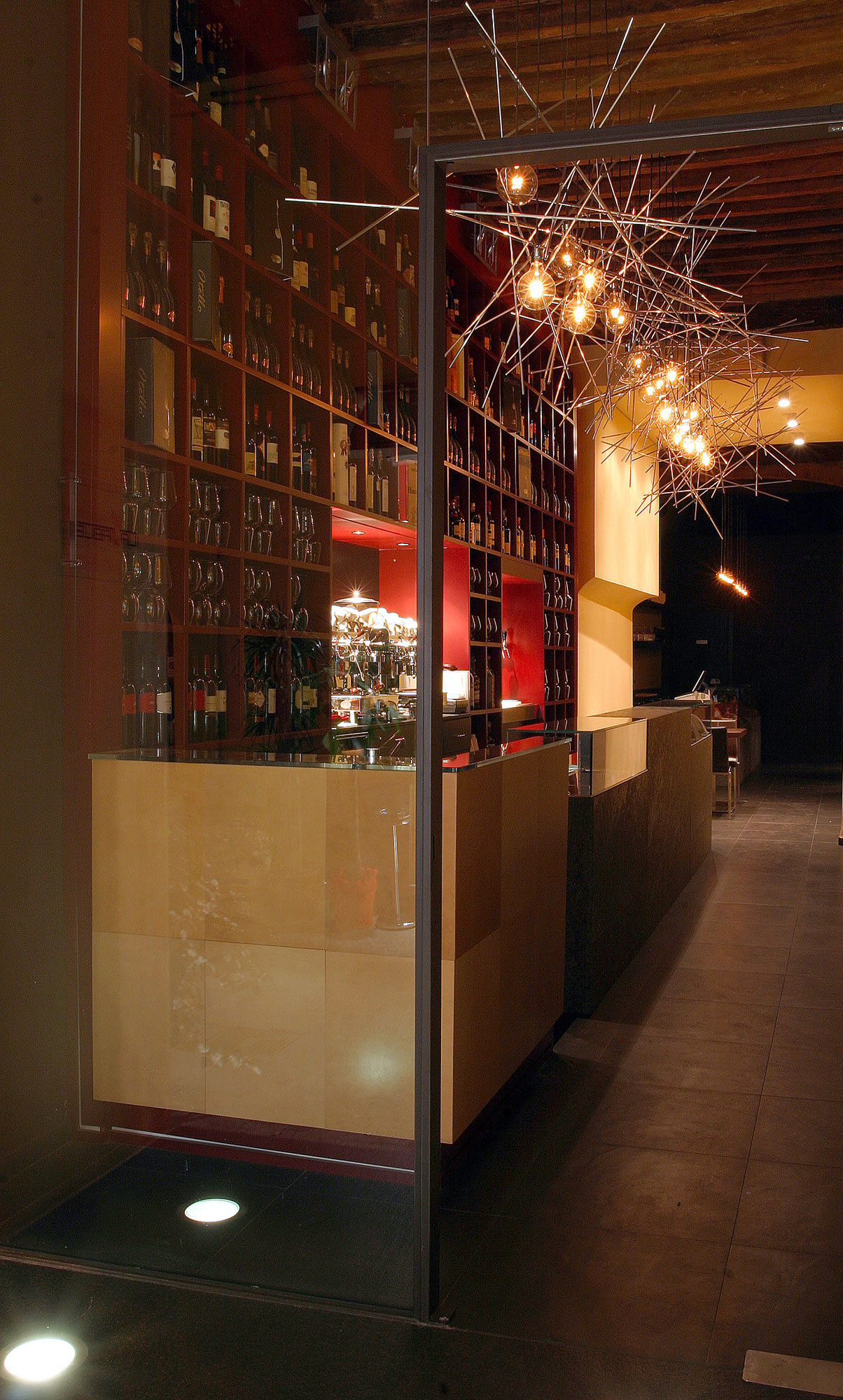
“La Table” è un locale collocato in centro a Parma, ristrutturato e rinnovato secondo un gusto moderno. All’interno lo spazio è suddiviso in 4 zone in base alla loro funzione. Il primo spazio,un lungo e stretto vano adibito a zona bar e degustazione vino, è caratterizzato dall’uso di materiali di pregio come il cuoio e la pietra naturale utilizzati come rivestimento del bancone. Il soffitto ligneo, già esistente prima della ristrutturazione, è stato recuperato, ripristinato e reso visibile.
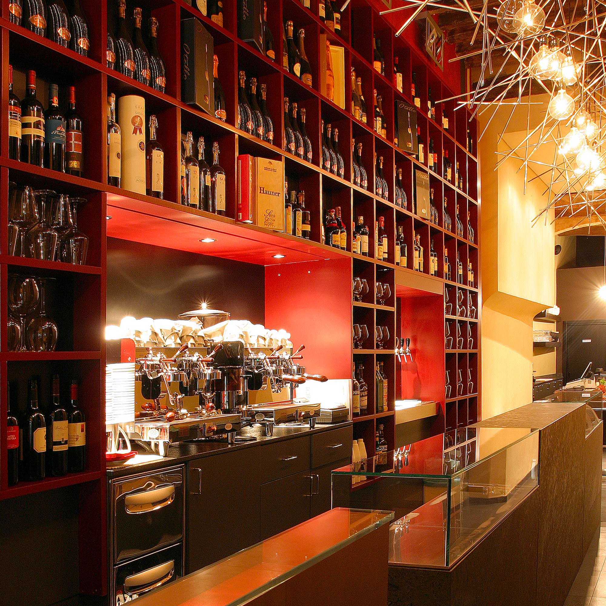
Gli elementi che rendono unico e particolare questo spazio sono la grande scaffalatura posta dietro il bancone di servizio che ospita le diverse qualità di vino; il lampadario sospeso e leggero è formato da profili in alluminio assemblati in loco che creano un gioco caleidoscopico, interrompendo lo spazio geometrico lineare dell’ingresso. I colori caldi utilizzati per fare risaltare i volumi si ripetono e si alternano in tutto il locale.
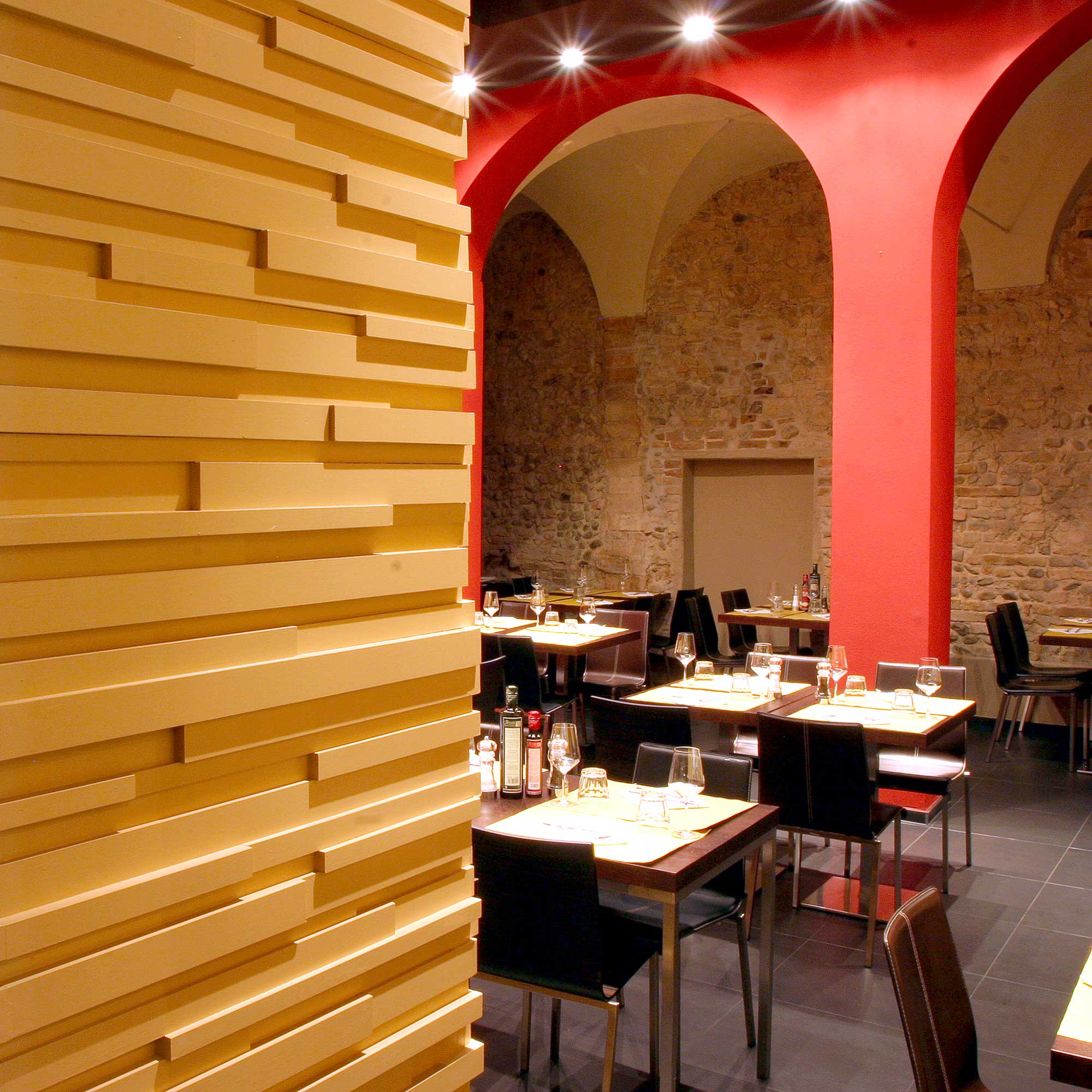
Ad uno spazio adibito all’esposizione dei cibi e completato da una scaffalatura contenente i prodotti culinari in vendita, segue un’area riservata alla consumazione che riprende i colori presenti all’ingresso – il nero, il bordeaux e il beige – mentre alcune pareti rimangono in pietra “a vista”.
Gli elementi che caratterizzano questo spazio sono il grande lucernario posto sul soffitto, rinnovato seguendo un gusto liberty, e la presenza di pilastri, rivestiti con listelli a posa orizzontale che smorzano la verticalità imposta dalla struttura e spezzano, ancora una volta, lo spazio lineare dell’intero locale.
“La Table” is a pub in the center of Parma, renovated and renewed with modern taste. Inside it is divided into four spaces based on function. The first room is long and narrow and is a bar and wine tasting room which features quality materials like leather and natural stone, for example the counter covering. The wooden ceiling, already present, was recuperated, renewed and made visible. The elements that render this pub unique and special are the large shelves located behind the service counter containing the different types of wine and the custom assembled lightweight hanging lamp in aluminum that creates a kaleidoscope effect which interrupts the linear space of the entrance.
The warm colors used increase the volumes, repeating and alternating throughout the rooms. In a space for showcasing the dishes served there are also shelves with products offered for sale, followed by an area for consummation which repeats the colors in the entrance –black, bordeaux and beige, while other walls remain in exposed stone.
The elements that characterize this space are a large skylight located on the ceiling renovated in Liberty style and the presence of pilasters covered with horizontal slats, which diminish the verticality, imposed by the structure and once again break the linear space of the entire pub.




Cantina CECI

Showroom
Interior design
2018-2019
Location: Parma IT
Client: Cantina CECI
Area: 90mq
Provide Service:
Architectural design
Interior design
Facade design
Lighting design
Works management
Cantina CECI 1938
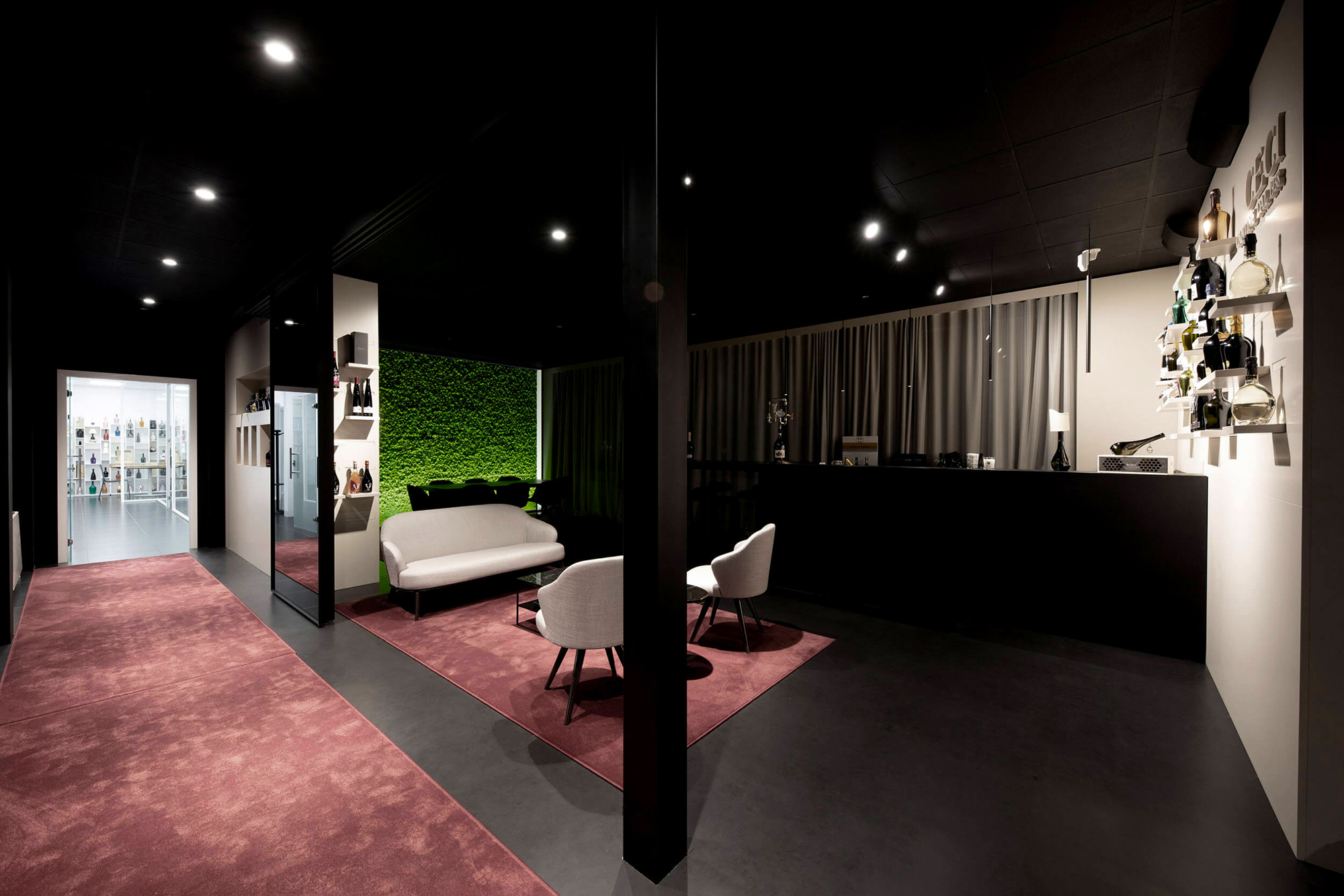
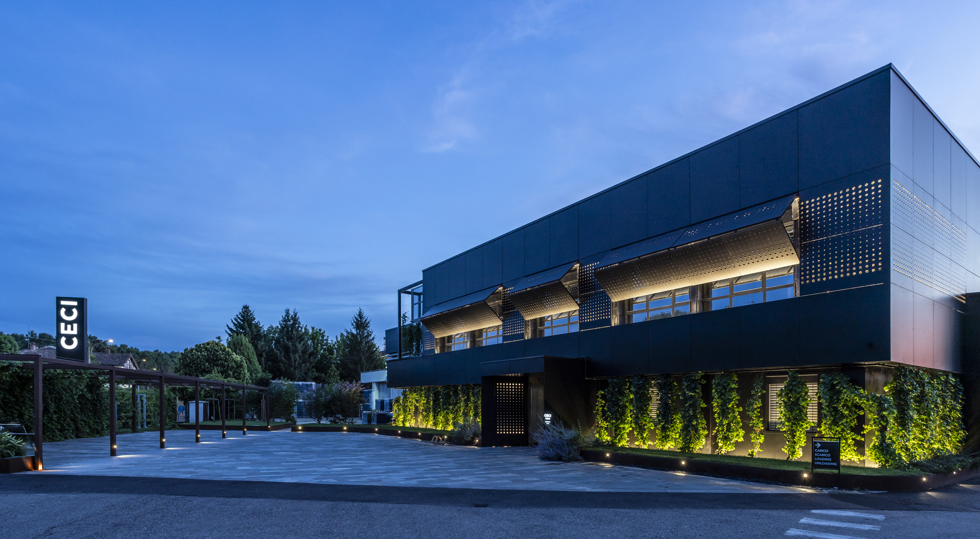
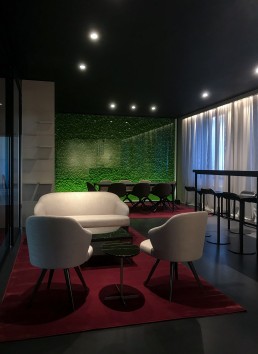
Per la realizzazione di una nuova sala degustazione della cantina Ceci si è partiti dallo studio della rappresentazione del marchio andando ad individuare gli elementi caratterizzanti la personalità dell’azienda e trasponendoli nella rappresentazione degli spazi attraverso colori, arredi e materiali. I caratteri di tradizione, territorio, famiglia e classicità sono reinterpretati attraverso una ricerca formale in elementi di alta qualità e design, creando un ambiente identificativo del marchio e che lasci al visitatore l’impressione di esserne diventato parte integrante.
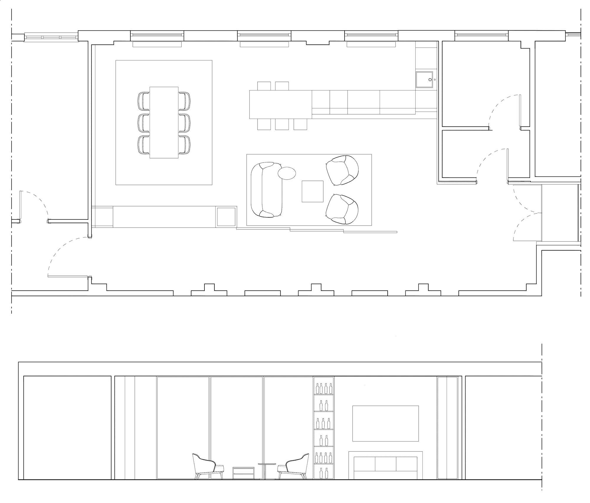
I colori scelti sono il nero, il bronzo e il bordeaux mentre i materiali sono il legno, il marmo e il vetro. Lo spazio è suddiviso in tre zone: la prima è costituita dal bancone bar, disegnato su misura, come la parete su cui si innesta, studiata come spazio dinamico di esposizione delle bottiglie attraverso un sistema di mensole a scomparsa all’interno della boiserie; la seconda zona è una sorta di salottino, dove poter degustare i prodotti sentendosi accolti nell’intimità di un salotto privato; la terza ha una duplice identità, può essere identificata da un grande tavolo centrale, pensato per gruppi più numerosi ma anche per eventuali riunioni, oppure come sala video; infatti spostando il tavolo centrale all’interno di un mobile disegnato su misura, si crea lo spazio per posizionare le sedute per accogliere le persone per la proiezione di video attraverso il grande schermo sito che si trova anch’esso all’interno del mobile.
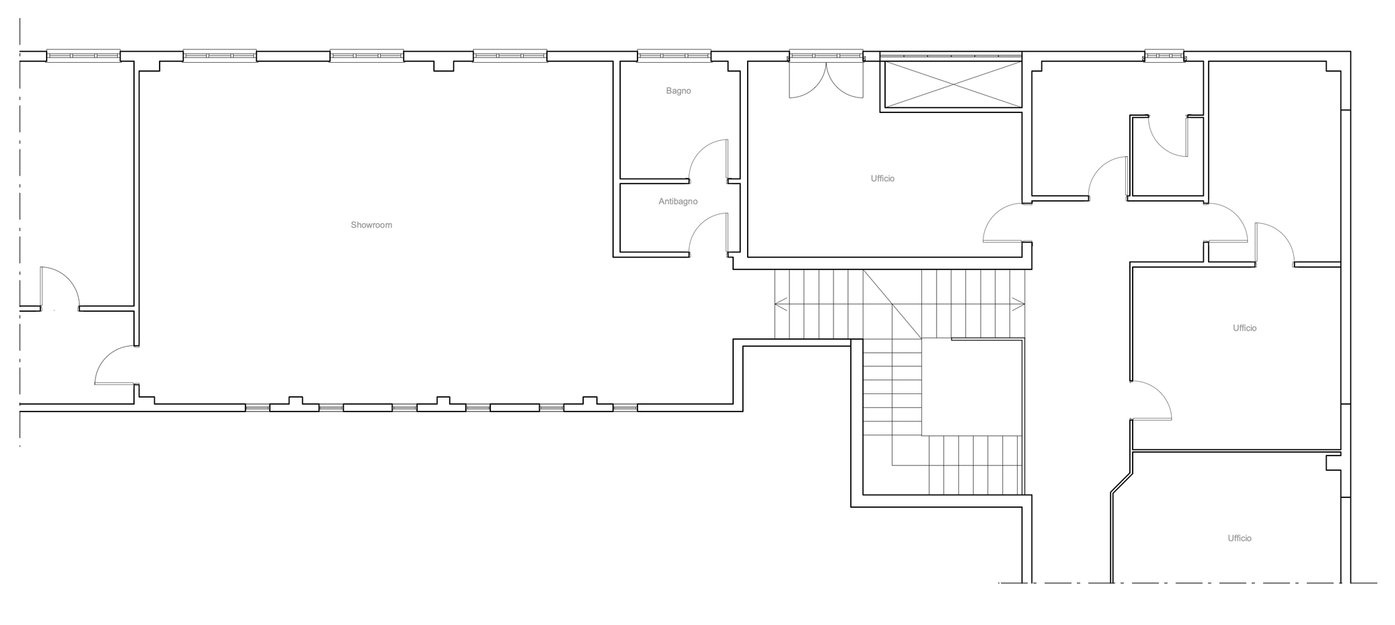
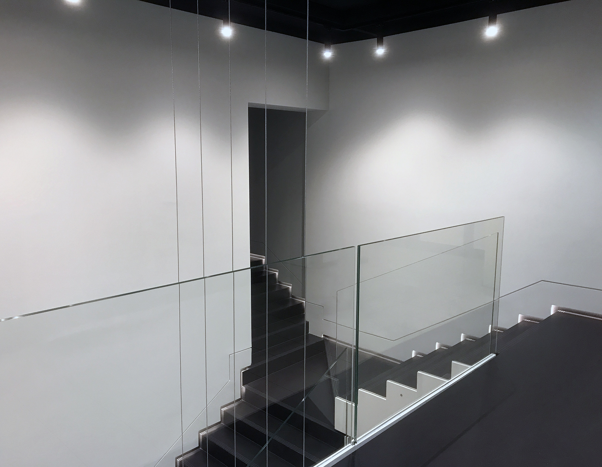
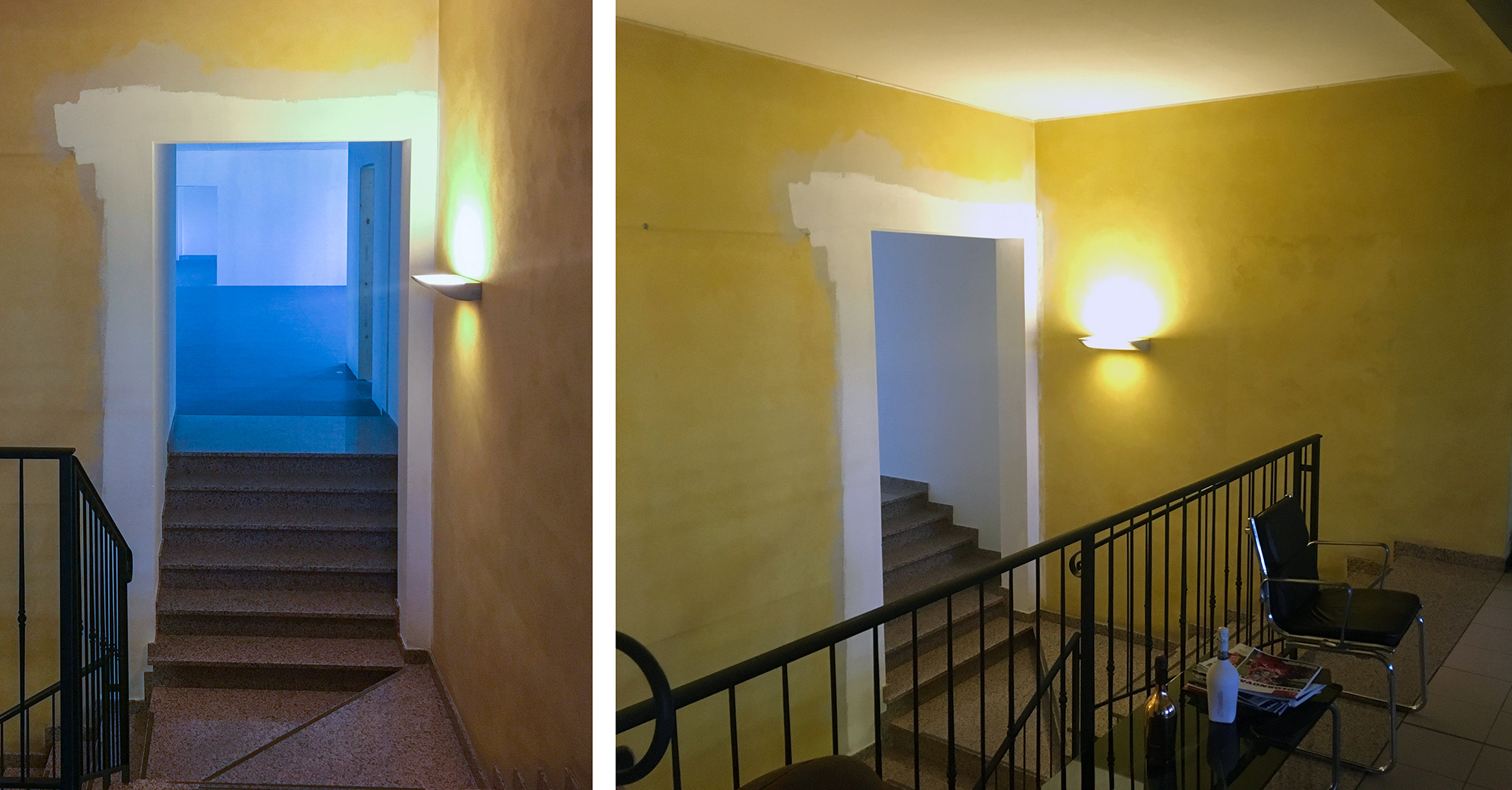
La parete di fondo diventa un grande giardino verticale, i cui colori contribuiscono ad esaltare ulteriormente l’atmosfera insieme al sistema di luci incassate a soffitto. Successivamente i lavori si sono estesi anche alla risistemazione della scala di accesso alla sala degustazione, il cui aspetto non risultava essere conforme al nuovo spazio. Si sono rivestite sia le pareti, con il cartongesso, che la scala, con piastrelle su misura in grès, completando il tutto con un nuovo parapetto in cristallo. I nuovi materiali, i colori e le luci utilizzate, creano la giusta atmosfera, raccolta ed essenziale, che introducono alla sala degustazione dove sono espressi appieno i caratteri del marchio Ceci.
CECI Wine Cellars
The creation of a new tasting room for Ceci cellars began by studying the brand and going on to identify the traits of the company’s personality and then transposing this to the spaces by use of color, design and materials. The traits of tradition, territory, family and classicism are reinterpreted through formal research in high quality and design elements, creating an atmosphere of brand identity which gives the visitor the impression of becoming an integral part. The chosen colors are black, bronze and burgundy while the materials are wood, marble and glass. The space is divided into three zones; the first is a bar counter, custom designed, as is the wall on which it is built, studied as a dynamic exhibition space for the bottles by use of vanishing shelving inside the boiserie; the second zone is a sort of private chamber where one can taste the products, feeling welcomed by the idea of being in a private boudoir; the third has a dual identity, it could be identified by the large central table, thought for larger groups or also for meetings, or as a video theater; in fact by moving the central table into a custom designed piece of furniture, a space is created for seating for the projection of videos on a large screen contained also in the same piece of furniture.
The back wall becomes a large vertical garden, where the colors contribute to further exalt the atmosphere together with the built-in lighting on the ceiling. Later the intervention was extended also to the redoing of the staircase leading to the tasting room, because it was no longer in line with the new space. The walls and the staircase were covered with plasterboard and porcelain tiles, completing all with a new plate glass railing. The new materials, the colors and lighting used creates the right atmosphere, cozy and essential, which introduces us to the tasting room, where the characteristics of the Ceci brand are fully expressed.