
L'oca Bianca Ristorante

Restaurants & Bars
Interior design
Architecture
2015-2018
Location:
Salsomaggiore IT
Client:
Ristorante L’oca Bianca
Area: 470mq
Provide Service:
Architectural design
Interior design
Lighting design
Works management
L’oca Bianca Ristorante
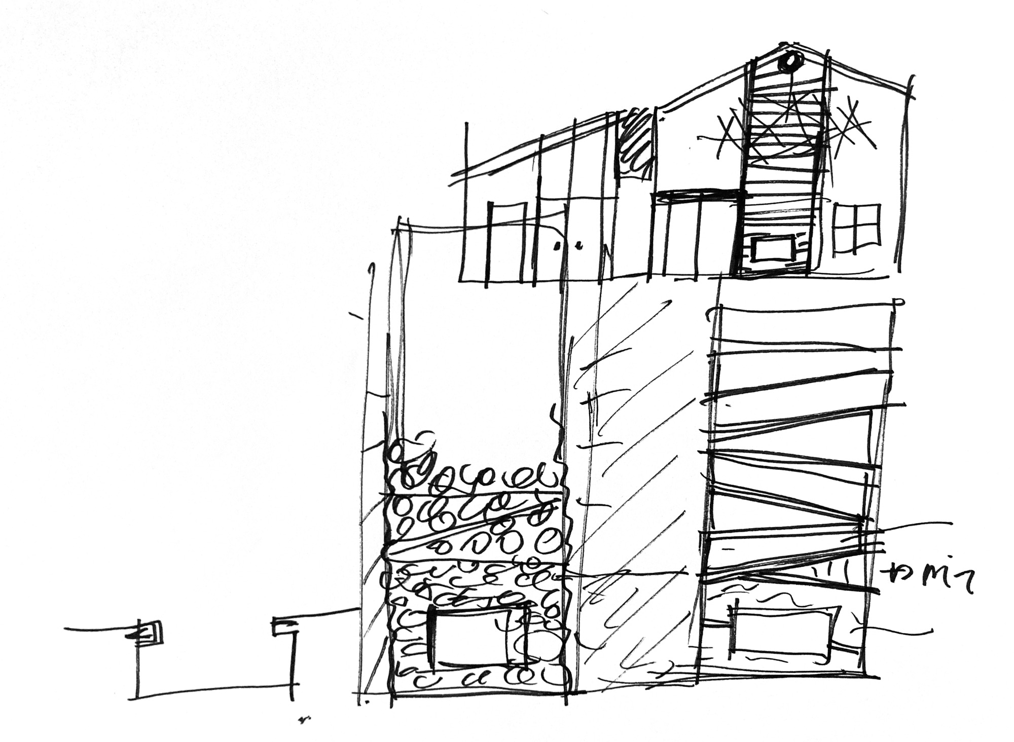
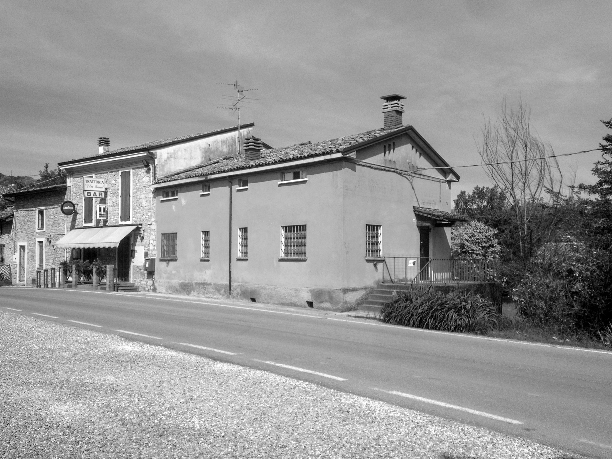
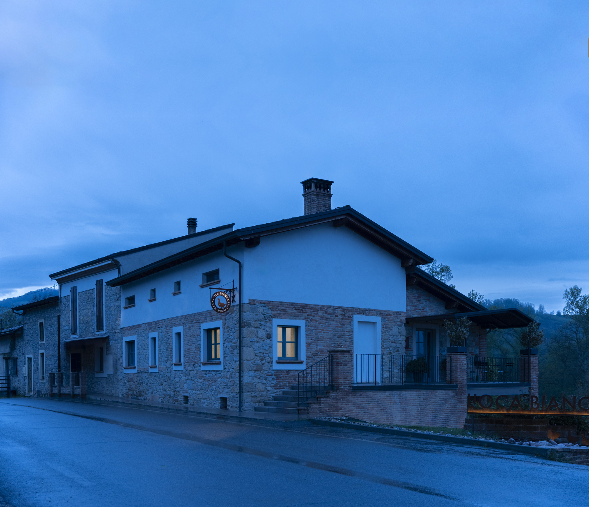
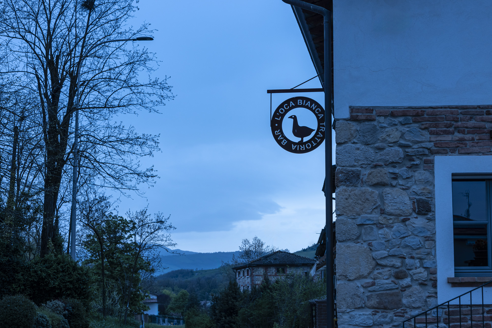
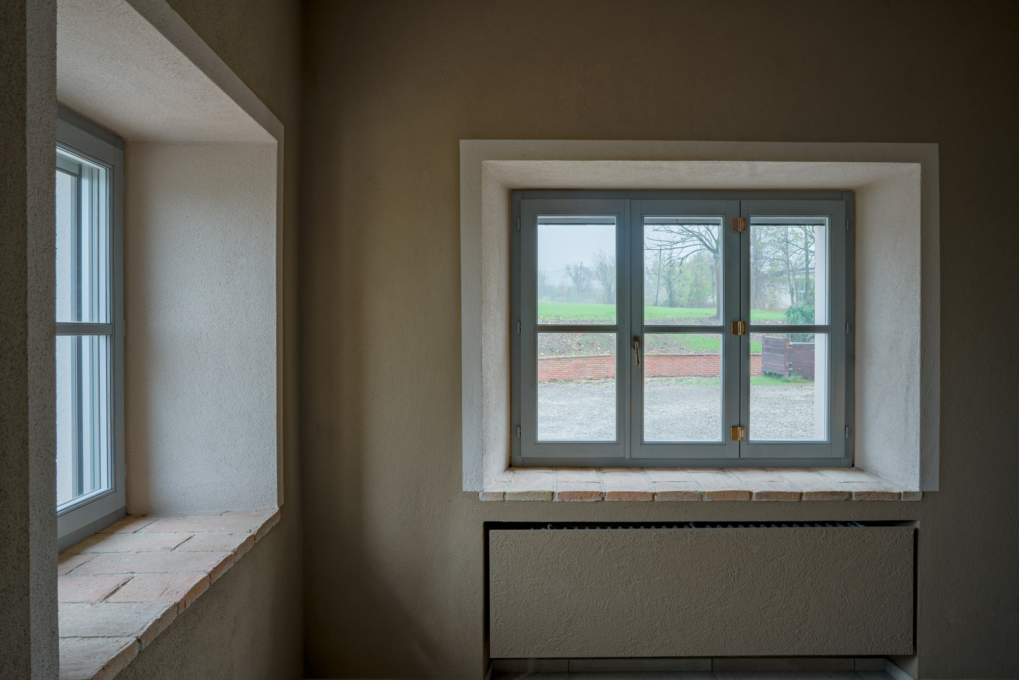
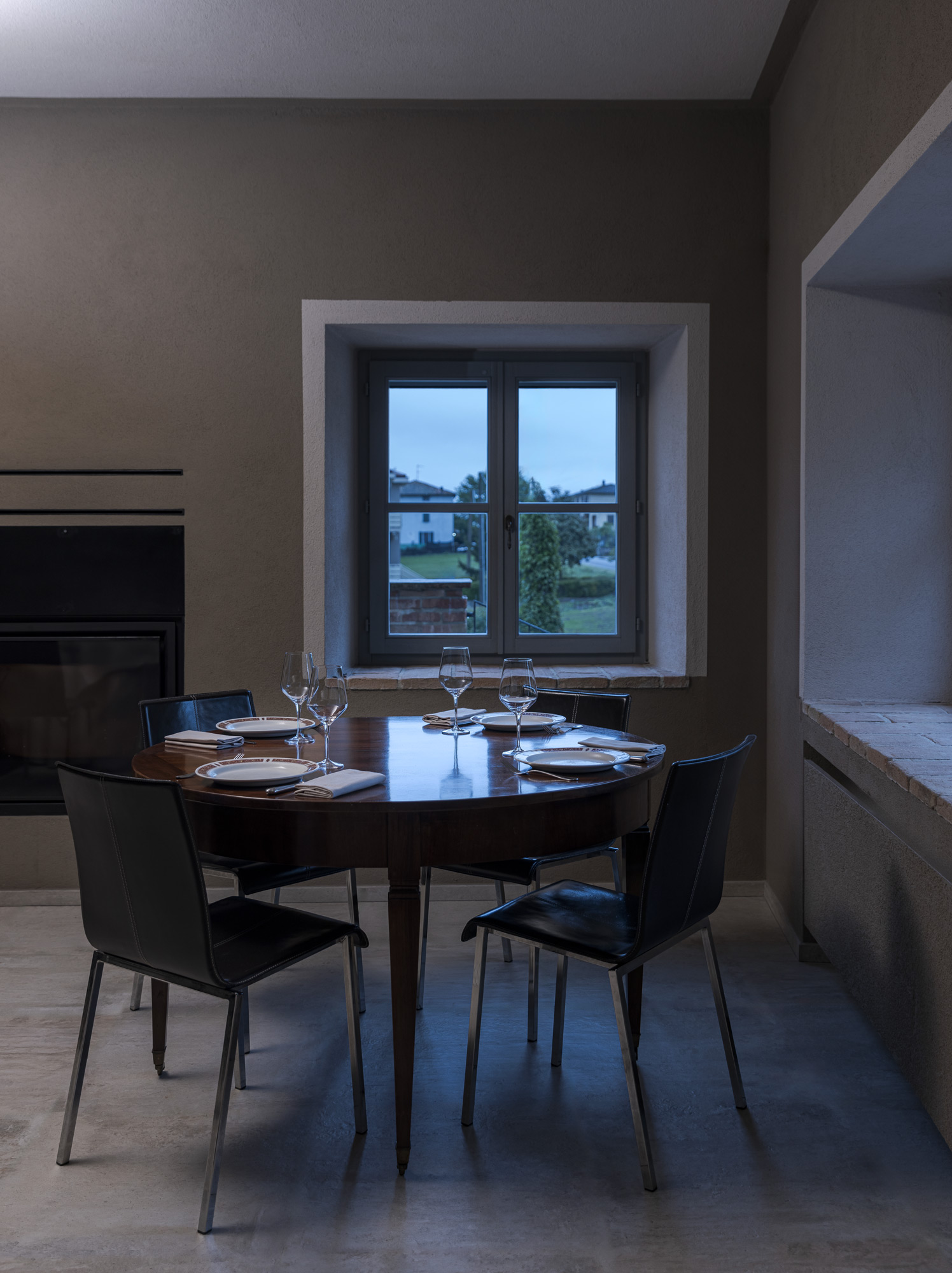
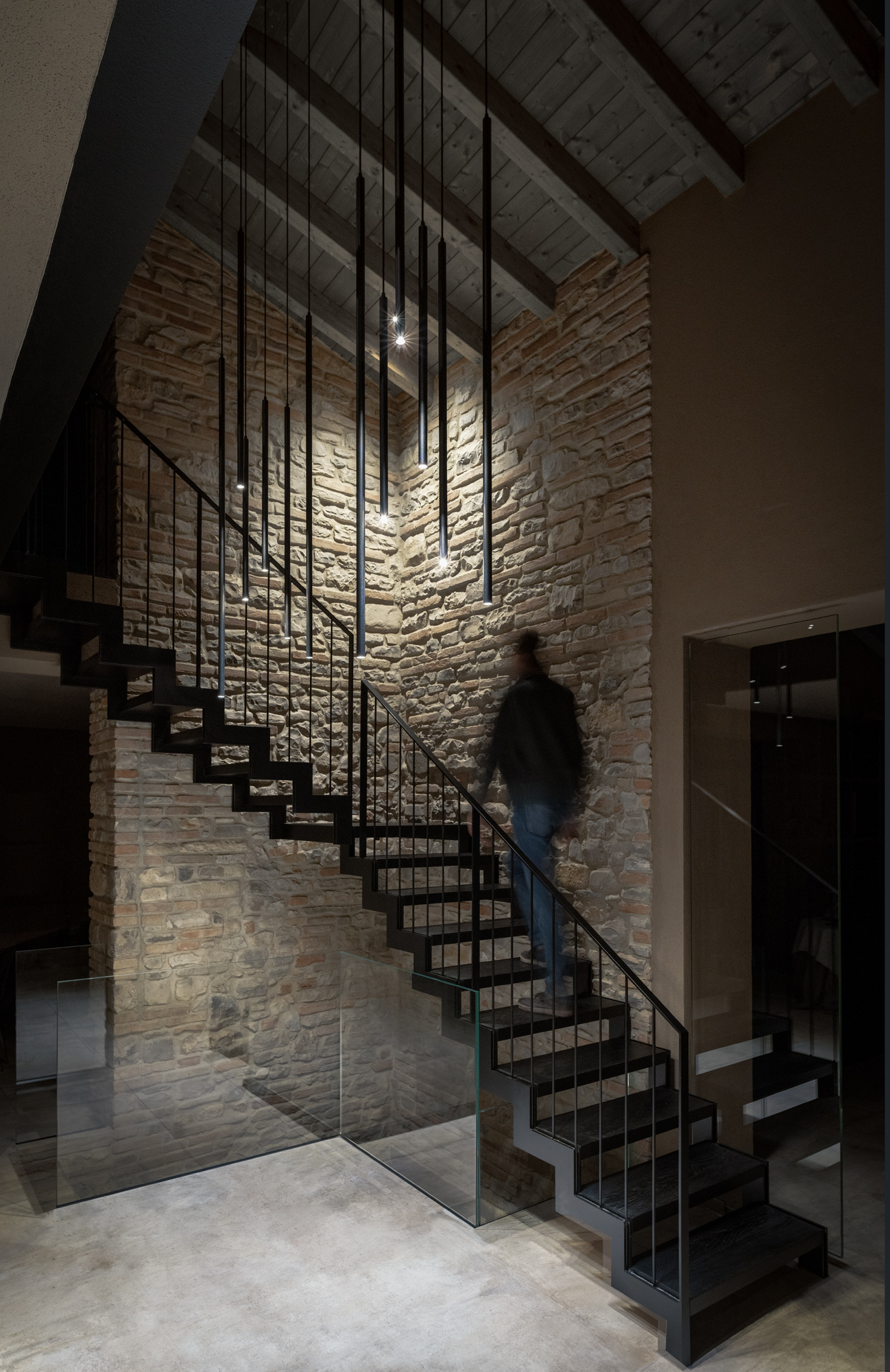
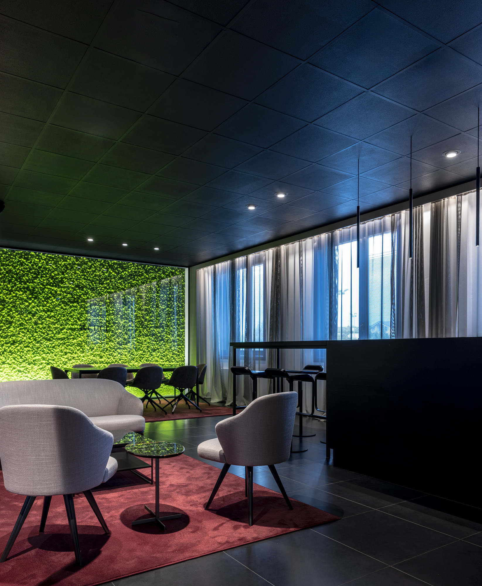
Lavori di ampliamento per una tipica e rinomata trattoria, L’Oca Bianca, nel comune di Salsomaggiore Terme. Il locale, a gestione familiare, distribuito nelle tre sale di una vecchia abitazione rurale risistemata, necessitava di maggior spazio per la clientela. Si è deciso di allargarsi nella casa confinante, non ancora ristrutturata, mantenendo così la cucina originaria, spostando l’ingresso e ottenendo una nuova spaziosa sala al piano terra, una cantina con saletta e un soppalco molto suggestivo. Volendo mantenere i caratteri presenti negli spazi esistenti per dare continuità al locale, le pareti restano in mattoni, i pavimenti in grès e i serramenti in legno mentre la copertura resta in legno naturale nella sala e viene verniciata nella zona bar. L’ingresso con il nuovo bancone bar, disegnato su misura insieme alla parete dove esporre i prodotti serviti nel menù del ristorante, apre la vista sulla sala a tutta altezza dove si accede al soppalco tramite la scala disegnata su misura e realizzata in ferro e rivestita in legno. Ad unire lo spazio è il grande lampadario, anch’esso disegnato su misura, formato da tanti pezzi unici che vengono poi riproposti singolarmente al bancone bar e come punto luce dei singoli tavoli. Anche le luci a parete vengono realizzate su misura, come lame di luce, creano atmosfera disegnando lo spazio senza essere invasive. Luce che crea atmosfera anche nei bagni dove il colore dominante è il nero, che diventa scenografia a disposizione dei giochi di luci creati dai faretti a soffitto e dagli specchi incassati e retroilluminati.
Works enlarging a typical and well-known restaurant, The White Goose located in Salsomaggiore Terme. The family run establishment which included three halls in a rebuilt old rural house needed more room for its clients. It was decided to enlarge by adding an adjoining house which had not yet been restructured and to maintain the original kitchen, and move the entrance thus obtaining a new a spacious hall on the ground floor and a cellar with a small room plus a very suggestive loft. Wanting to retain the character of the existing spaces to give continuity to the whole, the walls stayed brick, the floors stayed grès and the doors and windows were wooden as before. The ceiling remained in natural wood in the hall and was painted in the bar area. The entrance, with its new custom designed bar counter and its wall shelves for showing the products, opens out to the view of the dining rooms on all levels where the loft is reached via a new custom designed staircase in wood and steel. To unite the spaces is the large lamp, also custom designed, made up of many single pieces that are then also used individually on the bar counter as light points creating atmosphere without being invasive. Lighting which also creates atmosphere in the restrooms where the dominant color is black and which becomes scenography, is created by the ceiling spotlights and the built in mirrors lighted from behind.


Prema Nature Project


Headquartes & Commercial
Architecture
2002
Location: Milano IT
Client: Private client
Area: 1.000.000 mq
Provide Service:
Masterplan
Landscape design
Prema Nature Project
Punto internazionale di incontro del mondo “BIO”
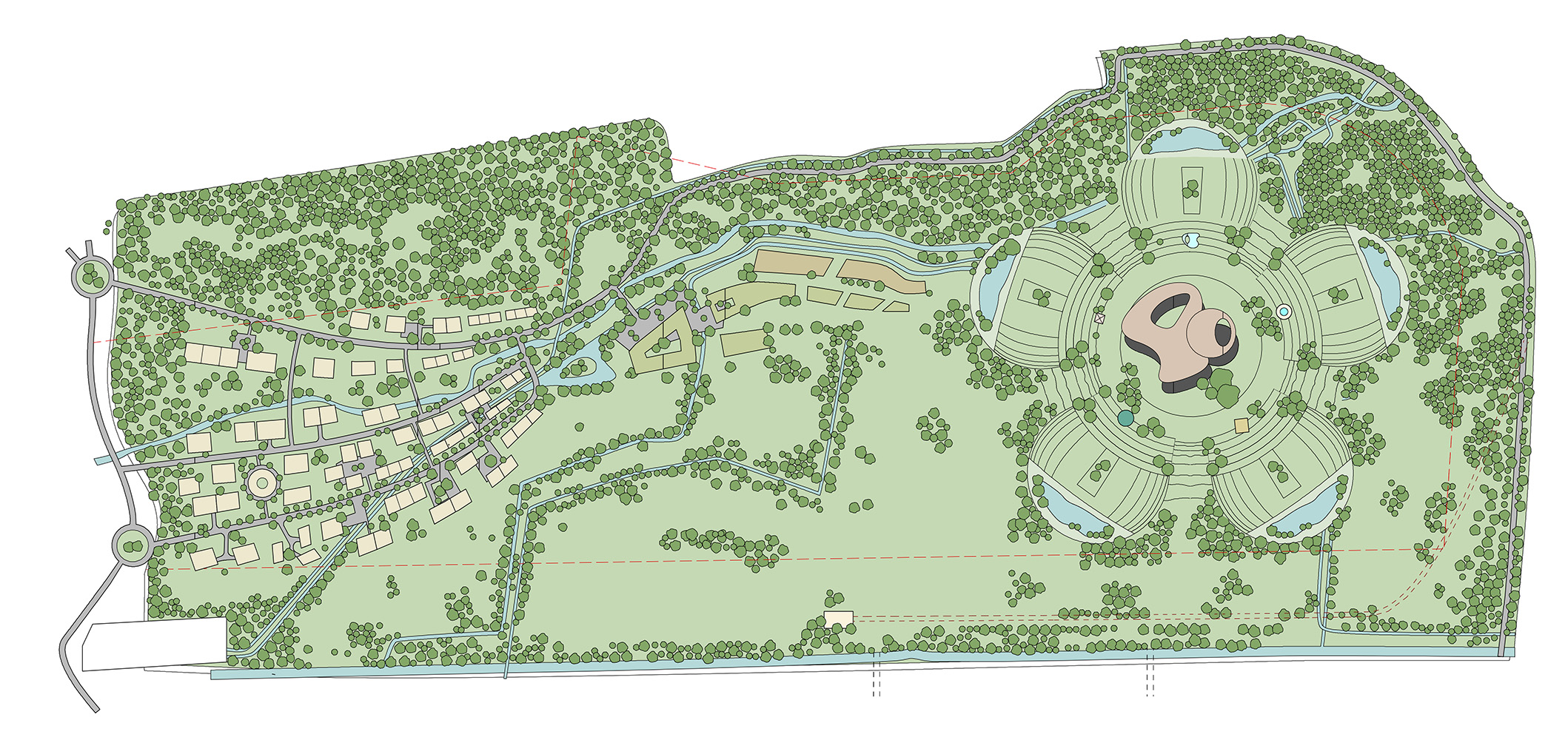
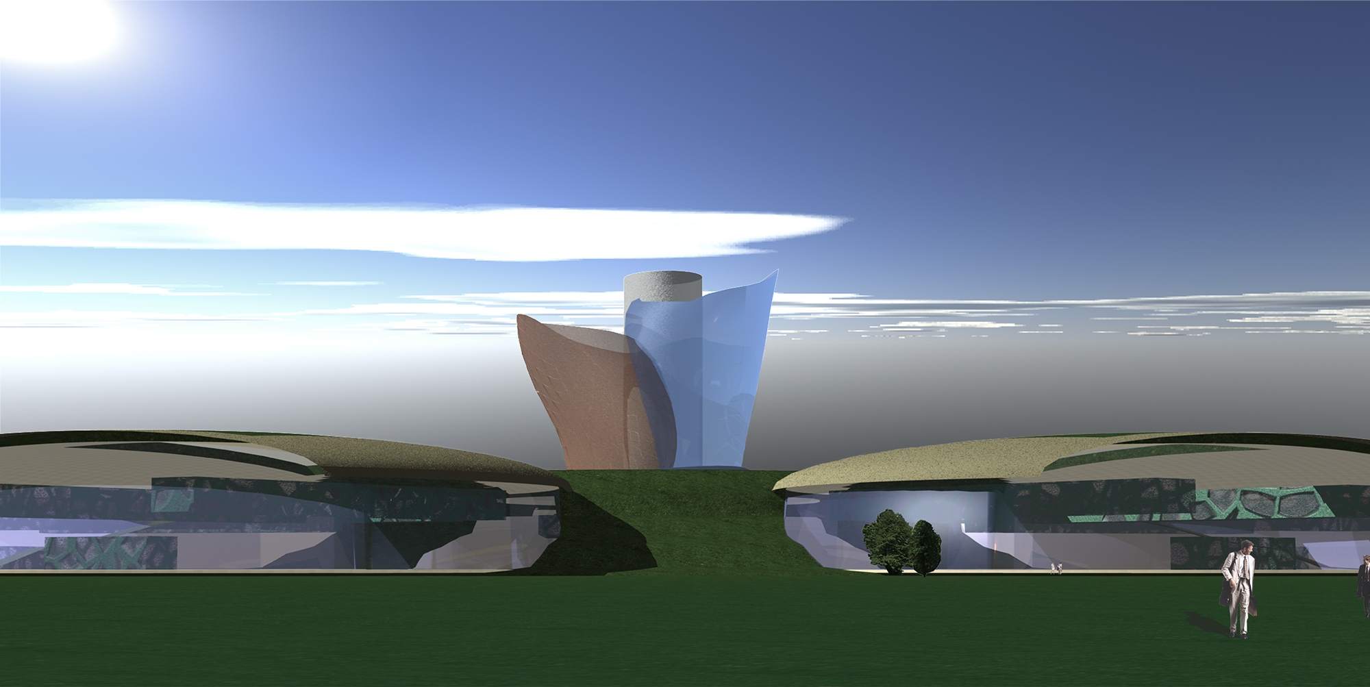
La missione del villaggio era quella di aggregare e certificare nella nostra nazione le migliori tecnologie bio-ecologiche, sviluppate attraverso attività di ricerca e di implementazione delle più innovative aziende al mondo. Da un’idea dell’imprenditore Boscaini, il progetto è stato affidato allo studio di Albino Vescovi. Con un’area d’intervento di circa 1 milione di metri quadrati Prema Nature project prevedeva un campus con laboratori, uffici, alberghi e residenze, progettati secondo principi di ecosostenibilità, ecocompatibilità ed utilizzo di energie rinnovabili, fino ad arrivare ad un nucleo centrale. Il “cuore” del progetto consisteva in una fiera tecnologica permanente: 5 padiglioni (bio ediliza, bio energia, bio design, bio fashon and cosmetics, bio food and medicine) disposti intorno ad un sesto elemento centrale, un “museo del design e delle arti applicate”. Il progetto Prema Nature Project si è concluso alla prima fase di progettazione – masterplan.
International meeting point for the “BIO” world
The mission of the village is to gather and certify the best bio-ecological technologies that have been developed through research and implementation by the most innovative companies worldwide for use here in Italy. Following Bosciani’s idea, the project was entrusted to Albino Vescovi’s studio. With an area of of about 1 million square meters Prema Nature project foresees a campus, laboratories, offices, hotels and residences designed according to eco sustainable, and eco compatible principles plus the use of renewable energy up until the central core. The “heart” of the project consists in a permanent technological fair: 5 pavilions (bio construction, bio energy, bio design, bio fashion and cosmetics, bio food and medicine) placed around a sixth central element, a museum for design and applied art. The first phase of planning, the master plan of this project has been completed.






Cantina CECI

Winemaker
Facade design
Architectural
2017-2024
Location: Parma PR
Client: Cantina Ceci
Area: 800mq
Provide Service:
Architectural design,
Facade design
Lighting design
Works management
Cantina CECI 1938
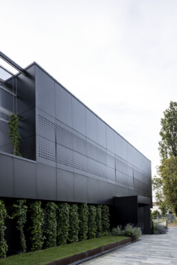
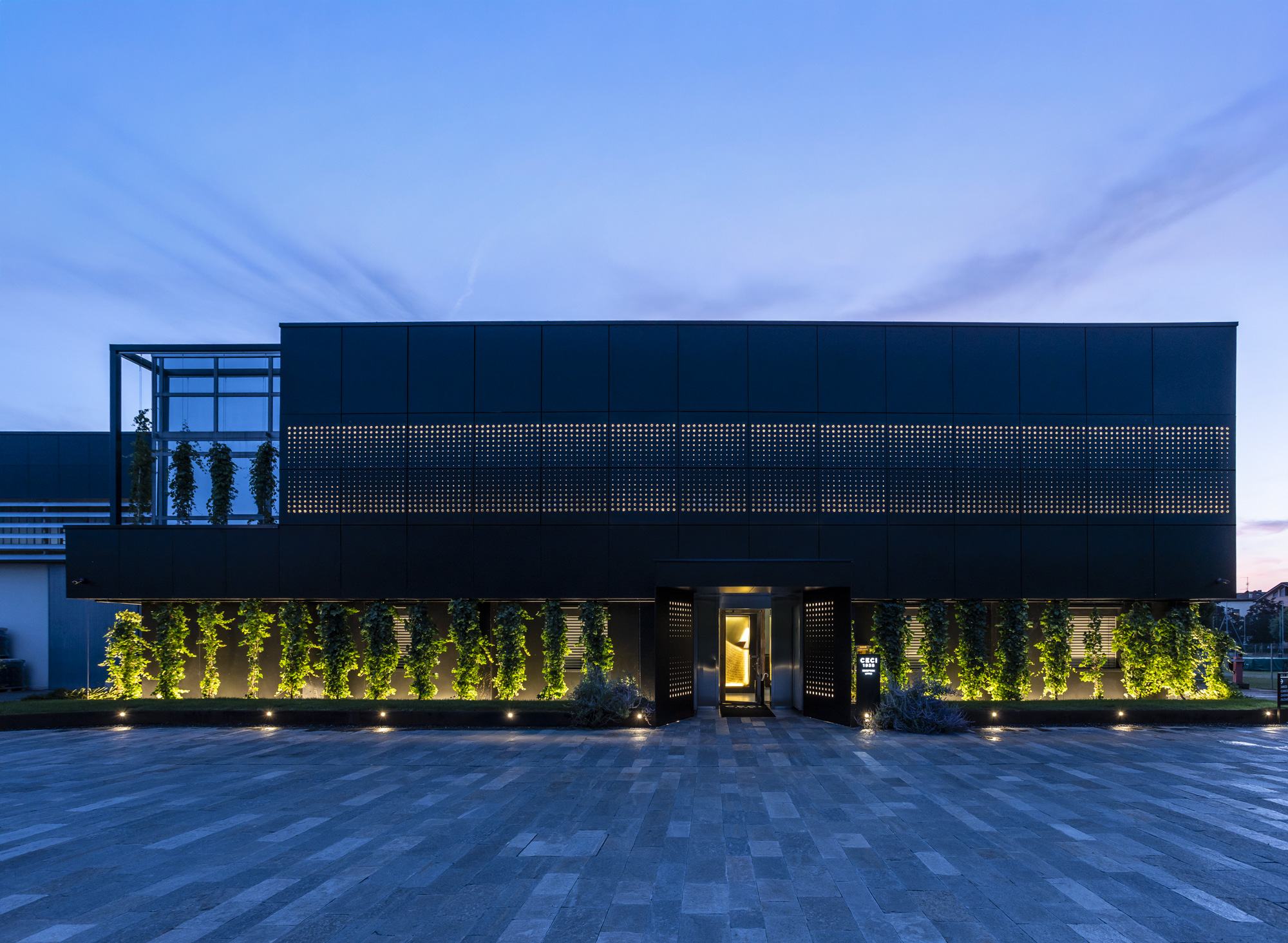
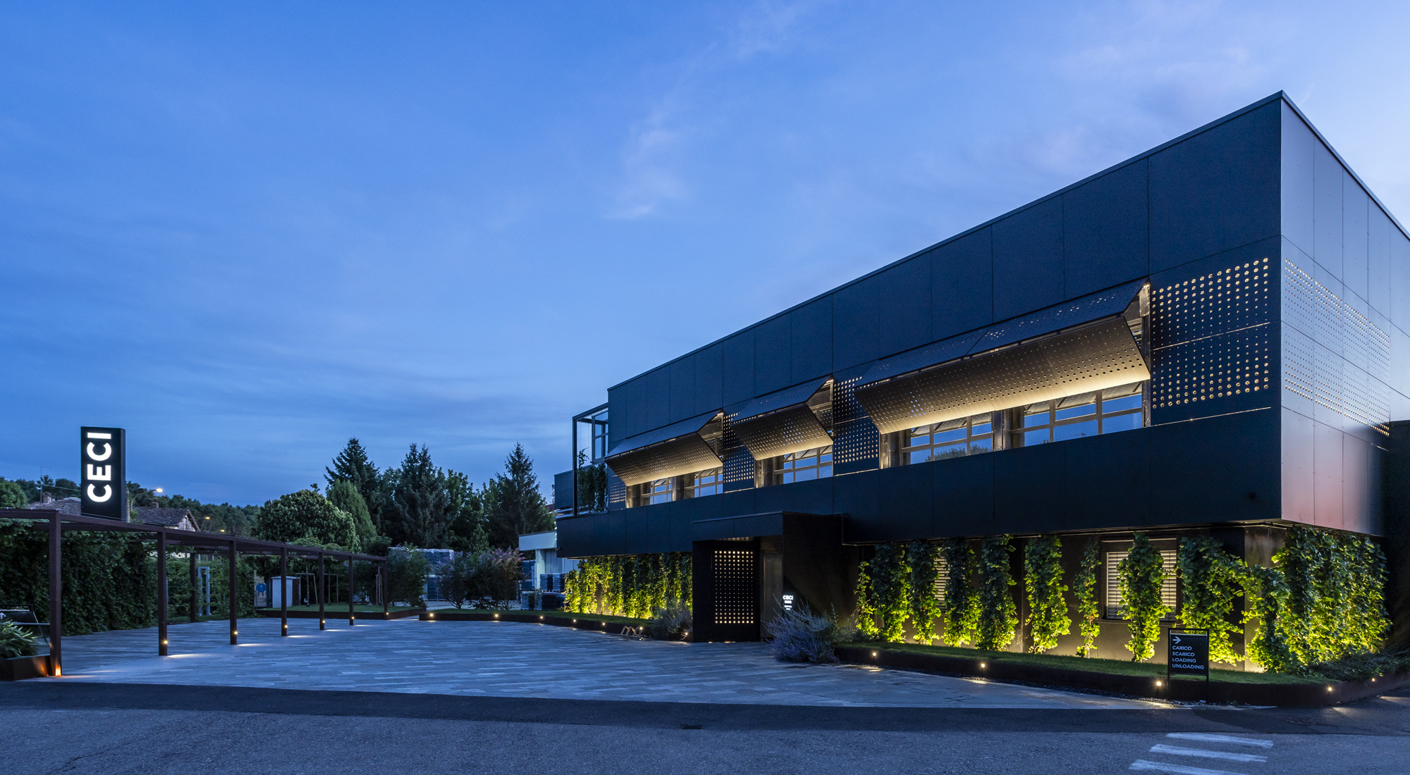
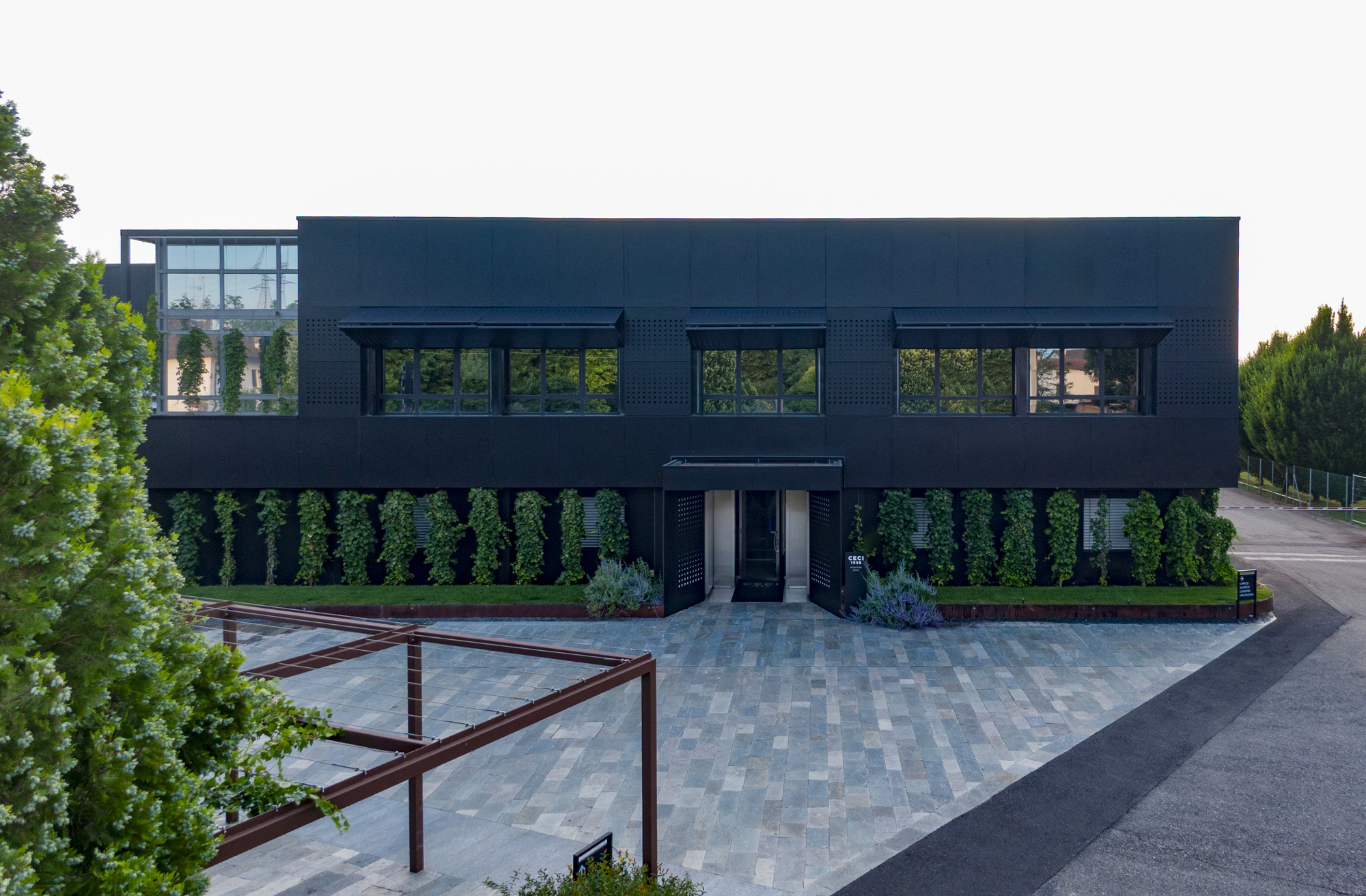
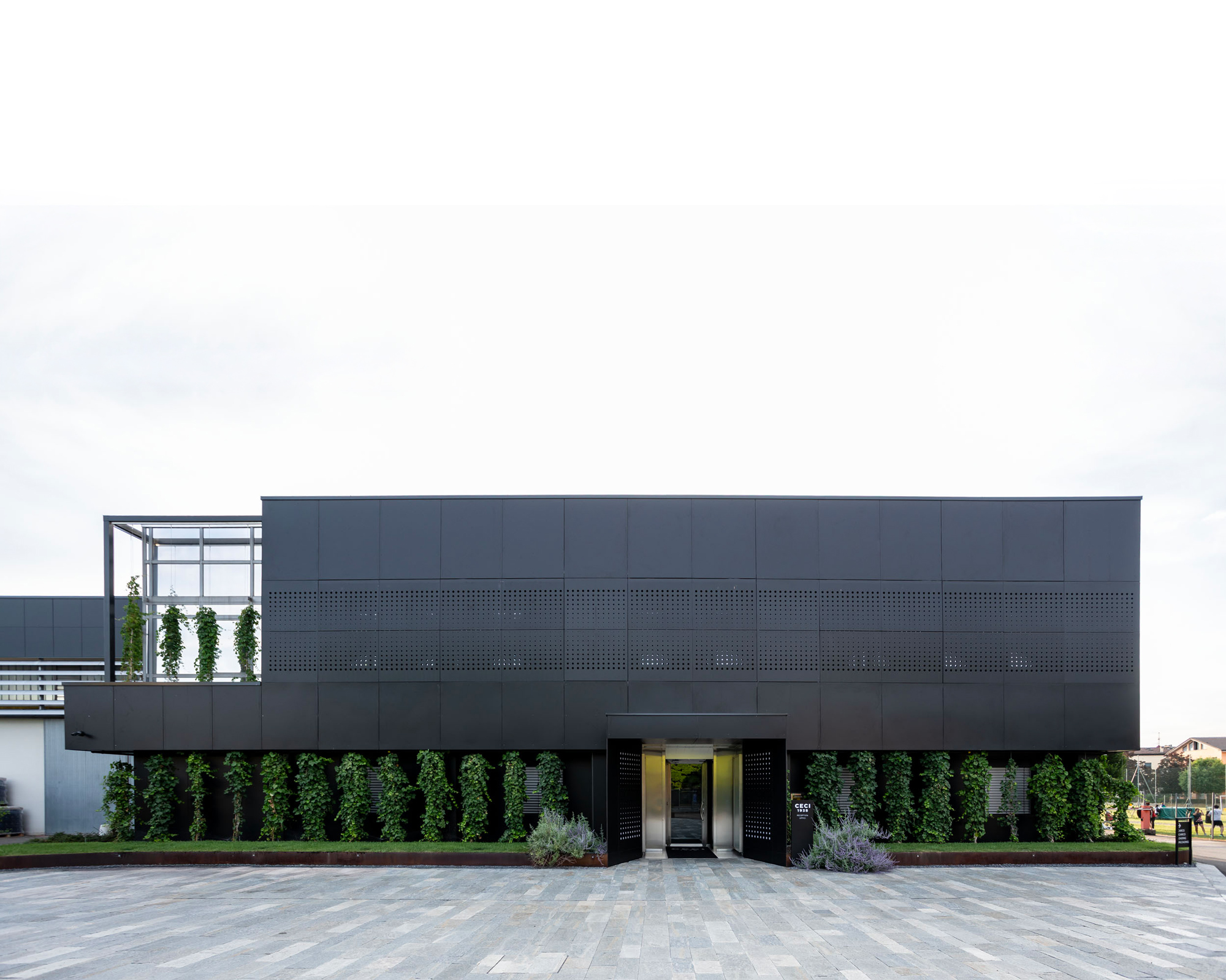
La nuova facciata di Cantina Ceci, completamente rivisitata, riflette l’eleganza del brand grazie ai rivestimenti neri e al verde perimetrale che richiama la natura. Le uve provengono dai vigneti di Torrano, nella Bassa Parmense, per la produzione del celebre Lambrusco, spumanti e vini Ceci 1938. La cantina si presenta oggi come una fashion winery dallo stile contemporaneo e innovativo.
Lo studio ha curato anche gli interni per la degustazione e ridefinito gli esterni. Sulla facciata, tiranti metallici sorreggono rampicanti che avvolgono il piano terra e risalgono nella zona vetrata, articolando e incorniciando l’edificio. I vecchi frangisole del primo piano sono stati rimossi: al loro posto, pannelli in Trespa forati con una texture ispirata alle bollicine del Lambrusco. Questi pannelli, apribili a libro, filtrano la luce e offrono protezione solare. Di sera, la retroilluminazione crea un suggestivo gioco di luci.
Anche il piazzale è stato riqualificato: la nuova pavimentazione in pietra di Luserna, insieme al verde, definisce gli spazi pubblici, di servizio e il parcheggio, dove le pensiline per le auto sono rivestite con gli stessi rampicanti, creando un disegno continuo e armonico.
The newly redesigned façade of Cantina Ceci reflects the elegance of the brand with its black cladding and surrounding greenery, evoking a strong connection to nature. The grapes used to produce the renowned Lambrusco, sparkling wines, and other Ceci 1938 labels come from the vineyards in Torrano, a small village in the Parma lowlands. Today, the winery presents itself as a contemporary and forward-thinking fashion winery.
The studio also redesigned the tasting interiors and reimagined the exterior spaces. On the façade, metal rods support climbing greenery that wraps around the ground floor and ascends the glazed section, helping to define and frame the building. The old sunshades on the first floor were removed and replaced with Trespa panels, perforated with a texture inspired by the bubbles of Lambrusco. These folding panels filter light and provide sun protection, while still allowing the windows to open fully. At night, the backlighting creates a striking light pattern through the perforations.
The outdoor courtyard was also renovated: natural Luserna stone paving and greenery organize the space into public areas, service zones, and visitor parking. The parking spots are covered by pergolas clad with the same climbing plants used on the façade, creating a continuous and harmonious design.

Ongoing - Veda Resort

Wellness center
Architecture
2022
Status: Ongoing
Location: Croazia
Client: Private client
Provide Service:
Architectural design
Masterplan
Veda Resort
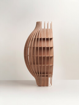
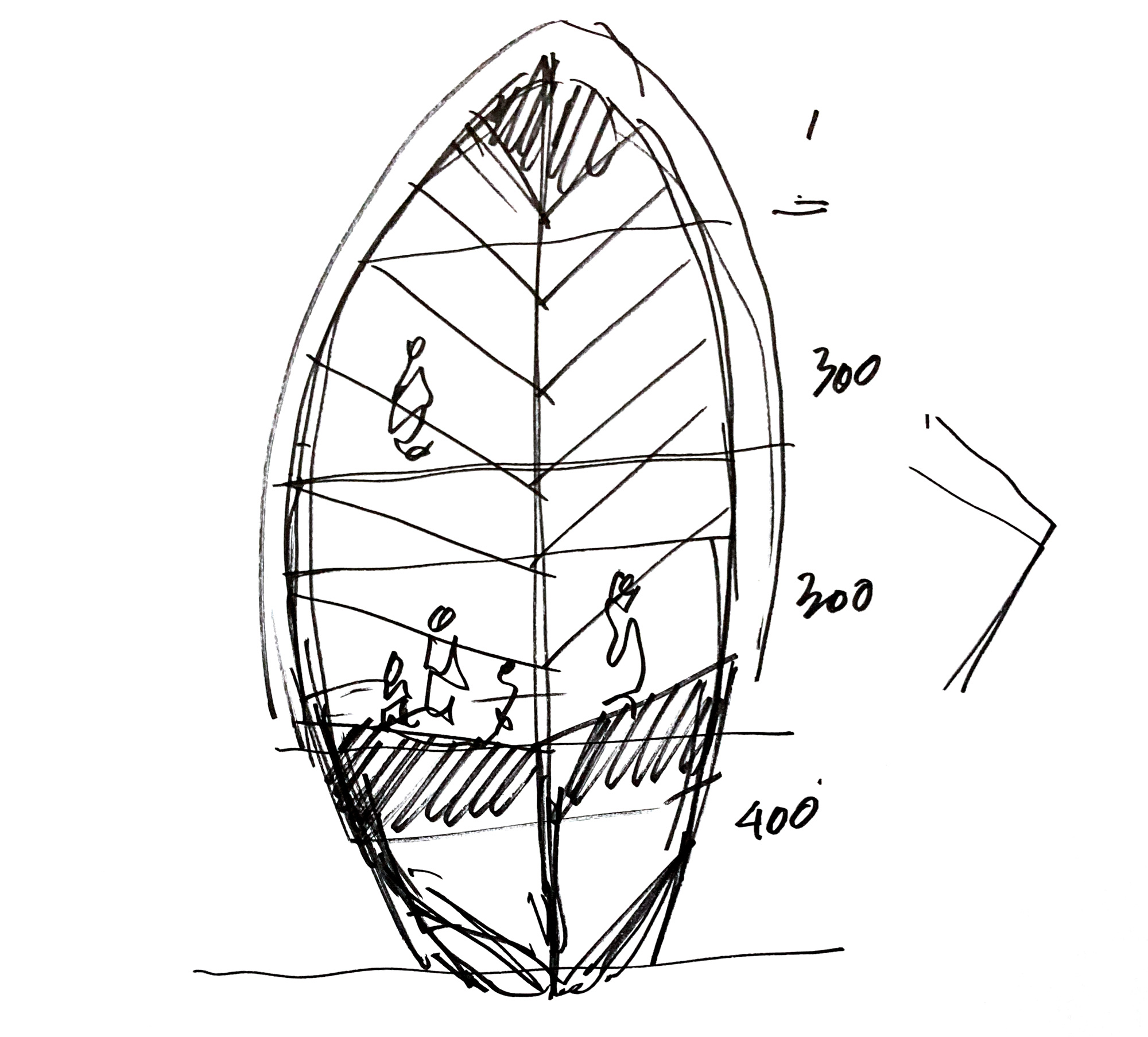
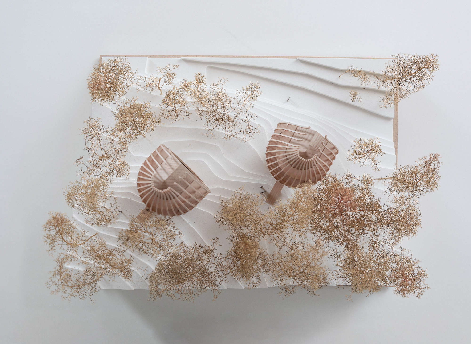
Il Veda Resort si propone di diventare il primo Healing Resort nel mondo, risvegliando una nuova cultura nel turismo d’affari nel segno di uno stile di vita sano, consapevole e in piena armonia con la Natura. Il concept sviluppato dal nostro studio è coerente con questa prospettiva: il resort è pensato secondo i principi dell’eco – building e si presenta con una forma profondamente evocativa. La ‘spa rigenerativa’ è radicata nella natura ma anche protesa al futuro. Richiamano la forma della foglia, gli edifici gemelli pensati per ogni resort. Il logo dei Veda resort diventano così vera e propria forma architettonica. Una scelta funzionale perché la base stretta non impatta sul suolo; una scelta simbolica ed estetica perché la foglia, nell’approccio olistico, racchiude in sé l’intera Natura.
I cinque piani racchiusi in questa ‘casa – foglia’ corrispondono a cinque suite, riservate ciascuna ad un ospite che può quindi ritrovarsi nel contatto con se stesso e con la Natura, grazie ad un’immensa vetrata che annulla il confine dentro/fuori. L’ospite si vede garantiti ampi spazi, ma anche una propria intimità. Oltre alle suite, gli edifici ospiteranno sale di rigenerazione, saune, piscine, sale terapeutiche, ristoranti, bistrot. La spa futuristica è stata pensata per essere proposta come forma di eco turismo di lusso in Croazia ed Europa. Ogni resort sarà circondato da un parco terapeutico, immerso nella natura incontaminata. I materiali prescelti per l’architettura sono legno, metallo e vetro, integrati in maniera armonica tra loro e con il contesto ambientale.
The Veda resort proposes to become the first Healing Resort in the world, reawakening a new culture in business tourism in the name of a healthy life style, aware, and in complete harmony with Nature. The concept developed by our studio is coherent with this perspective. The resort follows the principle of eco-building and has a very evocative form. The “regenerative spa” is rooted in nature but also posed towards the future. The twin buildings made for each resort recall the shape of a leaf. The Veda resort logo therefore becomes a real architectural form. A functional choice because the narrow base does not impact the ground, a symbolic and aesthetic choice because in the holistic approach, a leaf itself encompasses all of nature.
The five floors included in this “leaf- house” correspond to five suites, each one reserved to a guest who can therefore find contact with himself and with Nature, thanks to a large window that cancels the boundary inside/outside. The guest has ample space but also his own intimacy. Besides the suites, the buildings host regeneration rooms, saunas, swimming pools, therapeutic rooms, restaurants and bistros. The futuristic spa is to be proposed as a type of luxury eco-tourism in Croatia and in Europe. Each resort will be surrounded by a therapeutical park, immersed in uncontaminated nature. The materials chosen for the architecture are wood, metal and glass, integrated harmonically with each other and with the surroundings.


Casa di Accoglienza

Commercial
Architecture renovation
Interior design
2011-2013
Location: Piacenza IT
Client: Private
Area: 400mq
Provide Service:
Architectural design
Works management
Casa di Accoglienza
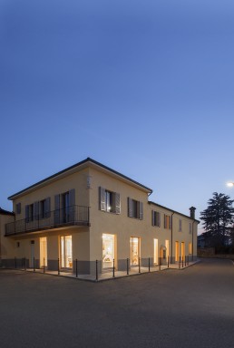
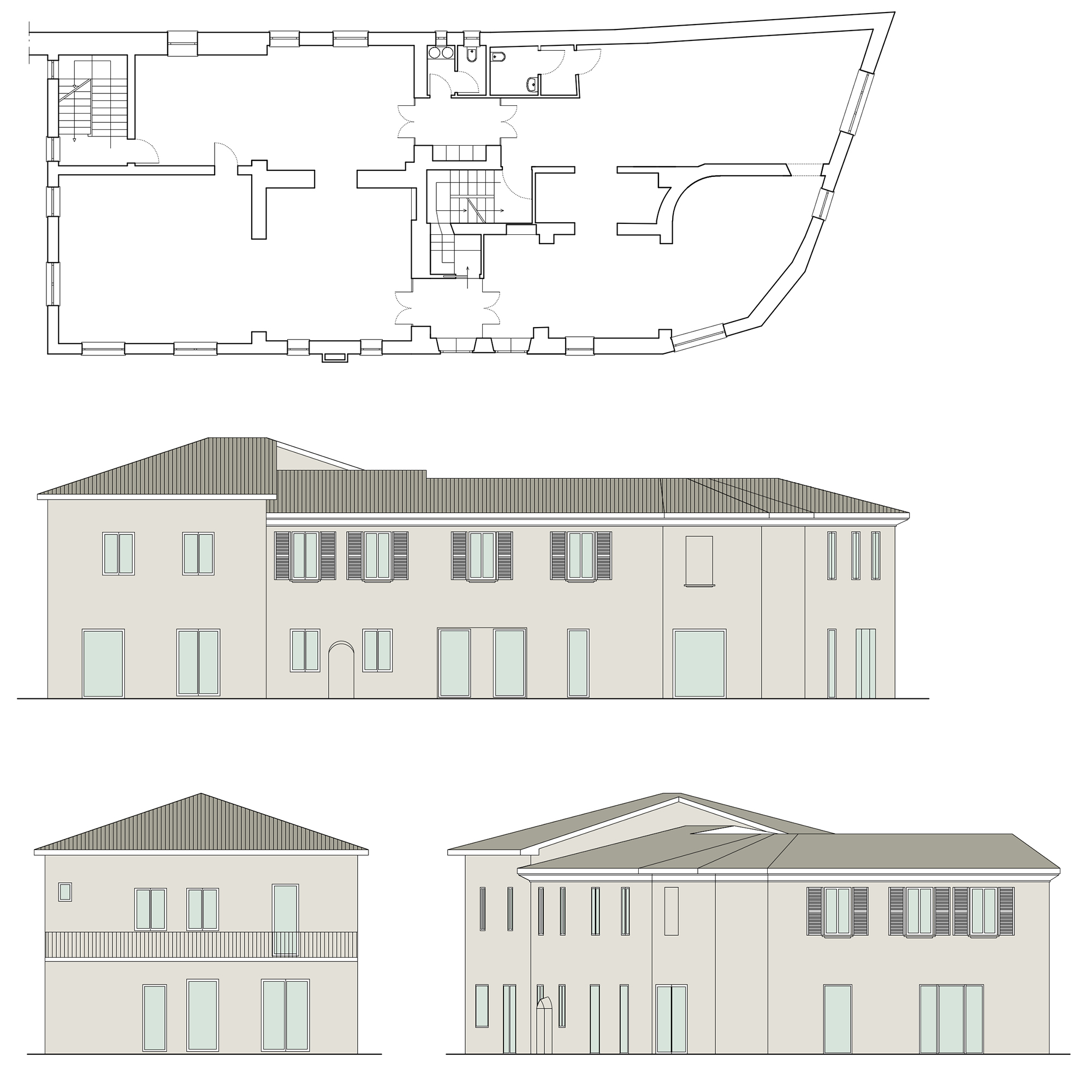
Un edificio al centro di un piccolo paese nel piacentino, recuperato, ristrutturato ed ottimizzato dal punto di vista funzionale ed estetico. Il piano terra, privato di davanzali e ostacoli visivi, con ampie vetrate a tutt’ altezza ospita un book shop ed un negozio di oggettistica religiosa dal sapore provenzale, legato al particolare culto di quest’ area molto sentito ed osservato. Dal punto vendita si accede alla zona di accoglienza, con un ampio salone e i servizi necessari ad ospitare i pellegrini che frequantano la zona, provenienti da tutta Italia e dall’ Europa centrale. La scelta cromatica ricade sui colori caldi (giallo, arancione) per conferire una sensazione di benessere e dare luninosità agli ambienti. Il piano superiore ospita locali ad uso residenziale, e come tutto il fabbricato, esternamente non ha subito notevoli modifiche per non allontanarsi dalla forma originaria della struttura. Per riordinare l’esterno della struttura sono stati rinnovati in pietra i marciapiedi che circondano il piccolo isolato.
A building in the center of a small town near Piacenza, recuperated, restored and optimized both functionally and esthetically. The ground floor, without visual obstacles or windowsills but with ample windows, has a bookshop and a store selling provincial religious items, which are dedicated to the special cult, strongly felt and observed here. From the shop the reception area is reached. It has an ample hall and all the services needed to host pilgrims who have come from all over Italy and central Europe. The chromatic choice is for warm colors (yellow, orange) in order to confer a feeling of wellness and illumination to the atmosphere. The upper floor has residential rooms and just like the rest of the building has not been modified too much in order to retain the basic original structure. To improve the exterior, stone sidewalks have been added, surrounding the little block.




La Fattoria di Parma

Food & Beverage
Architecture renovation
Interior design
2015-2017
Location: Parma IT
Client: Private client
Area: 2200mq
Provide Service:
Architectural design
Interior design
Facade design
Lighting design
Works management
La Fattoria di Parma
Una nuova immagine per l’azienda “La Fattoria di Parma”, salumificio che si affaccia direttamente sulla Via Emilia Parmense e che quindi punta sulla visibilità, data dall’ubicazione. Si parte dalla risistemazione del piazzale esterno, arrivando al rivestimento della facciata, sia dell’edificio principale che di quello a fianco, dove si trova la parte amministrativa, realizzati con i colori istituzionali dell’azienda: il rosso, il marrone e il grigio. Il rivestimento è realizzato con pannelli Trespa che definiscono la forma dell’edificio, con una fascia frangisole in legno che inquadra le due entrate separate, posta ad ovviare il problema dell’insolazione. L’illuminazione, curata nei minimi dettagli, contribuisce a rendere massima la visibilità della facciata e dà al frangisole una valenza scenografica. All’interno si aggiunge all’esistente zona di spaccio, un’area per la somministrazione diretta dei prodotti. Questa operazione è realizzata mantenendo il carattere proprio del locale attraverso: il riuso di materiali esistenti, come il rivestimento ceramico del bancone; facendo diventare quelli che erano utensili, veri e propri elementi di arredo, come la guidovia sfruttata per l’esposizione dei salumi; collocando i servizi igienici in quella che era la cella frigorifera, utilizzando la porta originale e arredando l’interno con materiali uguali a quelli esistenti; mantenendo i rivestimenti in ceramica delle pareti nella zona che era macelleria ma con stampe pensate su misura, ovvero il logo dell’azienda e una rappresentazione del maiale, materia prima dei prodotti in vendita. Gli arredi disegnati su misura contribuiscono ulteriormente a rendere questo locale caldo ed accogliente, dall’identità chiara e definita, sempre ben presente agli occhi del cliente.
A new image for the company “La Fattoria di Parma”, a salami store located directly on the Via Emilia in Parma and therefore opts for visibility due to the location. We began with redoing the outside plaza, then the outer wall covering both on the main building and the other office building. It has the company’s colors, red brown and grey and is made from Trespa panels, which define the structure’s shape and also features a wooden sunshade that frames the two separate entrances therefore solving this problem. The lighting was studied in great detail and contributes to making the façade more visible and the sunshade becomes an important part of the scene. All this has been done while retaining the character of the building by: reusing existing material such as the counter ceramic tiles; utensils becoming true decorative items such as a conveyor used to exhibit salami; placing the toilets in the refrigerator cell, using the old entrance door and using identical material to decorate the inside; retaining the ceramic wall covering in the ex butcher area but using custom prints such as the logo and picture of pigs, the basic product of the company. The custom designed furnishing further contribute to render this store warm and welcoming, with a clear definite identity, always present in the eyes of its clients.


Colloborators: Arch.R.Negri – Photographer: O.Menoni | F.Mazza
Office 1BOX

Commercial
Architecture
2005
Location: Piacenza IT
Client: Private client
Area: 60mq
Provide Service:
Architectural design
Interior design
Works management
Office 1BOX
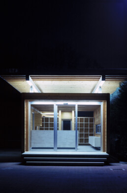
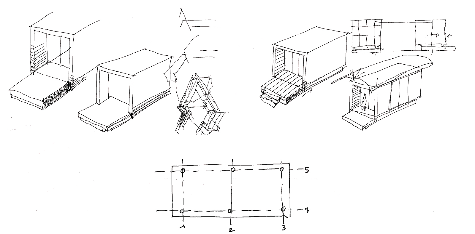
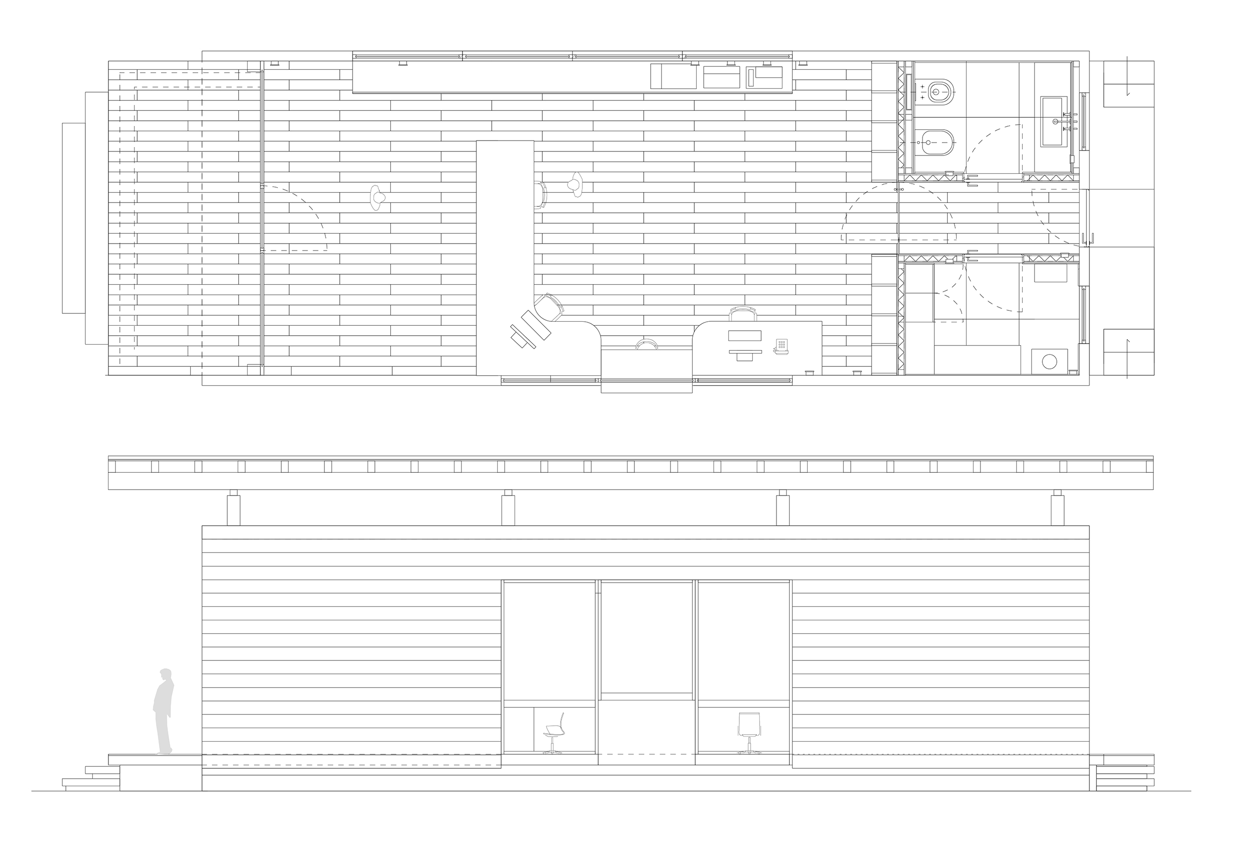
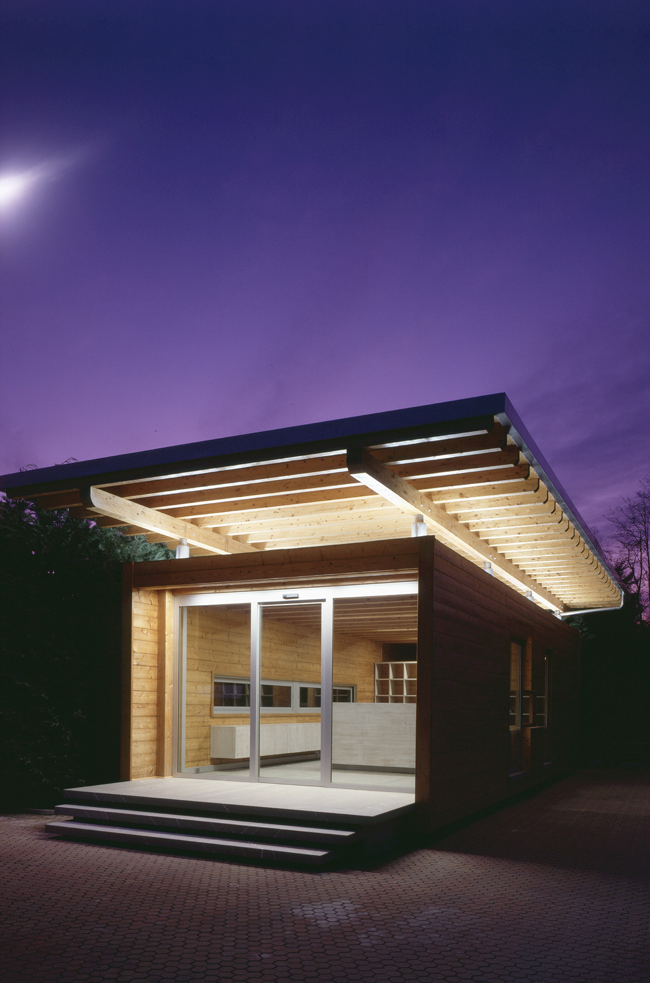
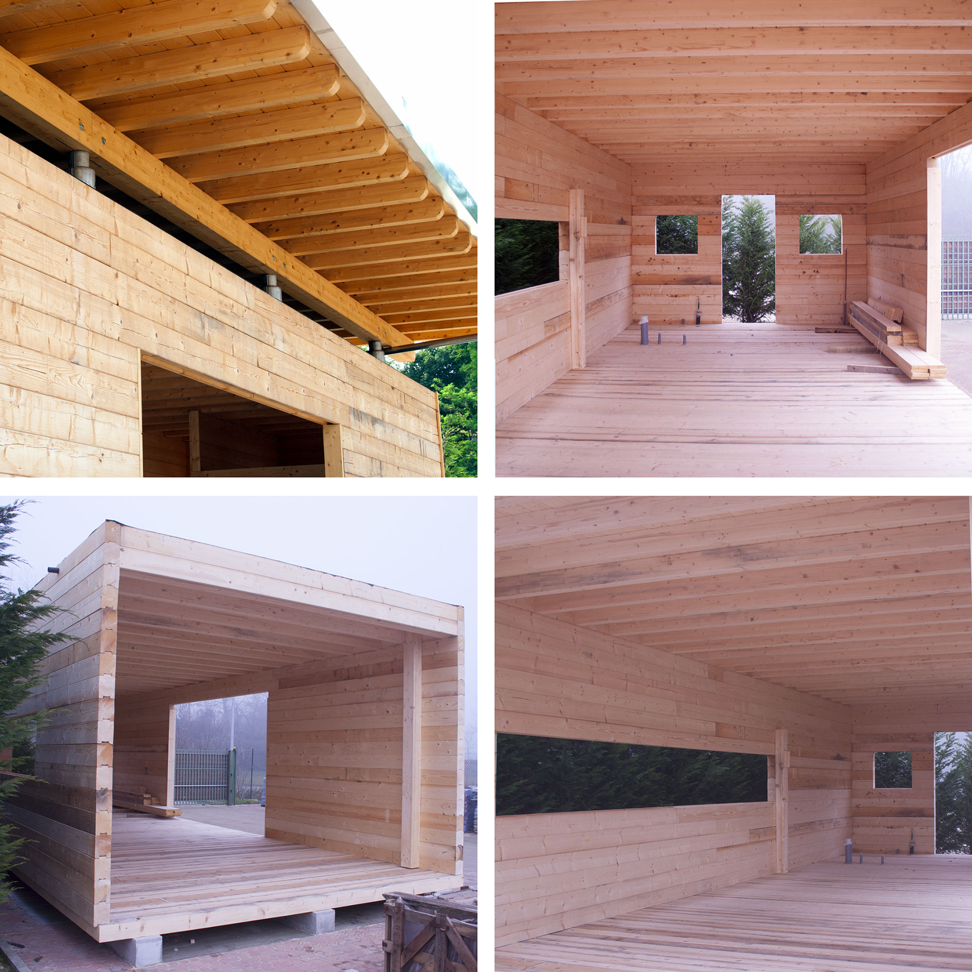
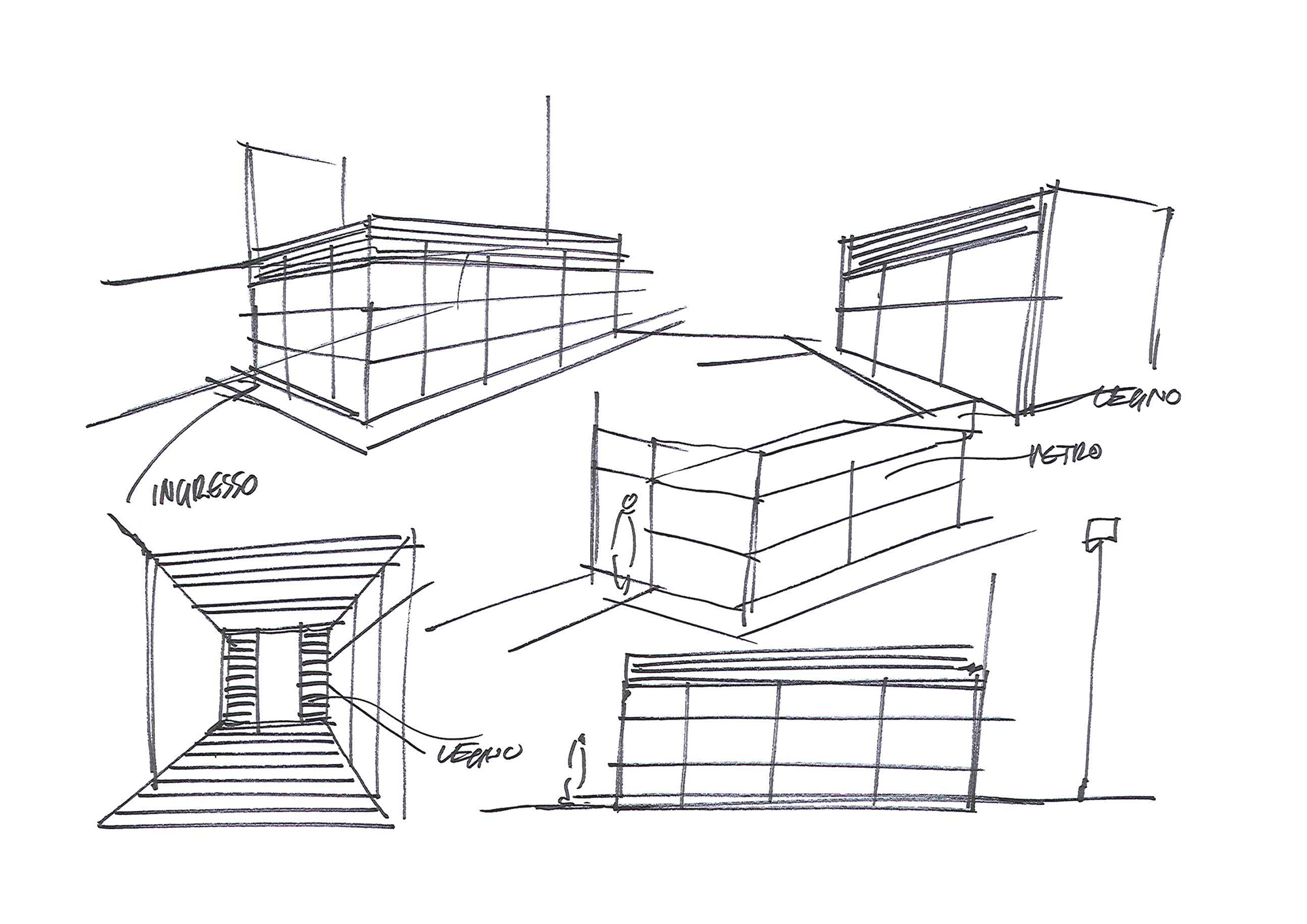
In un deposito di materiale edile appena fuori città, un piccolo ufficio per coordinare e smerciale gli ordini in arrivo e in partenza. Da qui l’idea di creare un edificio che ricordasse i container per forma e proporzioni, ma rielaborandolo in legno e vetro per dare il calore e la luminosità necessaria ad un luogo di lavoro. Uno spazio a misura di lavoratore dove l’ergonomia diventa il principio creatore delle forme e della proporzioni di mobili ed aperture vetrate. Il quadrato e la linea orizzonale come segni essenziali che marcano lo spazio ed evidenziano la vetrata in facciata. Una copertura piatta fluttua al di sopra di questo “container”, evidenziando il richiamo dell’edificio sotteso all’elemento più iconico del trasporto merci, mentre i travetti scandiscono il ritmo del tetto.
A small office to coordinate and handle incoming and outgoing orders in a building material warehouse just outside the city. From here the idea to create a building that reminds us of the form and proportion of a container but made in wood and glass to give the needed warmth and light needed in a work place. A space design to measure for the worker where ergonomics becomes the main creator of forms and proportions of the furniture and window openings. The square and the horizontal line are essential signs of space delineation and highlight the front window. A flat covering fluctuates above the “container”, evidencing the suggestion of the building below understood to be the most iconic form of transporting goods while the beams follow the rhythm of the roof.



Office 2BOX

Commercial
Architecture
2007
Location: Piacenza IT
Client: Private client
Area: 250mq
Provide Service:
Architectural design
Works management
Office 2BOX
Dalla necessità di un front desk all’interno di un magazzino di materiale edile nasce “Office 2Box”: una “scatola” di legno e vetro che diventa punto di riferimento per i clienti e centrale operativa per gli addetti ai lavori. Box Office si distingue dagli altri edifici del complesso sia per dimensione, ben proporzionato per il suo utilizzo, sia per materiali e finiture: legno e vetro e non cemento od intonaco. E’ proprio grazie a questa felice scelta materica che la struttura assume risalto, nella quale il calore del legno e la luminosità delle grandi vetrate moltiplicano il confort dell’ambiente di lavoro. L’essenza utilizzata per la pavimentazione è la stessa che riveste la muratura, creando una continuità visiva che amplia lo spazio e inganna l’occhio.
Particolare attenzione è stata data anche ad aspetti energetici ed ambientali: il riscaldamento radiante a pavimento consente un notevole risparmio energetico e gli infissi sono a triplo vetro, tecnologia ormai consolidata che evita le grandi dispersioni termiche delle tradizionali vetrature.
The need for a front desk inside a construction material warehouse gave birth to “Office 2Box”: a wooden and glass “box” that becomes a reference point for clients and an operational center for the employees. Box Office is different from the other buildings in the warehouse in size, well proportioned for its use, and in its materials and finishing: wood and glass and not cement or plaster. And thanks to this positive choice of material, the structure acquires prominence. The warmth of wood and the luminous large windows multiply the work environment comfort. The material used for the floor is the same as on the walls, creating a visual continuity that enlarges the space and tricks the eye. Particular attention has been given also to the energy and environmental aspects: the radiant floor heating consents considerable savings and the windows are triple layered, now consolidated technology avoiding thermal dispersion present in standard glass windows.


Depo 2BOX

Commercial
Architecture
2001-2002
Location: Piacenza IT
Client: Private client
Area: 250mq
Provide Service:
Architectural design
Works management
Depo 2BOX
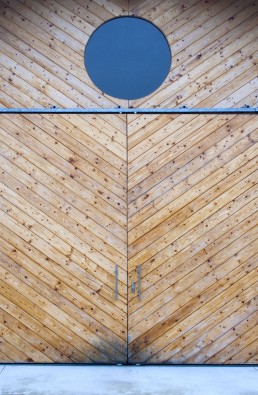
Un deposito di materiali edili fuori città, di nuova costruzione che si immerge nelle morbide campagne piacentine. Il design semplice dell’ involucro viene risaltato dalla singolare trama del legno che ricorda la struttura venosa di una foglia. Il calore e l’ ordine del legno di abete vengono spezzati dalle pietre scure cantonali, dando un impatto solido e più autorevole alla costruzione. Anche il punto luce all’ ingresso, tondo, fuori dagli schemi, conferisce un tono innovativo e curioso alla linearità geometrica dell’ architettura.
A new construction material depot outside town, which immerges in the soft Piacentine countryside. The simple design is enhanced by the pattern of wood that reminds us of the veins in a leaf. The dark cantonal stones give a solid and more distinguished impact to the building, breaking the warmth and the order of the pinewood. Also the unusual round light at the entrance confers an innovative and unusual tone to the linear geometry of the architecture.


Alcamoretti

Renovation
Architecture
2017-2019
Location: Fidenza IT
Client: Alcamoretti
Provide Service:
Architectural design
Facade design
Lighting design
Works management
Alcamoretti
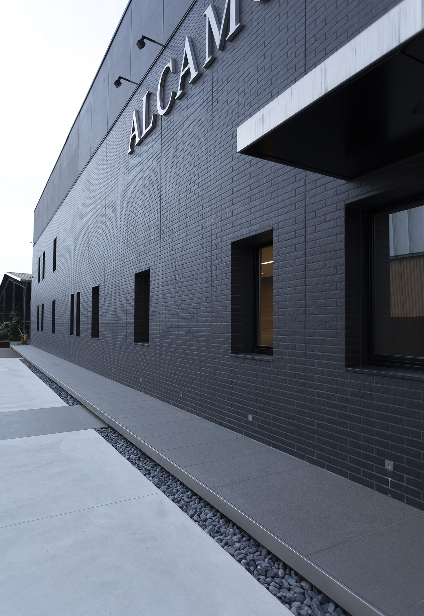
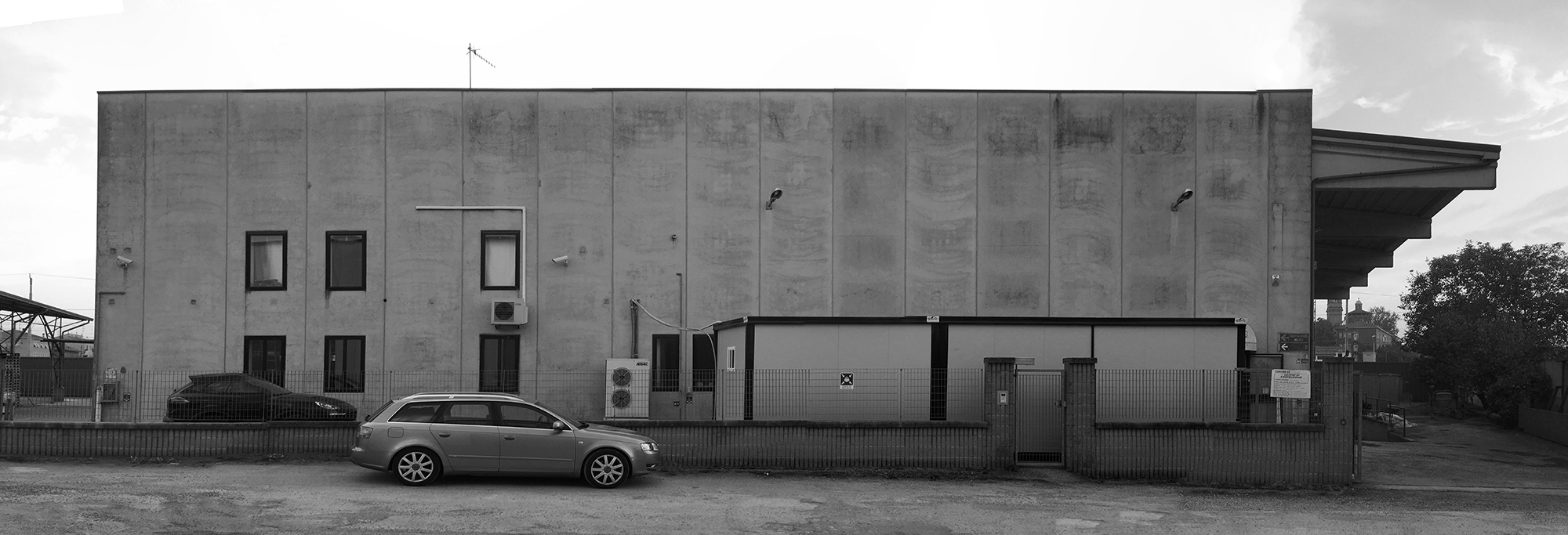
Lo stabilimento Alcamoretti, situato nella zona industriale di Fidenza e affiancato alla ferrovia, non sfruttava la possibile visibilità offerta dalla sua posizione. Oltre alla riqualificazione degli spazi interni, si è ridata forza e identità all’esterno, con un ripensamento della facciata. Data la collocazione e la natura architettonica dell’edificio si è optato per uno stile industriale, rivestendo la facciata di accesso con piastrelle e tinteggiando tutti i fronti in grigio scuro. Sul fronte principale sono state inserite un’insegna ben visibile e una passerella che corre lungo la parete esterna, proseguendo in continuità e trasformandosi in una tettoia che incornicia l’ingresso e presenta una caratteristica forma a U. Completa il disegno dell’accesso esterno, una recinzione in acciaio corten disegnata su misura.
The Alcamortti factory, located in the industrial zone of Fidenza and next to the railroad, did not exploit the possibility offered by its location. Besides requalifying the internal space, force and identity were also given to the external aspect by rethinking the façade. Given the architectural nature and location of the building we chose an industrial style, covering the entrance façade with tiles and painting the fronts dark gray. On the main fronts a very visible trademark was inserted plus a gangway that follows the external wall, then continues and becomes a canopy that frames the entrance and forms a characteristic “U” shape. A custom designed cortan steel fence completes the external design.