
Coffee & Bar
Interior design
Brand Identity
Format
Chronology 2019/2022
Location:
Lino’s 1.0
Vigevano (PV) IT 2018
Torino IT 2019
Vercelli IT 2019
Lodi IT 2020
Novate IT 2020
Gravellona Toce (VB) IT 2020
Gran Giussano (MB) IT 2020
Como IT 2021
Milano IT 2021
Novara IT 2021
Lino’s 2.0
Brescia IT 2022
Client: Lino’s Coffee
Area: 70mq/200mq
Provide Service:
Interior design
Graphic design
Brand Identity
Lighting design
Lino’s Coffee
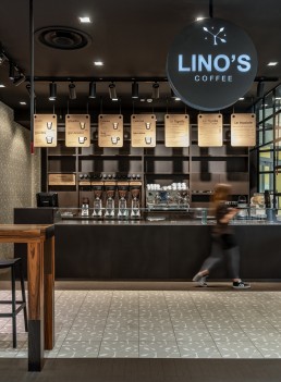
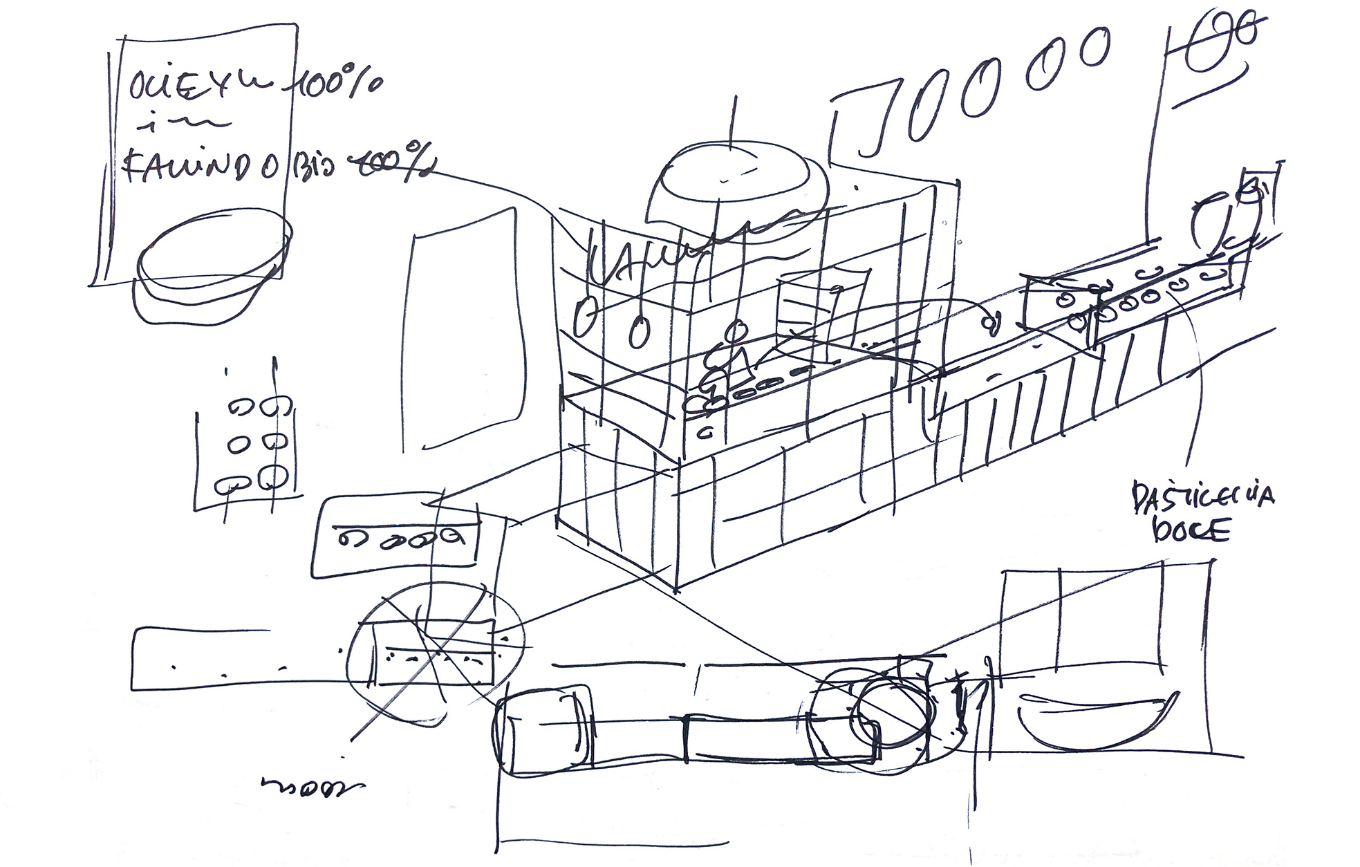
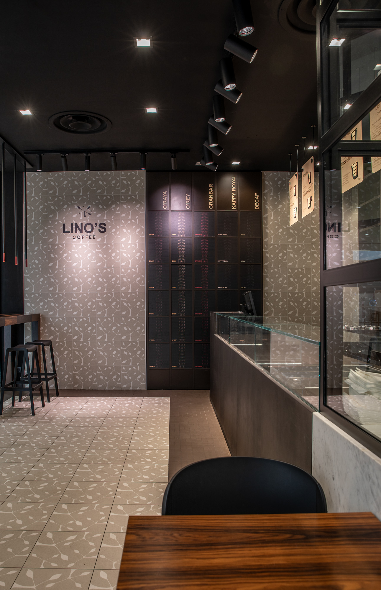
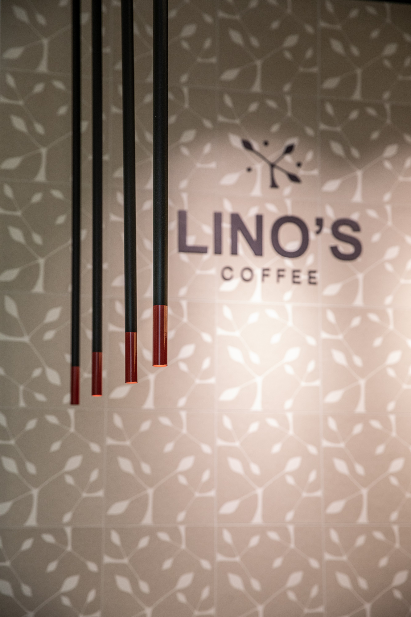
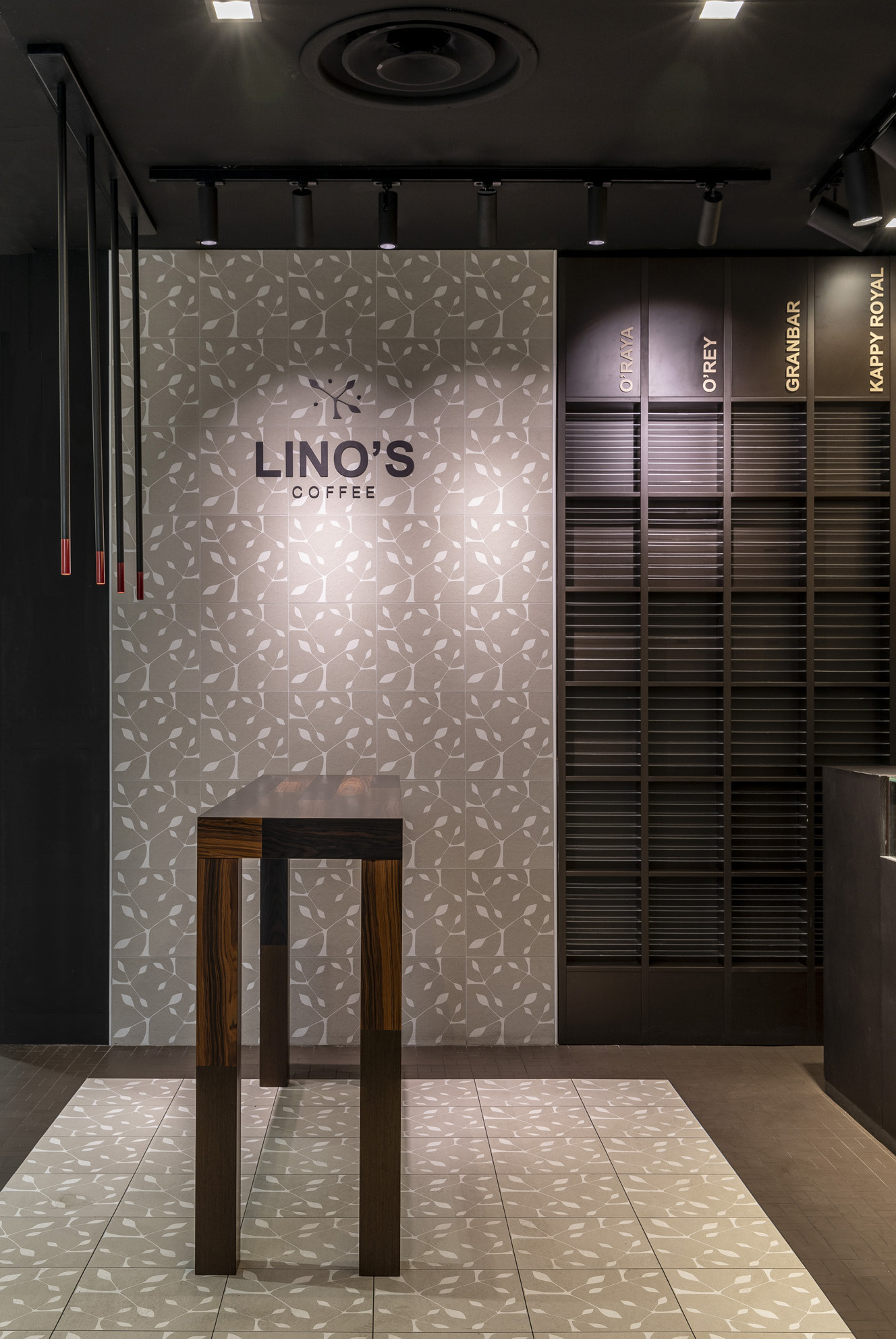
Locale della catena Lino’s Coffee, specializzata in degustazione di caffè. Il concept viene ripreso in tutti i punti vendita. E’ stato ideato il brand che connota tutti gli ambienti. Il primo locale progettato per il marchio risale al 1998. Nel progetto di rinnovamento articolatosi tra il 2019 e il 2022, si è puntato di una revisione del logo e sull’innovativa comunicazione attraverso originali menu board. La nuova insegna non è più orizzontale, bensì circolare e contiene il nome del brand, non più disposto linearmente ma armonicamente inserito nel cerchio. I menu board, ben illuminati e collocati in posizione strategica sopra al bancone, sono ricercati nelle forme e nei materiali. Presentano una base in legno; le scritte sono incise al laser e sono inseriti pittogrammi in rilievo per presentare il prodotto.
L’ambiente è tutto giocato sulle cromie del marrone scuro, che richiama il chicco di caffè. Il pattern con la stilizzazione di una pianta di caffè, che costituisce il marchio della catena, è replicato sui rivestimenti, con le piastrelle stampate ad hoc. Il bancone è suddiviso in due sezioni: la parte per la somministrazione che è aperta, il laboratorio che rimane a vista, grazie ad una vetrata.
A bar, belonging to the Lino’s Coffee chain, specialized in coffee tasting. The concept is present in all shops. The brand name was created to be used in all the Lino’s Coffee bars. The first bar goes back to 1998. The renovation project was carried out between 2019 and 2022, and the logo was revised plus an innovative communication using an original menu board was also introduced.
The new sign is no longer horizontal, but round and contains the brand name, not in a line but harmoniously inserted into the circle. The well illuminated menu board is strategically located above the custom counter and is refined in material and form, as is the counter itself. There is a wooden base; the text is laser printed and pictograms in relief are inserted to present the product. The atmosphere Is created by using shades of brown, reminding us of coffee beans. The pattern, showing a stylized coffee plant which constitutes the chains’ brand, is replicated in the ad hoc printed tile covering. The counter is divided in two sections: one open part for serving, and the other is a visible glass covered laboratory.

Colloborators: Arch.R.Negri / Photographer: F.Mazza