
Collaboration Ettore Sottsass


Museum-Exhibitions
Design
2000
Location: Milano IT
Client: Boscaro srl
Design team:
Massimiliano Mazzaschi
Provide Service:
Collaboration design
Works management
28 Progetti Ettore Sottsass
Boscaro Project
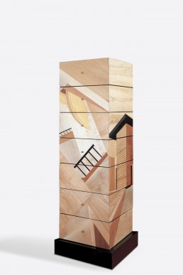
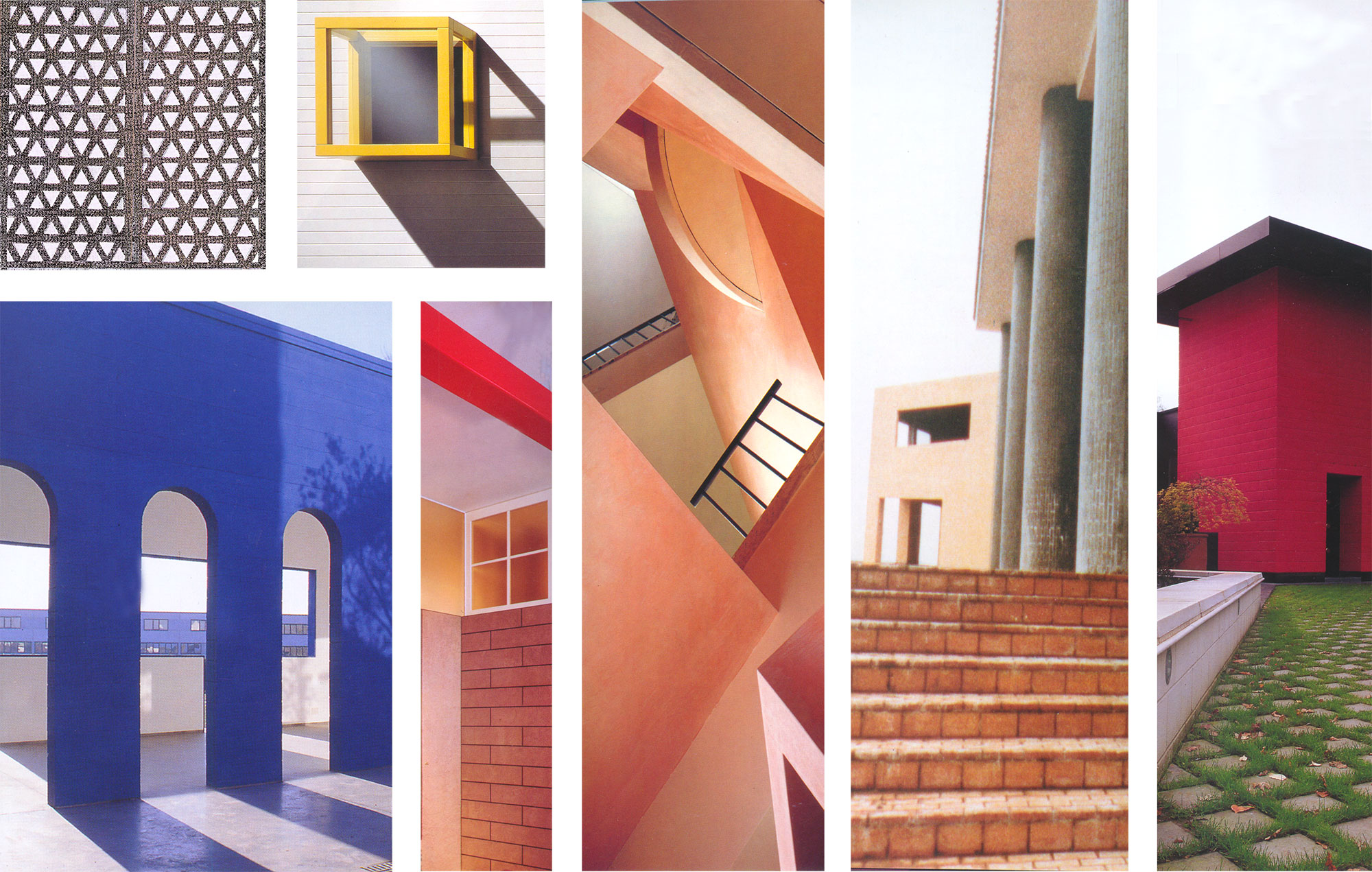
Collaborazione durata un anno con Ettore Sottsass nella progettazione di 28 mobili unici, realizzati da Andrea fedeli, ebanista e restauratore fiorentino, su idea del Boscaro Project. La volontà, propria dell’idea Boscaro, è quella di realizzare oggetti di altissimo valore dove si uniscono la creatività contemporanea e l’abilità manuale derivante dal sapere artigianale, si crea un ponte artistico tra il passato delle tradizioni dell’arte decorativa e il futuro del design. Le diverse essenze creano motivi geometrici che riproducono, talvolta, disegni di architetture realizzate dallo stesso Sottsass, che conferiscono al piano ligneo effetti straordinari. Nascono così pezzi unici di grande valore curati in ogni minimo particolare che portano nella quotidianità i profondi valori dell’arte italiana.
Boscaro Project
Collaboration for one year with Ettore Sottsass in designing 28 unique pieces of furniture, made by Andrea Fedeli, a Florentine antique restorer, based on the Boscaro Project. This project chose to make high-end furniture which unites contemporary creativity with a craftsman’s manual ability and therefore create an artistic bridge between the tradition of decorative art and the future of design. The various essences create geometrical motives which reproduce at times architectural designs made by Sottsass himself and confer an extraordinary effect to the wooden surface. In this way unique and very valuable items are created where every small detail has been considered, bringing the profound values of Italian art into daily life.




Chi Gold

Food & Beverage
Design
2009
Client: Soyana Swiss
Provide Service:
Concept design
Coordination and support
Chi Gold
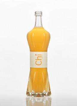
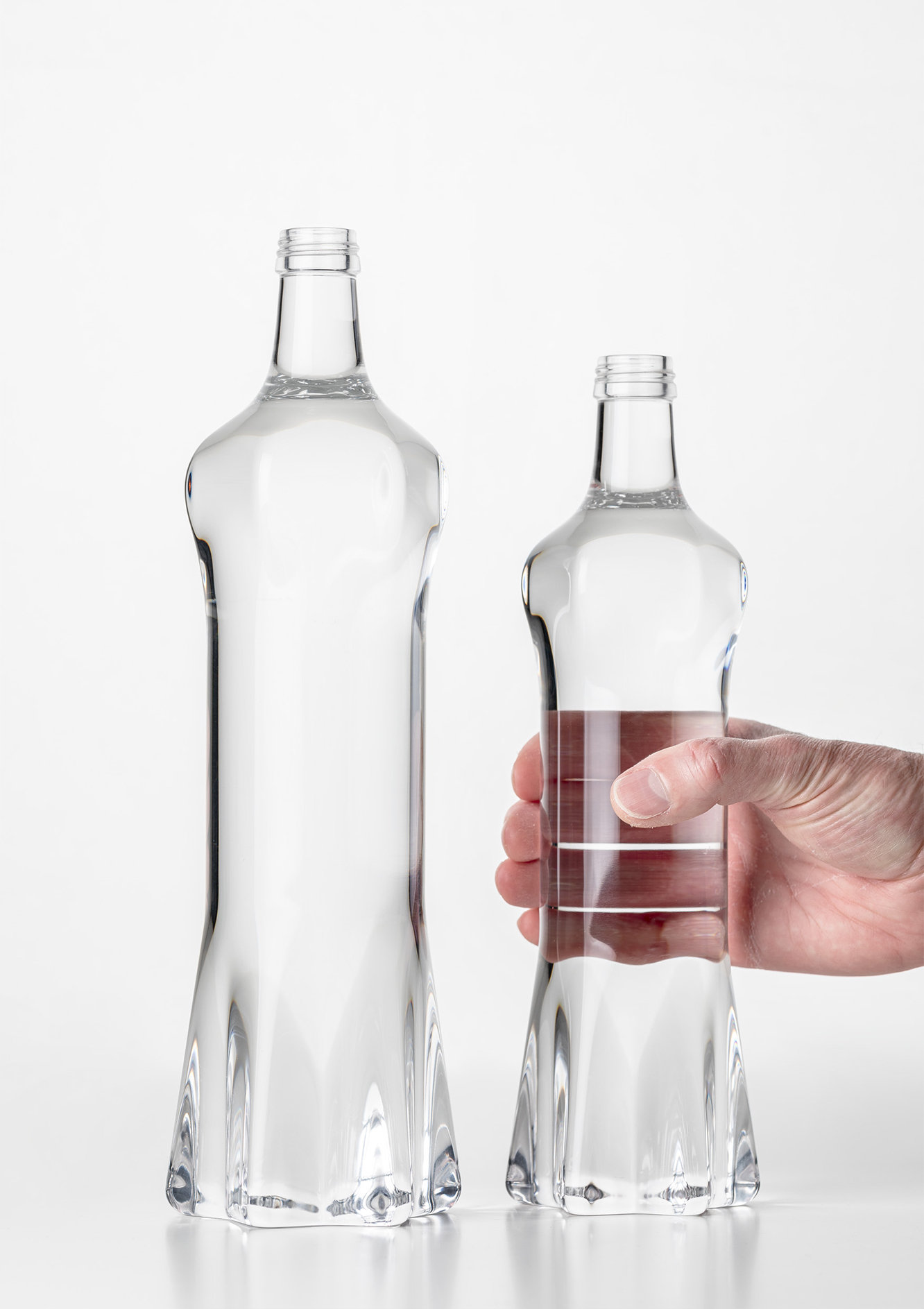
La bellezza della struttura cristallina di “Chi Gold” ha ispirato il designer Albino Vescovi per creare questa bottiglia unica. La bottiglia, come un vestito, rivela l’anima della bevanda. L’armonia della forma del cristallo è l’espressione di una forte energia vitale e uno dei più stimolanti archetipi in natura… il fiore. Tutti i materiali utilizzati per la bottiglia di “Chi Gold” sono del tutto riciclabili: vetro per la bottiglia, alluminio per il tappo, canapa e fiori di ibisco per l’etichetta. “Chi Gold” si presenta in una bottiglia che è l’unione tra un’estetica sorprendente e il rispetto per la natura. Bellezza e natura, insieme all’amore, sono le qualità che fanno questa bevanda e la propria bottiglia esprimibili in una sola parola: armonia.
The beauty of the crystalline structure of “Chi Gold” inspired the designer Albino Vescovi to create this unique bottle. The bottle, just like a dress, reveals the soul of the beverage. The harmony of the crystal shape is both an expression of strong vital energy and one of the most stimulating archetypes in nature…the flower. All materials used for the “Chi Gold“ bottle are recyclable: glass for the bottle, aluminum for the cap, hemp and hibiscus flowers for the label. “Chi Gold” is presented in a bottle that is a union between an esthetic surprise and respect for nature. Beauty and nature together with love are the qualities that make this beverage and its own bottle describable in one word: harmony.


Ufo 2

Coffee & Bar
Design
2002
Location: Milano IT
Client: IPER
Gruppo Finiper
Area: 16mq
Provide Service:
Concept design
Coordination and support
Ufo 2
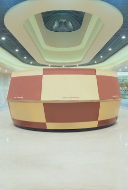
Situata all’interno di una galleria commerciale a Milano, questa struttura brevettata, è uno dei primi prototipi di chiosco autosufficiente, adibita ad uso gelateria. Si compone di due parti: una inferiore divisa in zona di produzione, di somministrazione e vendita del prodotto; una superiore, impiegata come magazzino per le materie prime. Lo spazio, soli 4 metri di diametro, viene in questo modo ottimizzato al meglio. Il pilastro circolare situato nel centro della circonferenza, oltre ad esser elemento di sostegno, si trasforma in neon verticale che illumina l’interno del chiosco. L’uso del vetro e la forma circolare permettono alla clientela una visione trasparente e a 360° della preparazione e del prodotto esposto.
Located inside a shopping mall in Milan, this patented structure is one of the first prototypes of a self-sufficient kiosk used as an ice cream parlor. It has two parts: a lower one divided into zones for production, serving and sale of the product and an upper part for stock and storage of the ingredients. The space, only 4 meters in diameter is best optimized in this way. The circular pilaster located in the center of the circumference, besides being a support, transforms itself into a vertical neon which illuminates the inside of the kiosk. The use of glass and the circular shape gives the client a 360° view of the product preparation.


Ufo 1

Coffee & Bar
Design
2001
Location: Milano IT
Client:Lino’s Coffee
Area: 19mq
Provide Service:
Concept design
Works management
Ufo 1
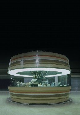
Questa singolare caffetteria della catena Lino’s Coffee sorge all’interno di un polo commerciale a Milano con l’intenzione di essere completamente indipendente ed autosufficiente. Il chiosco è composto da una solida base circolare in legno realizzata con i colori standard del marchio e una parte superiore mobile in tessuto che mantiene la stessa cromia di quella inferiore e che funge da protezione durante le ore di chiusura della caffetteria. Il neon verticale in posizione centrale illumina l’interno della struttura e la forma circolare del chiosco ottimizza lo spazio rendendo operativa l’intera area e coinvolgendo la clientela a 360°. La forma, la mobilità della parte superiore e la versatilità rendono questo progetto unico ed innovativo nel suo genere.
This unusual cafeteria belonging to the Lino’s Coffe chain is located in a shopping area in Milan and professes to be completely independent and self-sufficient. The kiosk is made of a solid circular wooden base with the standard trademark logo and with an upper mobile part in cloth that retains the same colors as below, also serving as a protection when the cafeteria is closed. A vertical central neon illuminates the entire structure internally and the circular shape optimizes the space, involving the client 360°. The shape, the mobility of the upper part and the versatility render this project unique and innovative in its genre.


Ufo 3
Coffee & Bar
Design
2000
Location: Milano IT
Client: Portello Caffè
Area: 15mq
Provide Service:
Concept design
Lighting design
Works management
Ufo 3
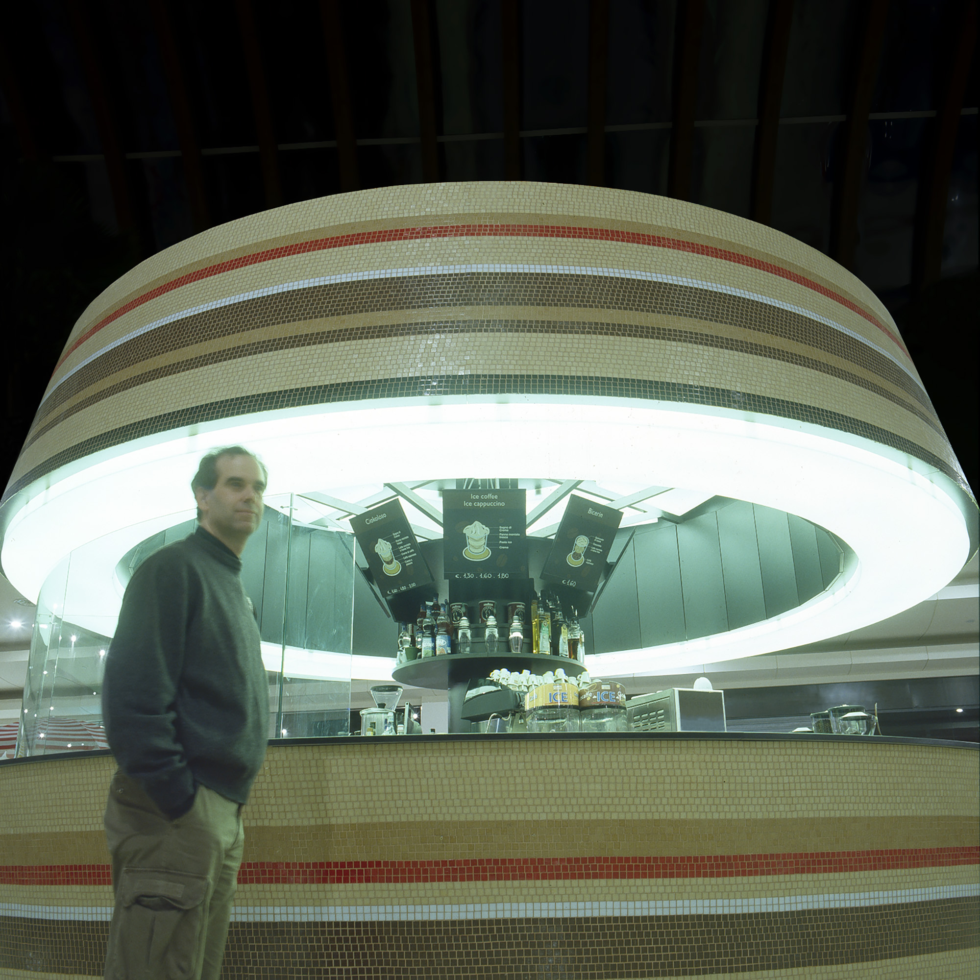
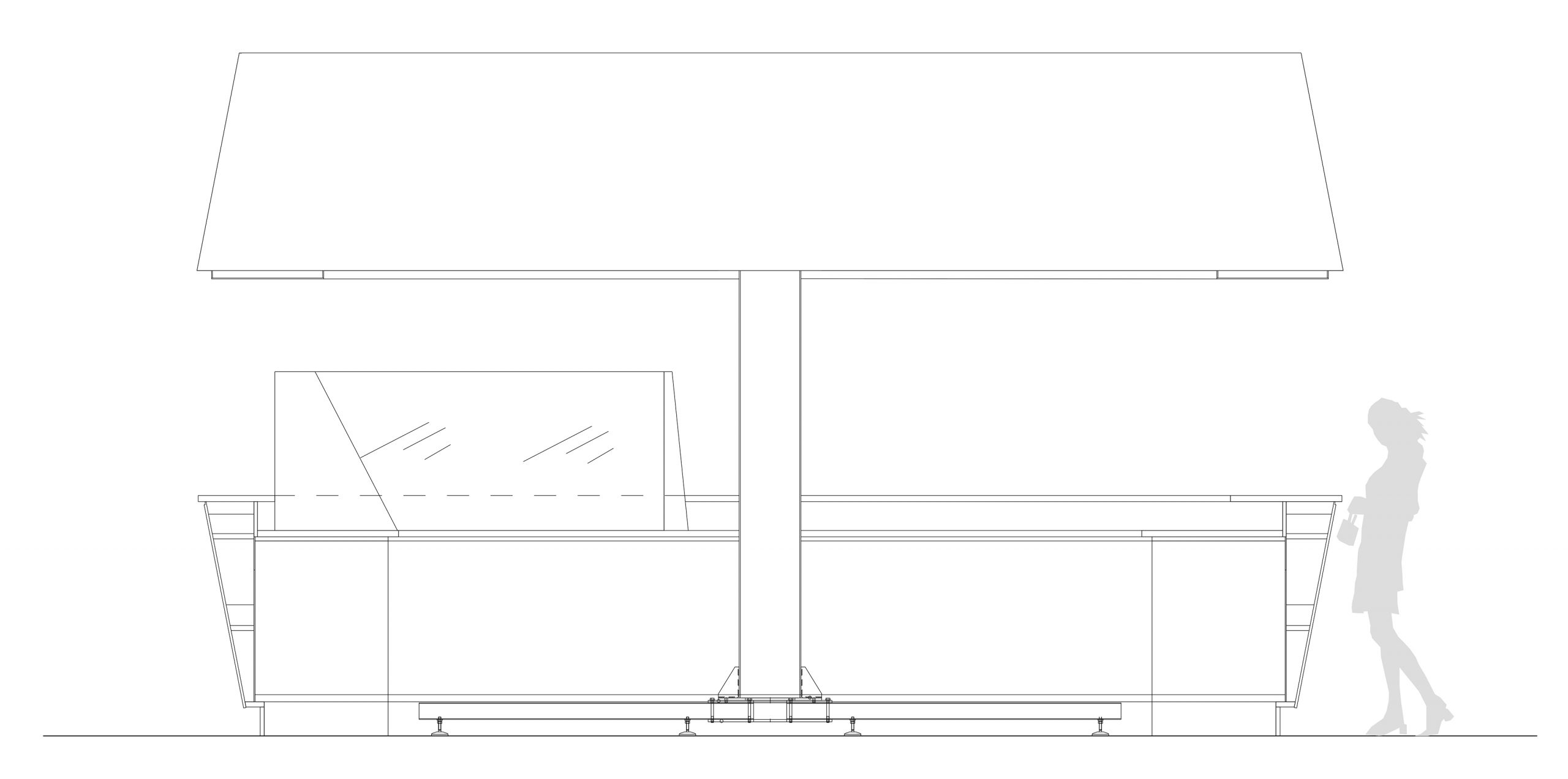
Questo chiosco installato in una galleria commerciale deriva dalle esperienze di chioschi circolari precedentemente progettati. UFO n°3 si compone di due parti principali: la fascia bassa, operativa, che termina con il bancone di somministrazione e la fascia alta, con funzione di stoccaggio/magazzino, unite da un perno centrale strutturale. Il rivestimento della superficie in grès ha un’ottima resistenza meccanica e chimica e assicura al chiosco una lunga durabilità nel tempo. Tramite le tessere a mosaico in grès viene ripreso il tema della riga colorata, che è la grafica di riferimento per la linea Portello Caffè. Infine la luce, appena sotto la parte alta, richiama l’avventore e uniforma l’illuminazione sul banco di lavoro e somministrazione ed enfatizza la forma circolare del chiosco.
This kiosk installed in a shopping gallery derives from the experience of previously designed circular kiosks. Ufo n.3 has two main parts, the lower operational strip that ends with the serving counter and the upper part, used for storage. They are joined by a central pivot structure. The coating is in grès with an optimal mechanical and chemical resistance that insures the kiosk a long functional lifetime. The colored line theme is repeated in a mosaic composition, which refers to the Portello Caffè line. Lastly the light just below the upper part, recalls the customer and the uniform lighting on the working and serving counters emphasize the circular form of the kiosk.


Isolacaffè

Coffee & Bar
Design
2008
Location: Milano IT
Client: Portello Caffè
Area: 22mq
Provide Service:
Interior design, Styling,
Graphic design
Lighting design
Works management
Isolacaffè
Collocata nel centro commerciale di Vittone (Milano), questa Isola caffè offre la possibilità di una piacevole sosta agli utenti. Il progetto nasce dalla volontà di creare una struttura che,in soli 7 metri circa di lunghezza, sia idonea alle funzioni principali e indispensabili di caffetteria. Lo spazio è suddiviso in due parti: la prima destinata alla consumazione di cibi e bevande, la seconda adibita all’esposizione, tramite vetrine, dei singoli prodotti. L’intervento è caratterizzato da una linea sinuosa e continua evidenziata dalla fascia luminosa che contorna ininterrottamente l’intera Isola caffè. Il connubio tra design e funzionalità pratica emerge grazie alla soluzione adottata per i cestini che risultano essere quasi invisibili, inseriti all’interno della linea luminosa in modo da non spezzare l’armonia della struttura. Nella parte superiore sono stati inseriti dei menù board che specificano le caratteristiche dei singoli prodotti. I materiali impiegati sono legno, vetro e plexiglass; mentre i colori scelti hanno la funzione di far risaltare le superfici, l’alternanza tra pieni e vuoti e la compenetrazione tra spazi concavi e convessi nel design del complesso.
Located in a shopping mall in Vittone (Milan) this coffee shop offers its customers a pleasant rest stop. The project was born from the desire to create a structure only about 7 meters long which would be able to carry out all the basic and essential functions of a cafeteria. The space is divided into two parts: the first is for eating and drinking and the second is for showcasing the single products offered. The project has a sinuous continued line highlighted by an illuminated frame circling the entire café island. The bond between design and practical function emerges thanks to the solution chosen for the wastebaskets that become nearly invisible, inserted within the illuminated frame in a way that does not break the structure’s harmony. In the upper part menu boards have been inserted which specify the individual products. The materials used are wood, glass and Plexiglas. The chosen colors are used to highlight the surfaces, and the alternating full and empty, convex and concave spaces are part of the total design project.


Out & Inside Coffee

Coffee & Bar
Design
2008
Location: Milano IT
Client: Portello Caffè
Area: 5mq
Provide Service:
Interior design, Styling,
Graphic design
Lighting design
Works management
Out & Inside Coffee
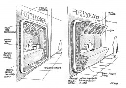
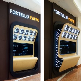
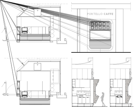
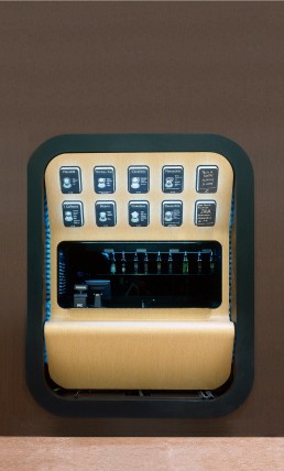
In un centro commerciale, una caffetteria dallo spazio limitatissimo (meno di 5 metri quadrati). Il concept progettuale richiama un unico “foglio” di legno, che con forme dalla sinuosità controllata si sviluppa dall’alto al basso assolvendo a tutte le funzioni richieste: menù board, zona somministrazione, bancone di servizio. I colori scuri dell’interno danno risalto alla facciata lignea, che traslando in avanti negli orari di apertura, espone i fianchi ai clienti che identificano da subito il prodotto offerto. Un progetto dal carattere originale e unico che riesce a sfruttare fino all’ultimo centimetro il pochissimo spazio a disposizione.
In a shopping mall, a cafeteria with very limited space (less than 5 square meters). The project concept reminds us of a single wooden leaf with a controlled sinuous shape that develops from the top to the bottom, resolving all the tasks required: menu board, preparation area, counter service. The dark colors inside emphasize the wooden façade that during opening hours is pulled out, its sides visible to the clients who immediately recognize the product offered. An original and unique project that is able to take advantage of the little space available up to the last centimeter.