
Mobile operator
Brand Identity
Chronology 2013-2015
Client: RingoMobile
Provide Service:
Graphic design
Logotype design
Packaging design
Vehicles liveries
Brand websites
Stores design
Works management
Ringo Mobile
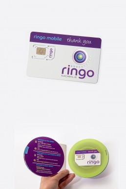
Lo studio è stato incaricato di gestire e coordinare l’ immagine di una nuova compagnia telefonica. A partire dal nome, scelto per la facile pronuncia in tutte le lingue, si propone anche per una clientela etnica in continuo aumento. La forma circolare del logo ricorda la globalità, la terra, e l’ immagine a cerchi concentrici suggerita dall’ incresparsi dell’ acqua al contatto con una goccia ricollega ad un network in espansione. L’utilizzo del colore viola, poco diffuso nel settore, conferisce al prodotto una componente innovativa; si abbina negli arredi e nelle scelte grafiche al verde acido e all’ azzurro cielo.
Uno studio a 360 gradi che si spinge fino all’ immagine coordinata (caratteri, colori, biglietti da visita, carta intestata, buste, sito web, email footer), ai punti vendita, ai totem informativi, ai corner commerciali e all’ advertising dinamico su mezzi pubblici.
The studio was commissioned to manage and coordinate the image of a new telephone company. Starting from the name chosen for its easy pronunciation in all languages it is also directed towards an ever-increasing ethnic clientele.The circular shape of the logo reminds us of being global and the earth. The image of concentric circles suggests a drop of water reconnecting to an expanding network.Using the color purple which is not often seen in this sector, confers an element of innovation to the product. It goes well with acid green and sky blue in home furnishings and the graphics.
A 360 degree study that reaches up to the coordination of the image (type face, colors, business cards, letterheads, envelopes, web sites, email footer) up to stores, information totems in shopping malls and dynamic advertising on public transport.


Photographer: